Abstract Form
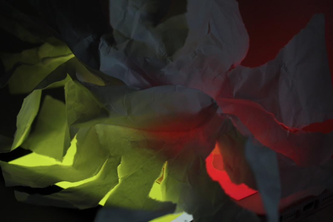
White Paper Test
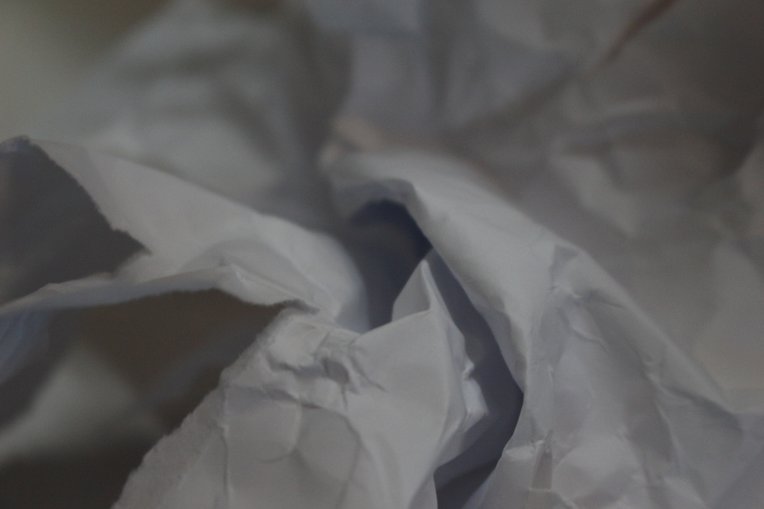
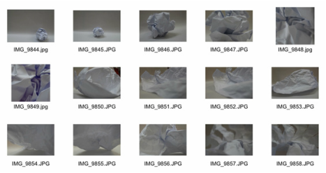
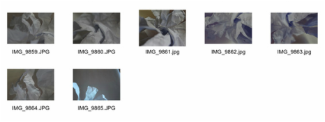
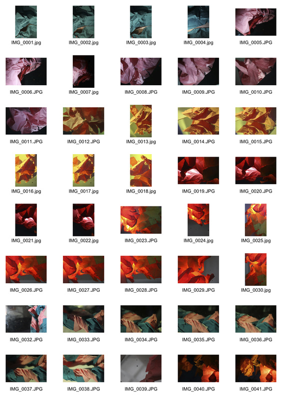
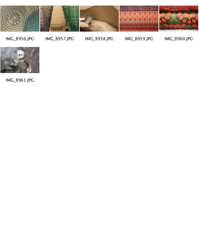
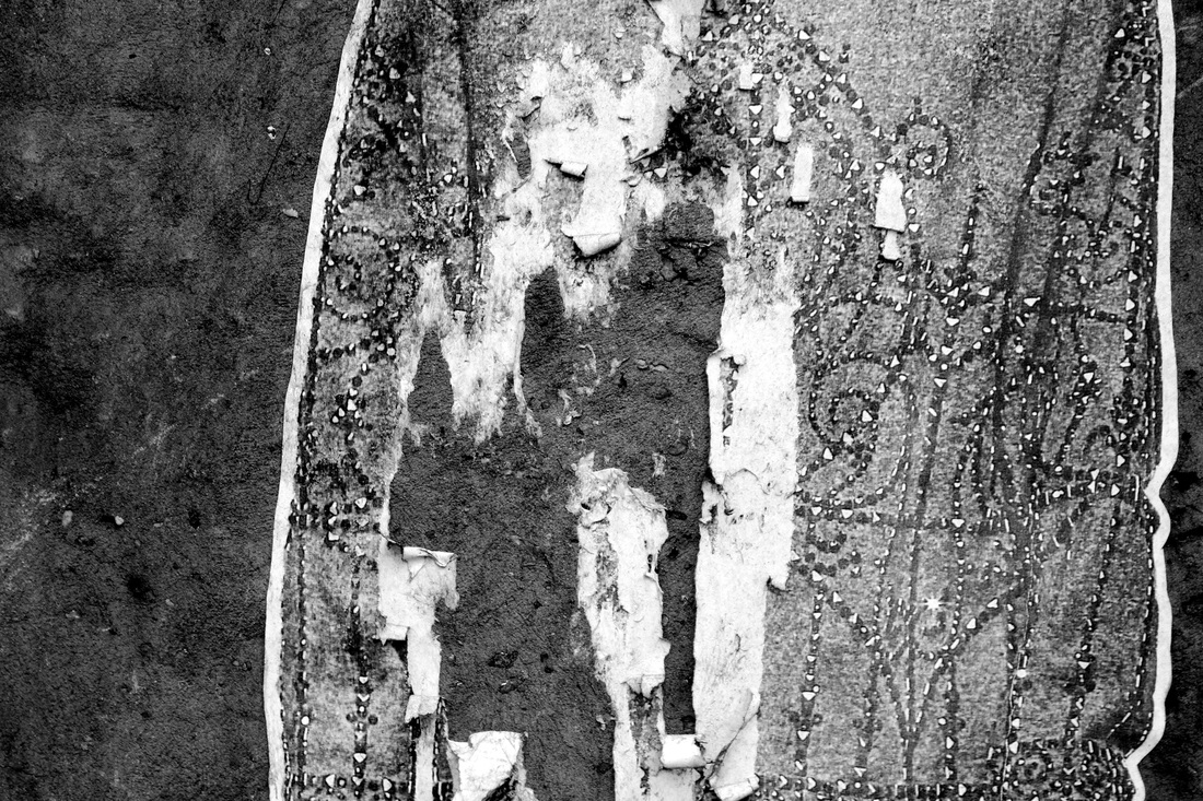
For this task I took several photographs of plain white paper, ripping it and folding it to manipulate the outcome of the image. Changing the paper by folding it and ripping it made the photographs more abstract. Below are the three best photographs that I captured and contact sheets of all the photographs I took.

|
|
Development
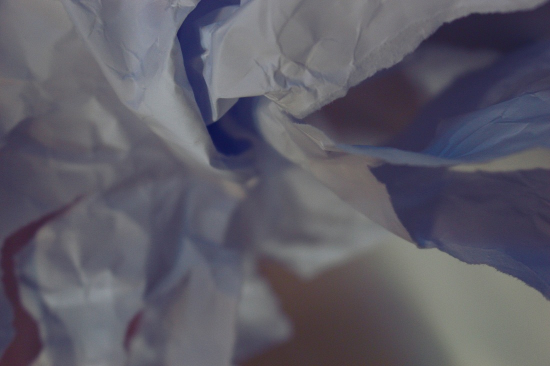
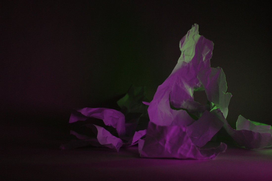
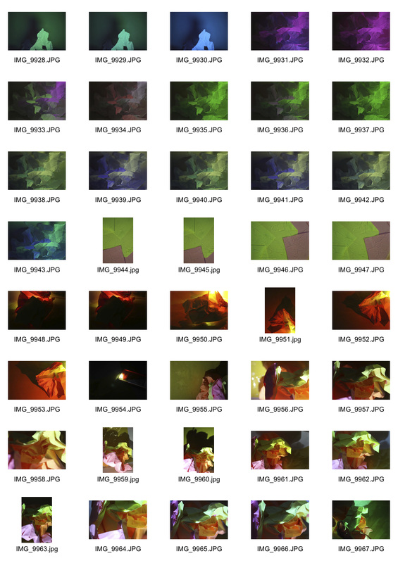
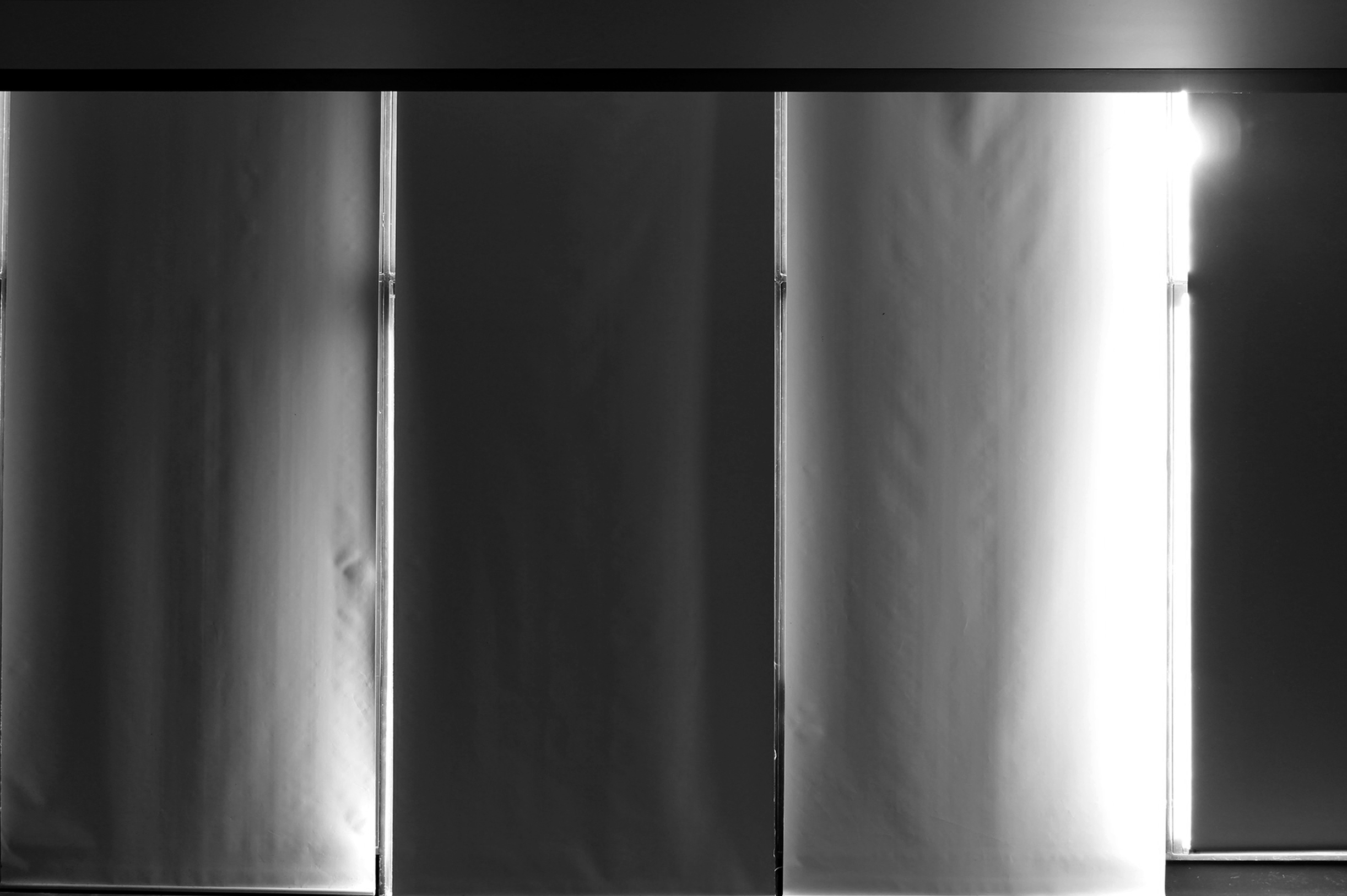
For the second part of this task, I used coloured lights to change the colour of the paper in the image. I also used coloured acetate to manipulate to colours within the photograph. Below are three enlarged images that I think worked the best for this task and then a contact sheet of all the images I took overall.


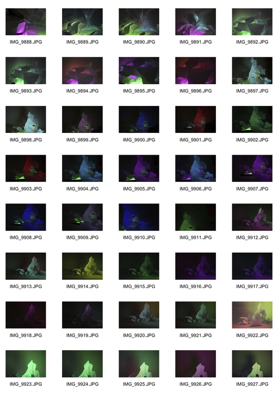
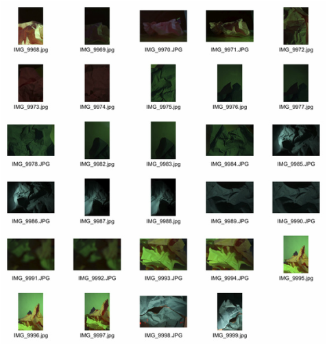
|
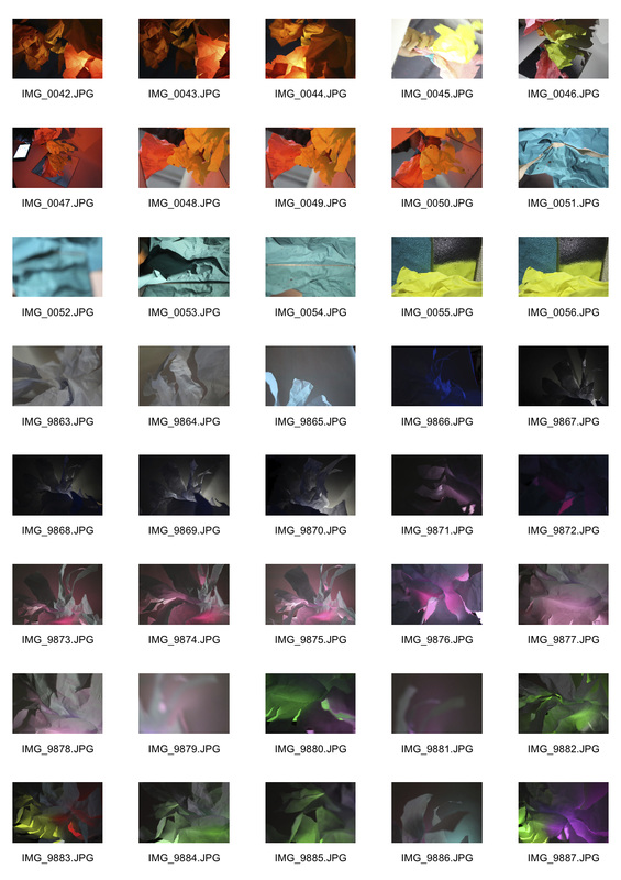
|
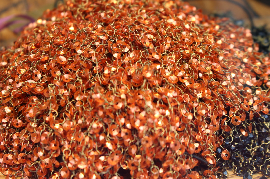
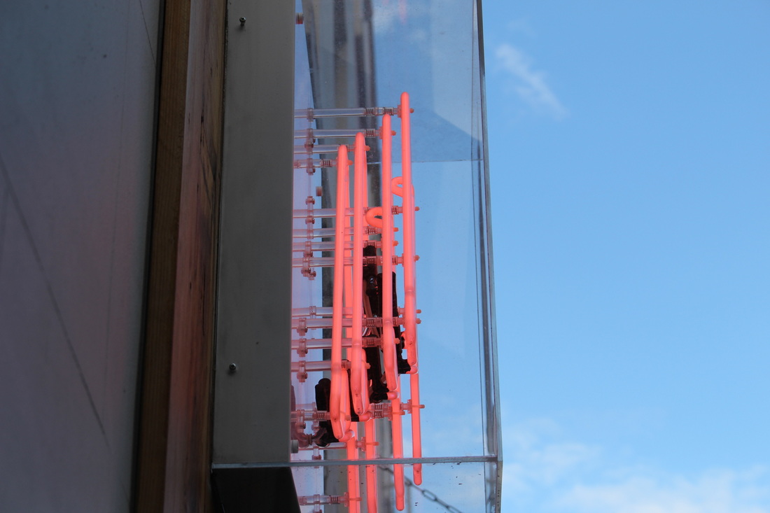
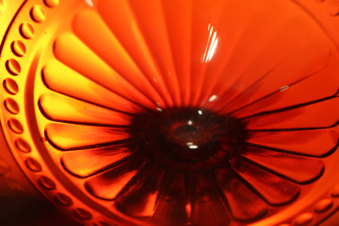
Abstract Homework
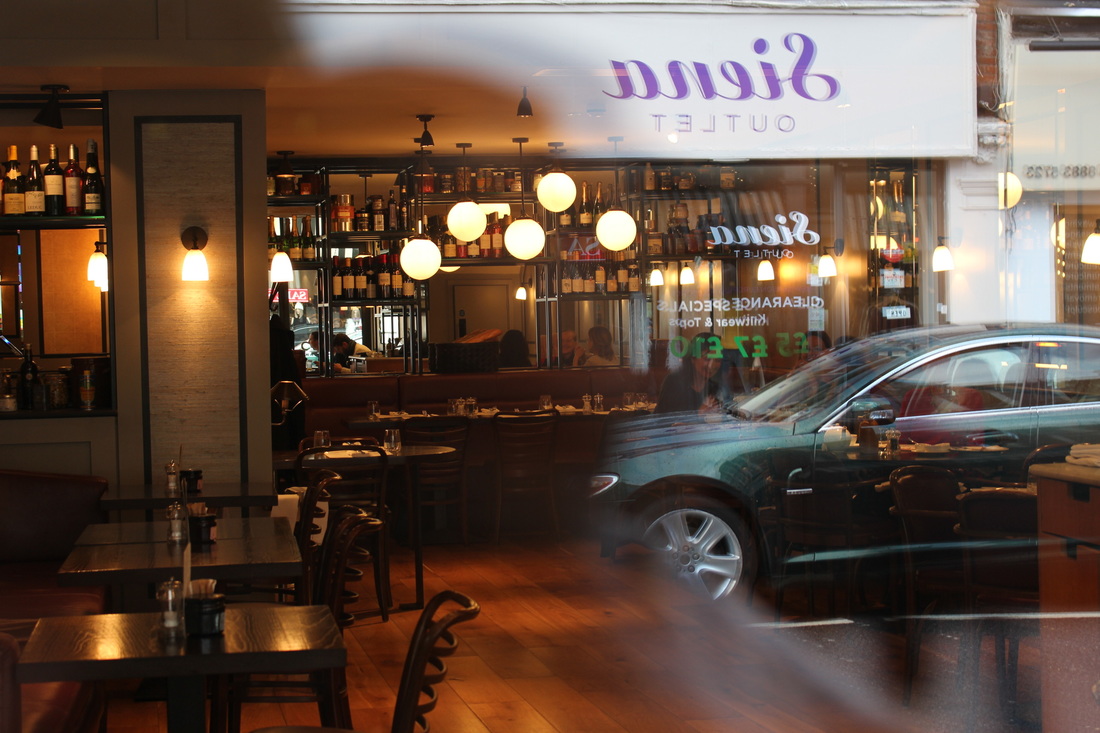
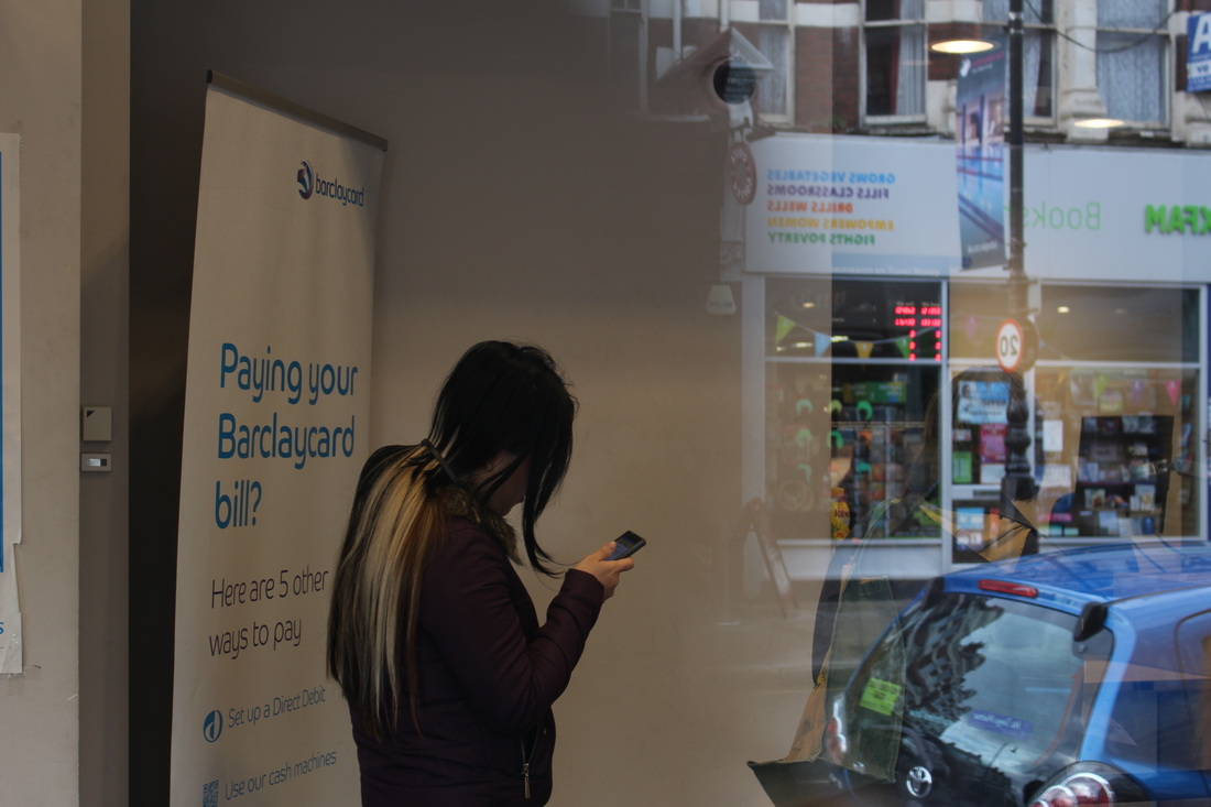
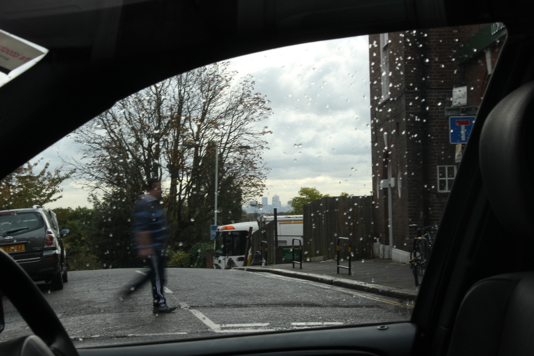
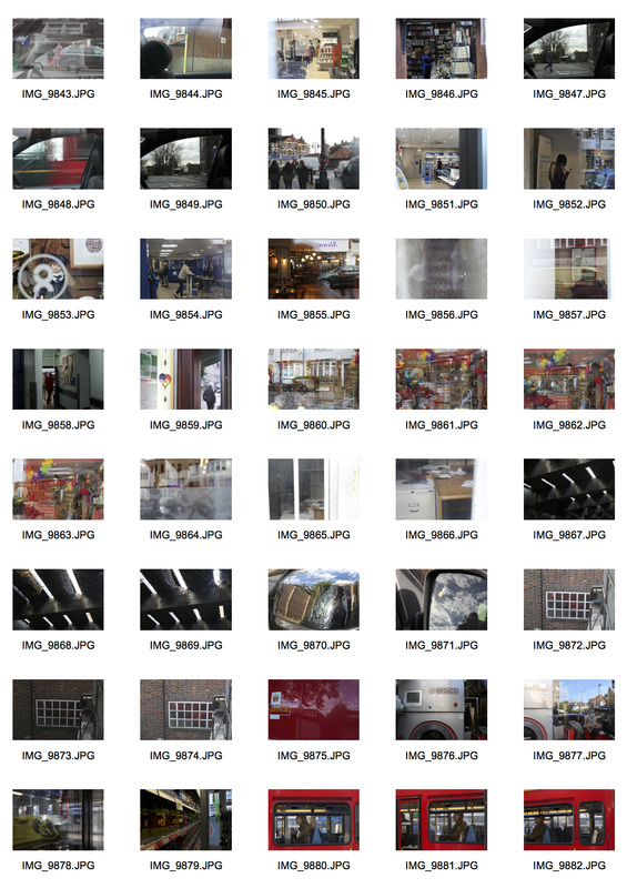
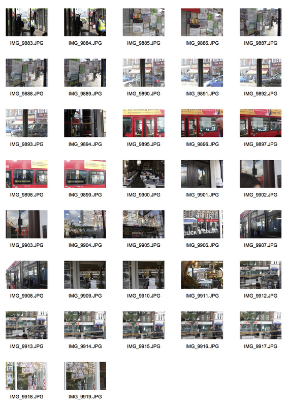
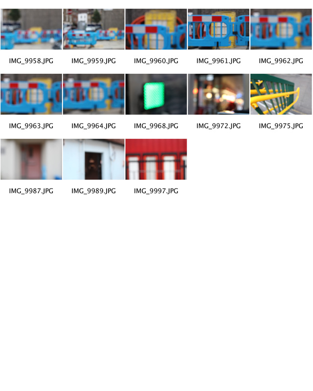
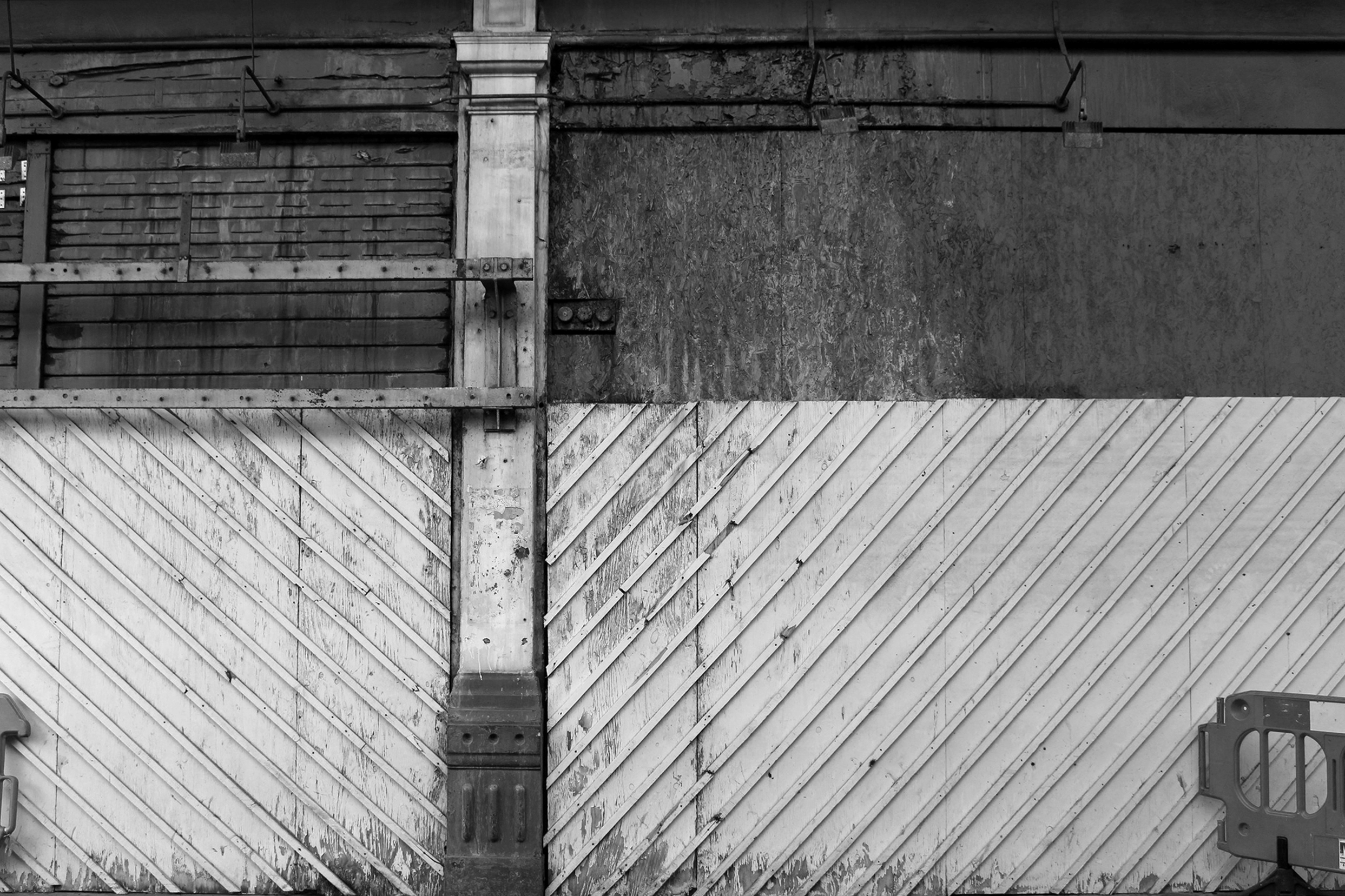
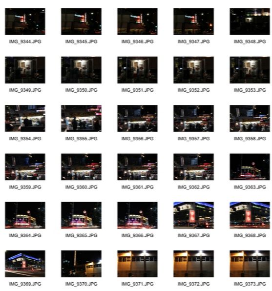
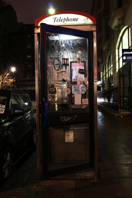
For the homework task, I took several pictures around the street and in different shops. I tried to capture photographs that I thought looked as abstract as possible, trying to make it hard to be able to completely tell what the pictures are of. I think some of the pictures I took achieved this, but others I would have to edit in order to make them look more abstract.
|
|
Abstract Development
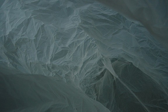
Antarctica In A Bag - Francois Delfosse
In this series photographer and architect, Francois Delfosse, captures several different images of the view inside a crumpled up, used plastic bag. These images are described as a 'glacier cave just North of the South Pole as viewed from the inside of a plastic bag'. I think this series is interesting as it plays on the fact that nature can create beautiful things and many people would consider glacier caves as stunning or mesmerising. Also, I think it represents how a photographer can manipulate a flimsy, feeble object to appear as though it is one of the strongest forces in nature. This series highlights how abstract photographs open the viewer's mind to interpretation and how a simple choice of title can have such a strong impact on what people think they see. It also conveys the idea that abstract photographs, such as these, can allow different people to see things through the eyes of an architect. I think this is extremely interesting as it can completely change the viewers perception of a normal, everyday object. Underlining that the photographers individual idea has the ability to be expressed through the image and become known to the public.

|
I think all of the images in this series have a very limited colour palette, which adds to the illusion that the photographs are taken in a glacial cave. This photograph, in particular, uses bright light and a warms-eye view to fool the viewer into thinking the image is taken at the bottom of a crevasse, looking up into the daylight from inside of the cave. I think this in an interesting technique the photographer has used as it plays with the scale of the plastic bag, deceiving the viewer into thinking that the bag is much bigger than it is in reality.
|
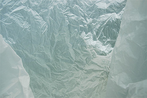
Exposure plays an important role in this image, as it shows a full range of tones from shadow to highlight in a way that really resembles a landscape and tricks the mind into thinking that the plastic bag is really an ice cave. There is a grey-green cast to the colour that is very ice-like in this photograph that sets up the atmosphere of nature, which I think is very interesting as it must be extremely difficult to make a thin sheet of plastic take the form of such a strong, prominent aspect of nature. I think this is a very fitting technique to use for photographs such as these because it shows the contrast of man vs nature, which makes the image a lot more interesting as it can be categorised in many different ways.
|
Framing is very important in this final image. The two folds of plastic at the right and left of the image look like crevasse walls in the foreground, this helps create the feeling of a recession that leads back. Lighting is used very well to create a crinkly texture and a cold colour that the heighten the illusion of depth and further intrigue the viewer to wonder how a plastic bag can look so much like an icy cave. I particularly like this last image as I think it is one that can most trick the eye into wondering what it is actually taken of.
|
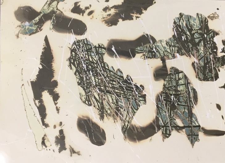
Abstract Experiment
For this task I first printed a picture that I thought would look particularly interesting, then printed this on to acetate and used it in the darkroom as a negative. I printed the picture onto a piece of light sensitive paper then developed, stopped and fixed it; the end result looked like this:
|
Black & White Inverted Image:
|
Original Image:
|

|
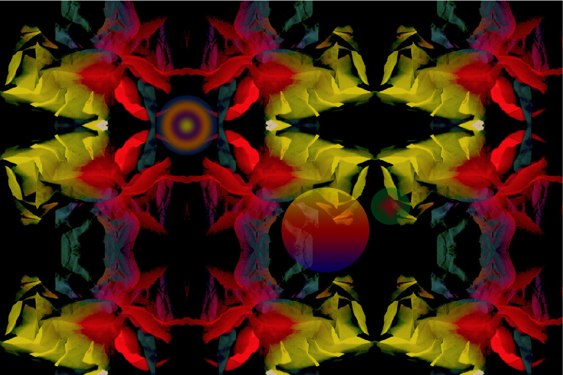
To make the photograph look more abstract, I then covered it with coloured acetate, experimenting with different colours and different layouts. I tried to photograph the image after doing this but it was too reflective so I scanned the images in.
Final Outcomes:
|
|
Another way that I physically edited images was by creating a chemigram. In order to do this, I used photographic paper, revealed it to light and then experimented using different materials trying to effect the photographic paper. I used moisturiser, honey, masking tape and also scratched the paper to achieve the final look that I wanted. I also put the photographic paper into the fix before developing it to give a more abstract look.
Chemigram Example:
After editing images physically, I tried editing a photograph that I took of the piece of paper as I think these photographs better suit the theme of abstraction and using abstract images will add to the effect of the final edited outcome. On the image shown below, I edited it using photoshop to manipulate its colours and make the photograph look more abstract.
Original Image:
Final Outcome:
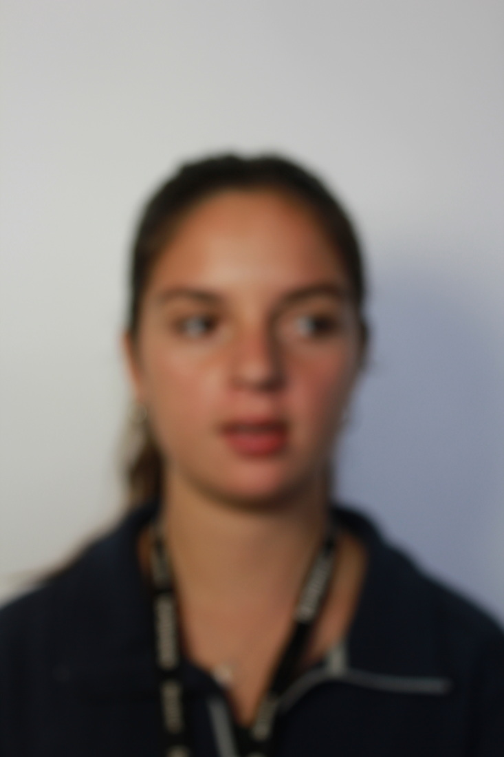
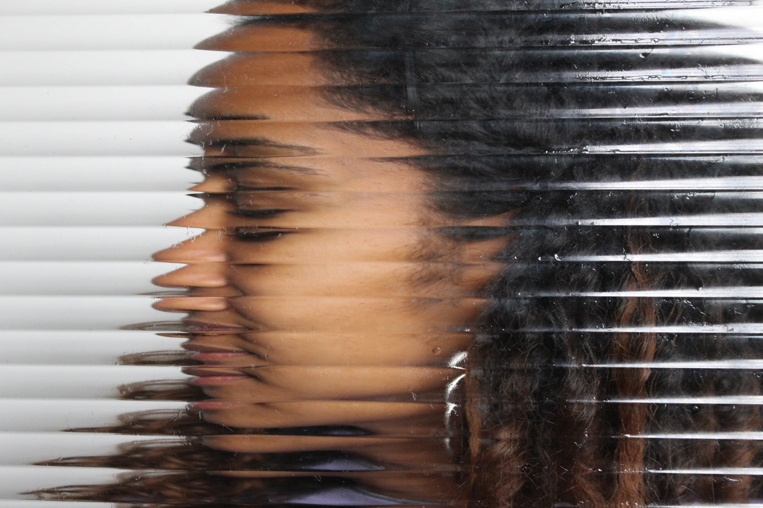
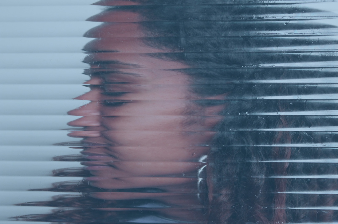
Studio Abstract Portrait
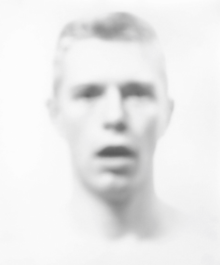
Bill Jacobson
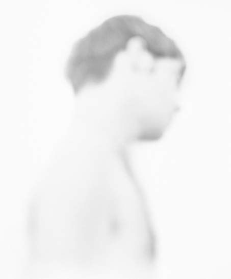
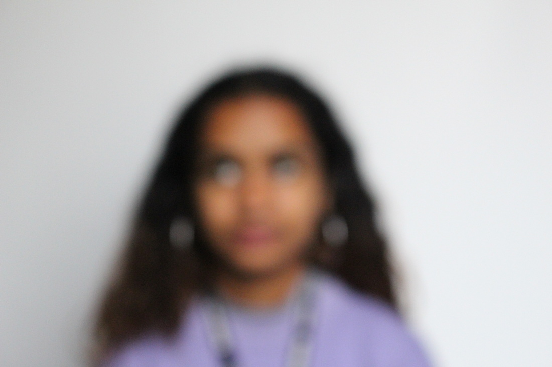
Bill Jacobson (b. 1955, Norwich, Connecticut) is widely known for his out of focus photographs of both the figure and the landscape. His work is in the collections of the Guggenheim Museum, the Metropolitan Museum, the Whitney Museum, the Victoria and Albert Museum, and many others. In 2012, he was the recipient of a fellowship from the John Simon Guggenheim Foundation. He began his signature, indistinct images in 1989, and has since been exhibiting in galleries and museums throughout the US and Europe. These early works, titled Interim Portraits, feature shadowy, pale figures that evoke the loss experienced by many during the height of the AIDS epidemic. The blurred subjects underline the futility of capturing a true human likeness in both portraiture and memory.
|
In this photograph, Jacobson creates a surreal, abstract type of image. He does this by blurring the subject, making their features look softer and less easy to see. This makes the photograph more interesting to the viewer as they can't completely tell what the subject looks like so there is a greater element of abstraction. Jacobson wanted us to consider a sense of futility in trying to capture a human likeness in memory or portraiture. These images also represent how Jacobson says he sees the world: as blurry, defocused, or perhaps diffused. Reducing the images down to areas of tone, colour or forms he achieves this conceptual, surreal effect that Jacobson portrays.
|
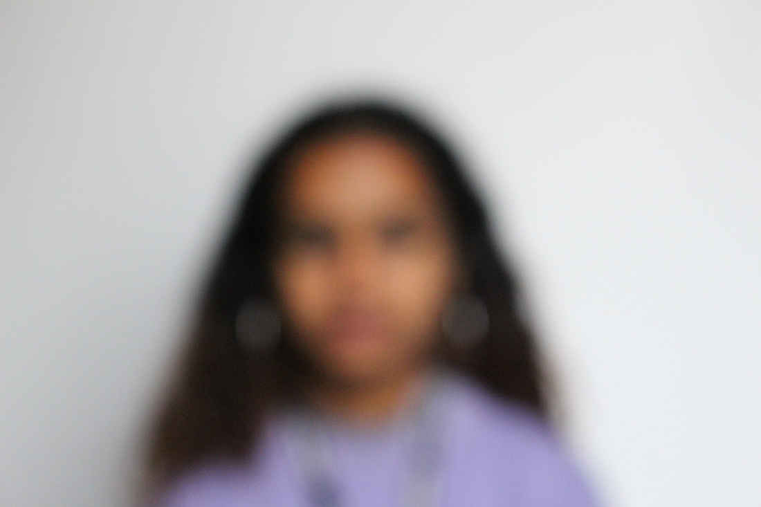
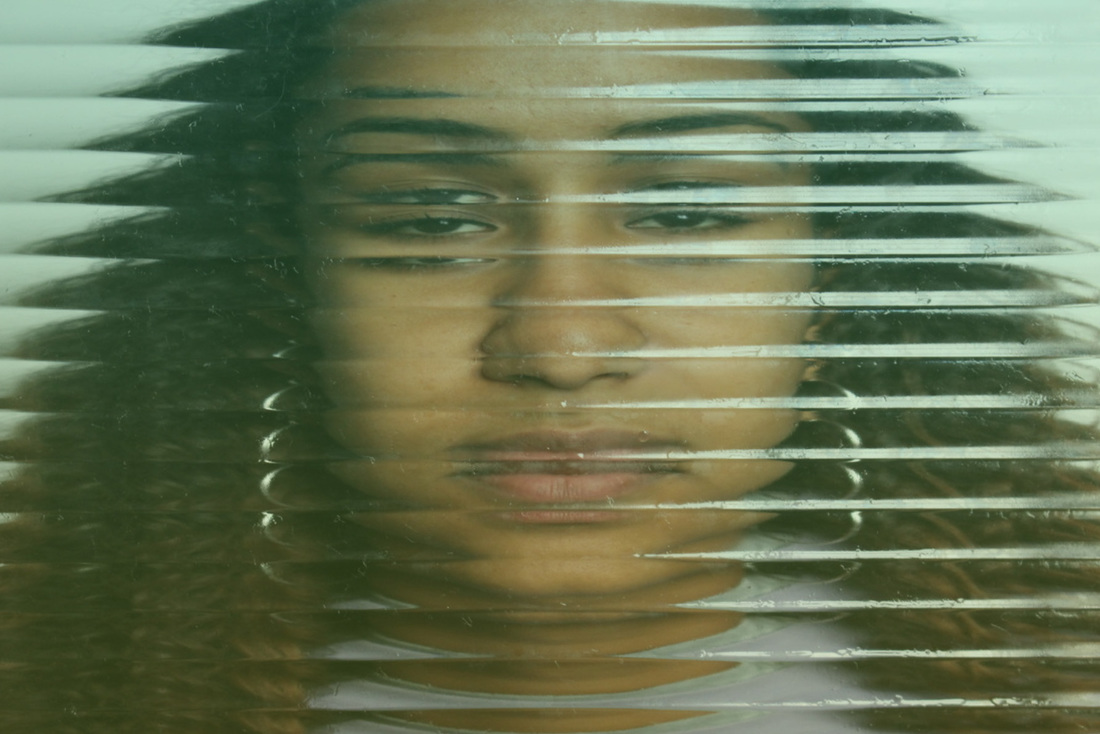
In this second image, the photographer uses different angles of the subject. The significance of the subject facing away from the photographer makes the subject seem more distant as opposed to looking directly at the viewer. Jacobson is considering preoccupation with loss and mortality in the early 1990's; themes closely tied to his observations of the AIDS epidemic. The hard to grasp faces receding into the white field of the photograph were inspired by the photographer's fascination for early twentieth-century photography and the blurred or obscured subjects of the medium's early pioneers.
|
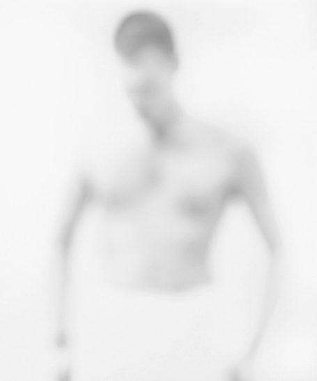
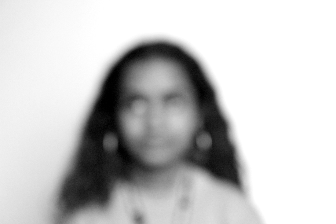
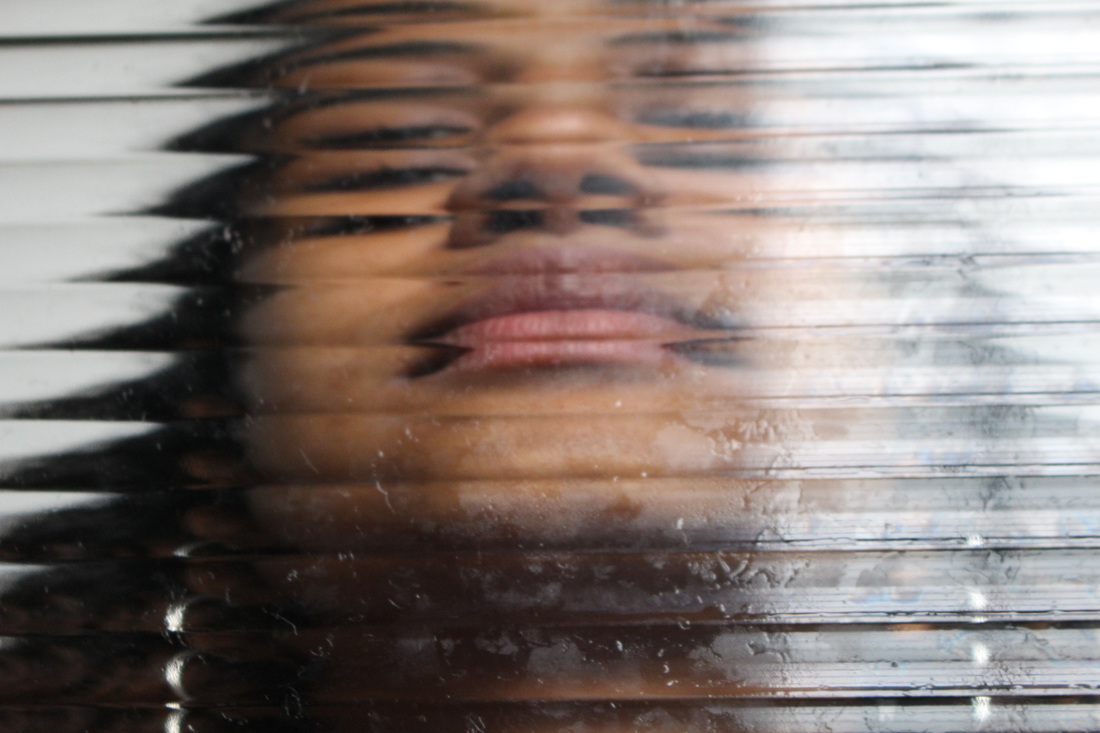
This photograph is more zoomed out than the previous two as the photographer has included the subject's body in the image. This image is also much blurrier, the details of the photograph are less visible giving the image a more abstract effect as the details are left more up to the imagination of the viewer. This allows the viewer to perceive the photograph in a more personal way, for example, Jacobson says that some view the subjects of this particular series as handsome men, while others have said it makes them think of sorrow and illness. These are both things that Jacobson was trying to portray in his photography, his work usually combines elements of beauty and melancholy.
|
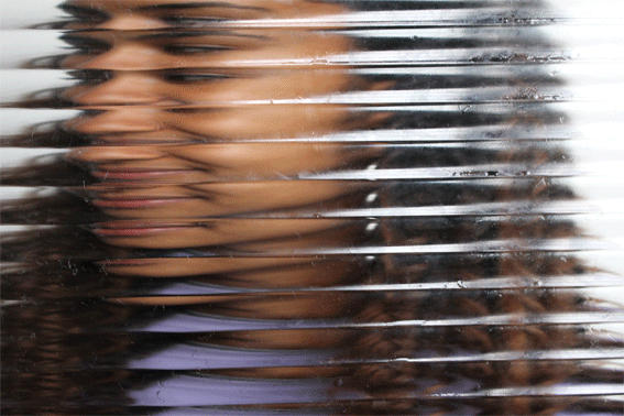
Response to Bill Jacobson


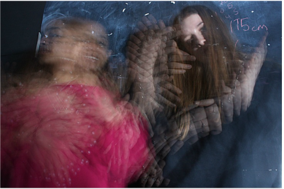
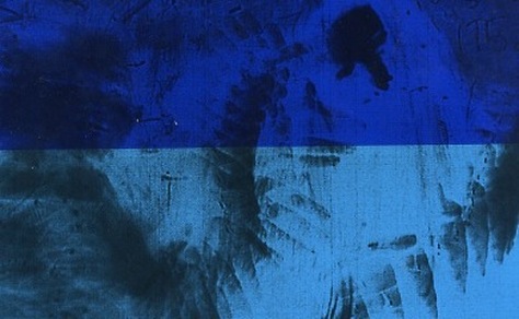
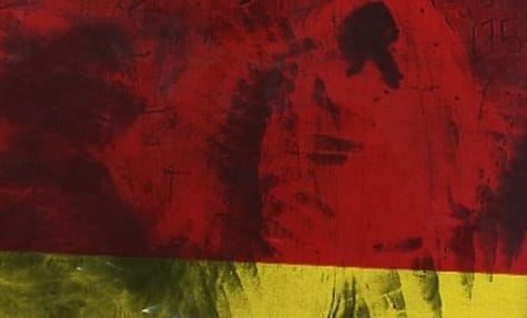
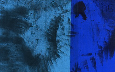
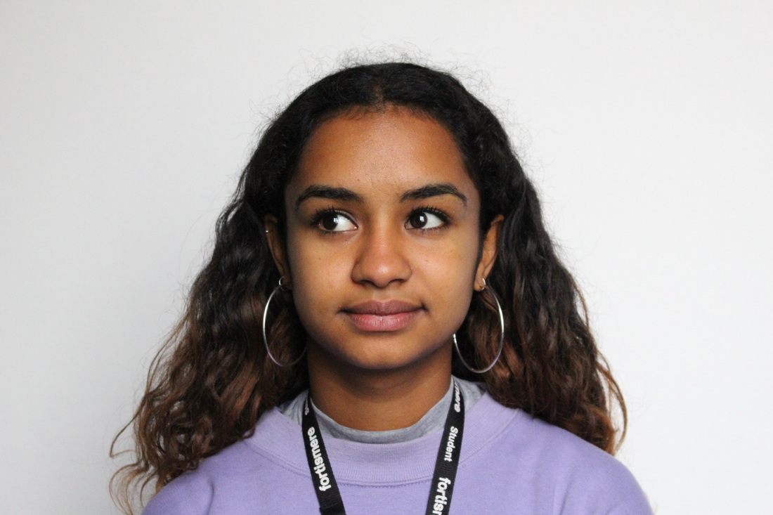
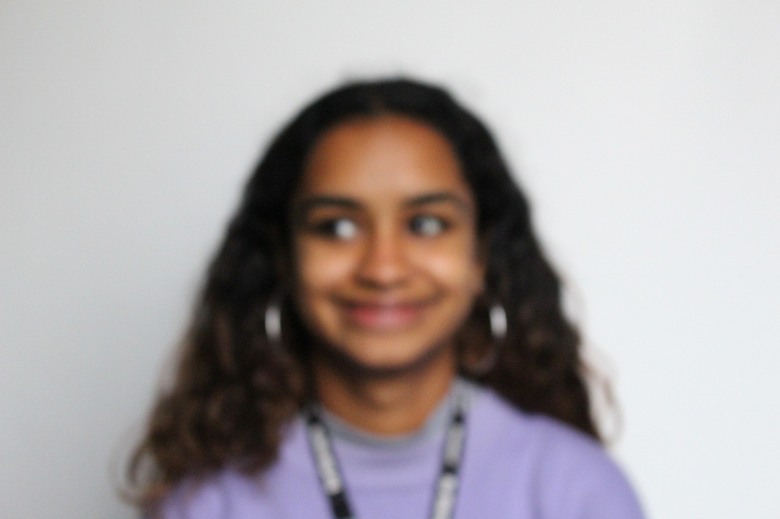
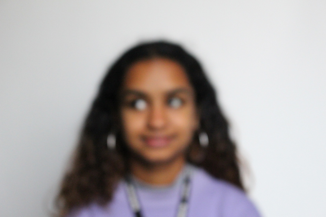
Experimenting with different levels of blur
|

|


|
|
Process:
|
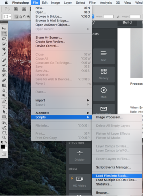
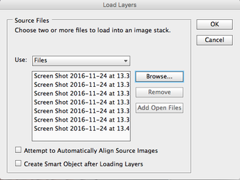
To make the gif I first opened Photoshop > File > Scripts > Load Files into Stack...

|
|

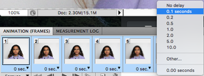
This then opened all the frames of the gif into layers, from here, I selected all the frames and clicked the small arrow in the corner to adjust the speed of the gif making it 0.1 seconds as opposed to no delay which I felt was too fast as it didn't properly show the different stages of blur between images...
|

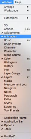
In the Animation window that I opened, I went to the small arrow in the corner allowing you to open more options, I then clicked Make Frames From Layers...
|

|
I then opened all the separate flies that I wanted to be in the gif...
|

|
In order for the gif to work on weebly I had to change the size of the gif, opening Image > Image Size...

|

Finally, I saved the gif to desktop and uploaded it as an image.
|

|
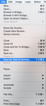
I then went to File > Save for Web & Devices so that the gif could work on the website...
|
I changed the height of the gif to 20 cm...
|
Erwin Blumenfeld
When Erwin Blumenfeld died in 1969 he left the disposal rights of his photographic archive to his assistant, Marina Schinz. At the time there was little interest in vintage prints and Marina chose to divide the prints into four parts, one for each of the three children and one for herself. Having four disparate stakeholders in Erwin Blumenfeld's legacy has caused a lot of confusion amongst curators, galleries, museums, collectors, editors and publishers. There has not been one guide to the Erwin Blumenfeld story, until now. Additionally, the Erwin Blumenfeld prints that have come to the surface until now has also not necessarily been Blumenfeld's finest work. Today, Erwin Blumenfeld's grandchildren, Paulette, Yorick, Nadia, Yvette, Remy and Jared are committed to leaving the past behind and working together to bring Blumenfeld's life and the vast body of his work to a wider audience.
|
|
"What [Erwin Blumenfeld] disliked the most was the people around telling him what to do. Fashion was full of horrible women, such as [Harper's Bazaar editor] Carmel Snow—he found them hard, cruel. But the person he had the most issues with was Alex Lieberman, who was the director of Vogue and later of the whole of Condé Nast. He once had a new idea for a Vogue cover, told Liebermann about it, and Liebermann ended up doing the same idea but with another photographer" - Interview with his son, Henri Blumenfeld
|

|
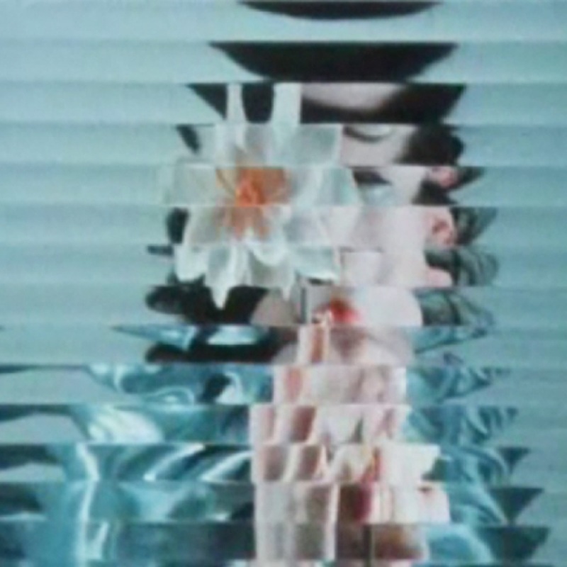
In this photograph, Blumenfeld uses cool tone colours. The cold, harsh colours throughout the photograph contrast with the black of the subject's hair making the photograph a lot more powerful. This also shows how Blumenfeld manipulates colours to create a certain feeling. He also uses colour in this photograph to make certain parts of the image stand out. For example, the subject is wearing red lipstick and Blumenfeld has framed the photograph so that the subject's lips are in the middle of the image. Furthermore, the distorted effect that Blumenfeld has used over the image to make horizontal sections of the photograph look split up, makes the photograph more abstract as it differentiates it from just a simple portrait photograph. The effect used makes it unclear for the viewer to be able to see what the subject looks like as her features cant be seen properly and aren't distinct.
|
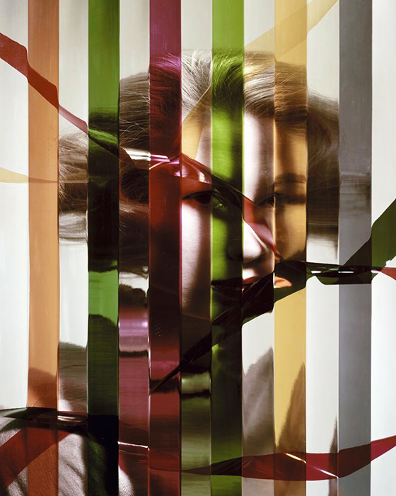
Blumenfeld manipulates use of colour here to give the photograph an even more abstract effect. The different colour, vertical sections of the image distort the subjects face behind. Different to the previous image from Blumenfeld, there are different coloured pieces of plastic thrown across the image, in front of the subject's face. These also cover certain features of the subject's face; the spaces of the image under the pieces of plastic and the vertical coloured lines are distorted in a way that leave the viewer to imagine what it really looks like without these distortions. Blumenfeld also uses shadows in this particular image to add depth to the photograph, giving it a more aesthetically pleasing look. The shadows in this image also cover sections of the subject's face, Blumenfeld has created these shadows in specific places of the image to add different levels to the picture.
|
In this final photograph, Blumenfeld portrays several conventions of abstraction. For example, the photograph embodies quite unusual colours; the subject's body appears black/dark red against a lighter red background with a blue half circle over top. The image is also quite blurred and out of focus making it harder to make out exactly what the photograph has been taken of. The shadows in this photograph emphasise the abstract element of the image as they make what would be defined lines look more blurred and diffused. Furthermore, the unfocused and slight grain of this photograph make it look more like a vintage print, as Blumenfeld was trying to achieve. This could also be seen as quite an unordinary method of photography as there was little interest in vintage prints at the time - making the photograph abstract in it's context as well as it's contents.
|
Response to Erwin Blumenfeld
Edits:
Documentary Abstraction
Saul Leiter
Saul Leiter was an American photographer and painter whos work in the 1940's and 50's was an important contribution to what came to be recognised as the New York school of photography. Leiter was given his first camera by his mother at the age of 12. At 23 he left theology school to move to New York and become an artist. He developed an interest in painting and was fortunate to meet the abstract expressionist painter Richard Pousette-Dart who encouraged Leiter to pursue photography. Leiter was soon taking black and white photographs with a 35mm Leica. In 1948, he started taking colour photographs and associated with contemporary photography. Leiter then worked as a fashion photographer for the next 20 years.
|
|
"Near the end of 'In No Great Hurry', a 2014 documentary about Saul Leiter, we see the 88-year-old photographer kicking back in his chair, illuminated by cool New York light. "I may be old fashioned", he says slowly. "But I believe there is such a thing as a search for beauty - a delight in the nice things in the world. And I don't think one should have to apologise for it."
Yet Leiter - who died in November 2013 - was a photographer of an early different order: an artist whose boundary-defying work segued effortlessly from street scenes to formal portraiture, from fashion to architecture, and which also embraced painting and sculpture. Elliptical, poet, beautifully crafted, Leiter's images are impossible to pin down." |
|
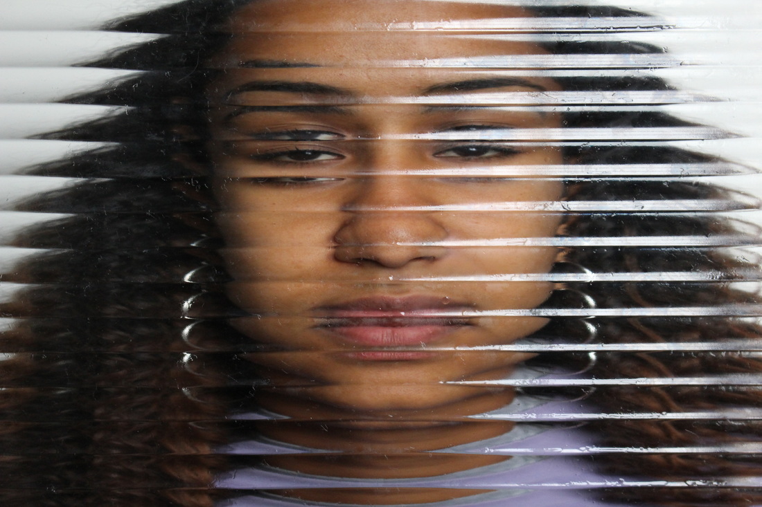
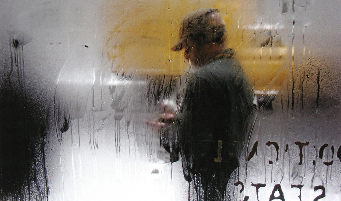
In this photograph by Leiter, the steamed glass used adds an element of abstract to the image. The subject of the photograph standing behind the glass appears slightly distorted and also blurred so there is little detail in the photograph. However in the right-hand corner, near the subject of the image, there is printed writing on the glass which is strongly in focus. This makes the photograph more interesting as it adds layers to the image. The first focused glass layer and the second abstract, blurred layer. Secondly, the use of colour in this photograph draws attention to the subject of the image but also gives the picture a greater element of 'beauty', like Leiter intended to display through his photographs.
|
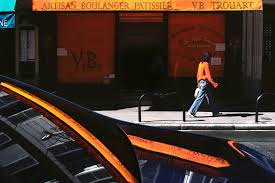
In this second image by Leiter, he uses to reflections to make the photograph more abstract. The reflection of the vibrant, orange sign on the black car also uses heavy contrast of colours and enhances the brightness of the orange colour. The colours used in this photograph are limited. Leiter mainly highlights the oranges and blacks in the image. His use of the colours within his images represent his love for painting as he clearly takes much thought into the colours that he exaggerates within his images. This makes Leiter images unique. Furthermore, this image is interesting as it displays the perfect moment in which a woman with black hair and an orange top walked in front of the black and orange shop. This emphasises Leiter taking delight in the nice things in the world and capturing them for other people to enjoy.
|
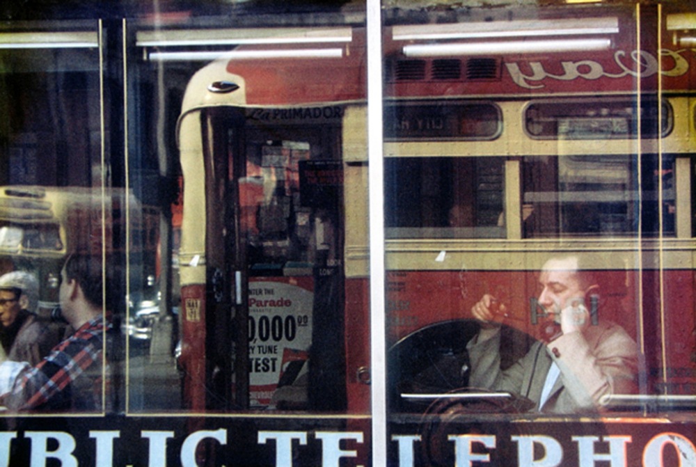
This final photograph is different to the previous two as it uses quite dull, cool colours instead of bright, vibrant ones. The use of reflection in this photograph makes the contents of the image much busier, which also shows a difference to the previous two images as they are both quite simple and don't have much going on within them. This image is interesting as the only thing other than the reflection that can be seen is the people sitting down. The abstract element of the picture is emphasised by the people that can be seen as it isn't entirely clear what the people are doing there or what the building attached to the window actually is. There is also a slight element of symmetry used in this image as the lights from inside the window are shot directly inside the line sections on the window.
|
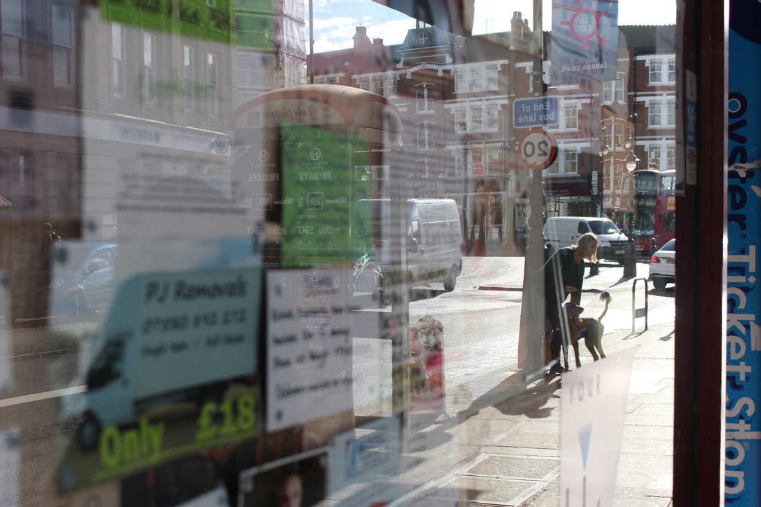
My Response
For my response to Saul Leiter, I tried to capture images using reflections on windows of shops, but also still show the interior of the shop. I also experimented taking photographs through car windows, trying to get reflections and use the rain drops on the glass to add an abstract feeling to the images. Below are enlarged versions of the images that I thought worked best with the task and contact sheets of all the images I took.
|
|
|
|
First Strand
Aaron Siskind
Aaron Siskind was an American photographer born in 1903. Siskind is widely considered to be part of the abstract expressionist movement. In his biography, Siskind wrote that his interest in photography sparked when he received a camera for a wedding gift and started taking pictures on his honeymoon. Siskind focuses on the details of nature and architecture. He presents them as flat surfaces to create a new image out of them, which, he claimed, stands independent of the original subject. His work has often been described as crossing the line between photography and painting. Siskind was an active member of the New York Photo League. Working with that group he produced several significant socially conscious series of images in the 1930's. Among them, the 'Harlem Document' remains the most famous.
|
|
"Siskind's photographs forswear any hint of pictorial depth. They seem as flat as any abstract painter's canvas, and they ask to be taken on much the same terms as paintings. Siskind, who is still photographing at the age of 86, has written, ''When I make a photograph, I want it to be an altogether new object, complete and self-contained,'' And most of his work since the 40's lives up to this credo. But in 1940, when he began to spend summers in Martha's Vineyard, the social world drained from his work. Starting with such recognizable images as ''Gloved Hand'' of 1944, Siskind pared away the backgrounds from his pictures, concentrating more and more on subject matter that was already flat and in some cases unrecognizable.These essentially two-dimensional pictures show us photography at its most abstract and otherworldly. Their visual impact is elegant and bracing."
|


|
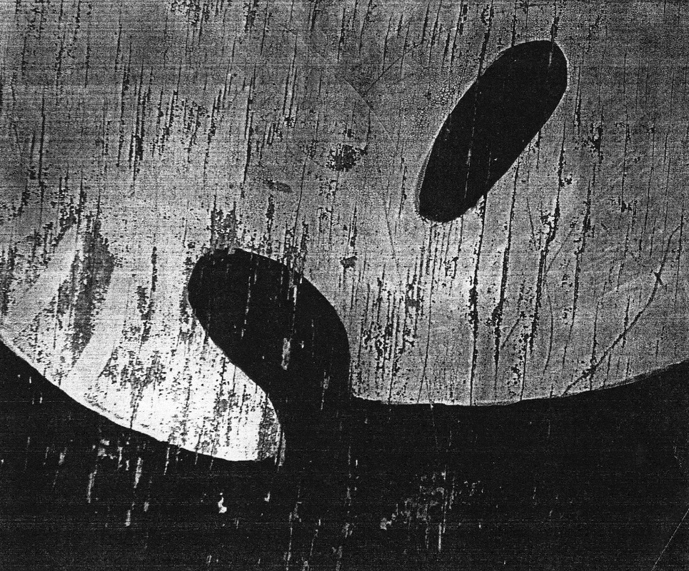
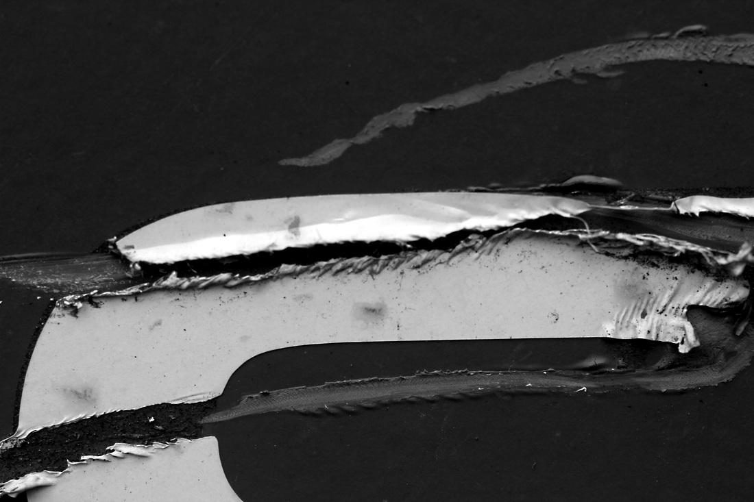
In this first photograph, Siskind portrays a flat image with no shadows and no captured moments of light. This emphasises a two-dimensional feeling that so many of Siskind's photographs embody, being the reason why many compare his photographs to paintings. The effect of Siskind not using any form of shadow in his images and making them look extremely flat and almost painting-like, further highlight how Siskind used the theme of abstraction throughout his work. In this particular photograph, Siskind shows nature as the image is a close up of bark peeling off of a tree. This is not entirely obvious at first, further emphasising the abstract element of the photograph and also leaving the subject of the photograph up for contemplation.
|
in this second photograph by Siskind, the abstract shapes within the image add to the two dimensional, painterly style effect that so many of Siskind's photographs embody. In this image, the subject of the photograph is really left up to the imagination of the viewer. The fact that Siskind has made these images black and white also adds more mystery to what the subject of the images may be, since, if they were in colour it would be more obvious. The black and white effect also adds a lot of contrast to all the images, making them more dramatic. In this particular photograph by Siskind, he has truly managed to create an altogether new object by framing the photograph and zooming in and also portraying his signature two dimensional look.
|
Finally, this photograph is different to the previous two as it has much more texture to it and the contents of the image are more crowded and busy. This photograph in particular is interesting because of the textures that can be seen within it, but still somehow the surfaces look flat and the photograph does almost appear like a painting. Furthermore, the subject of this photograph is quite unclear and strange looking adding further to the abstract theme of the photograph. This also makes the photograph look more like a painting as opposed to something actually taken from real life as it is hard to image what this object actually is. This image also has high contrast within it, further highlighting the rough texture of the object.
|
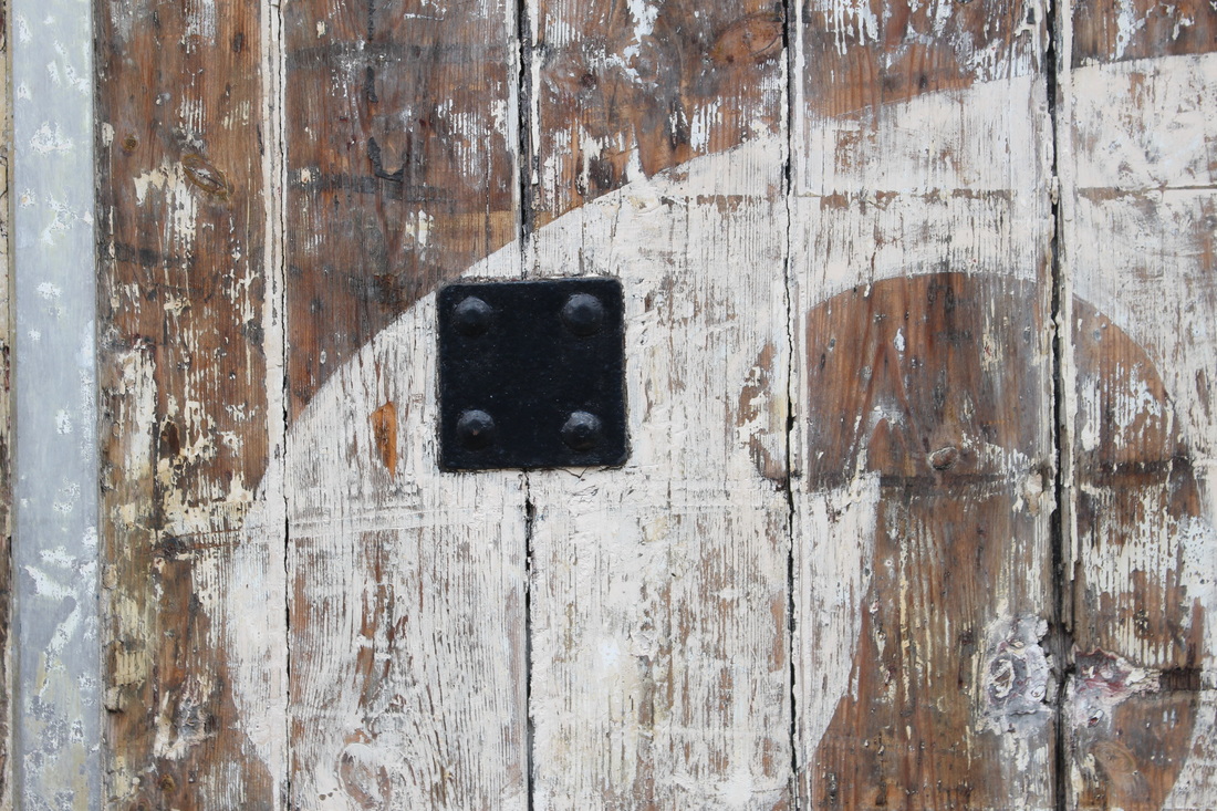
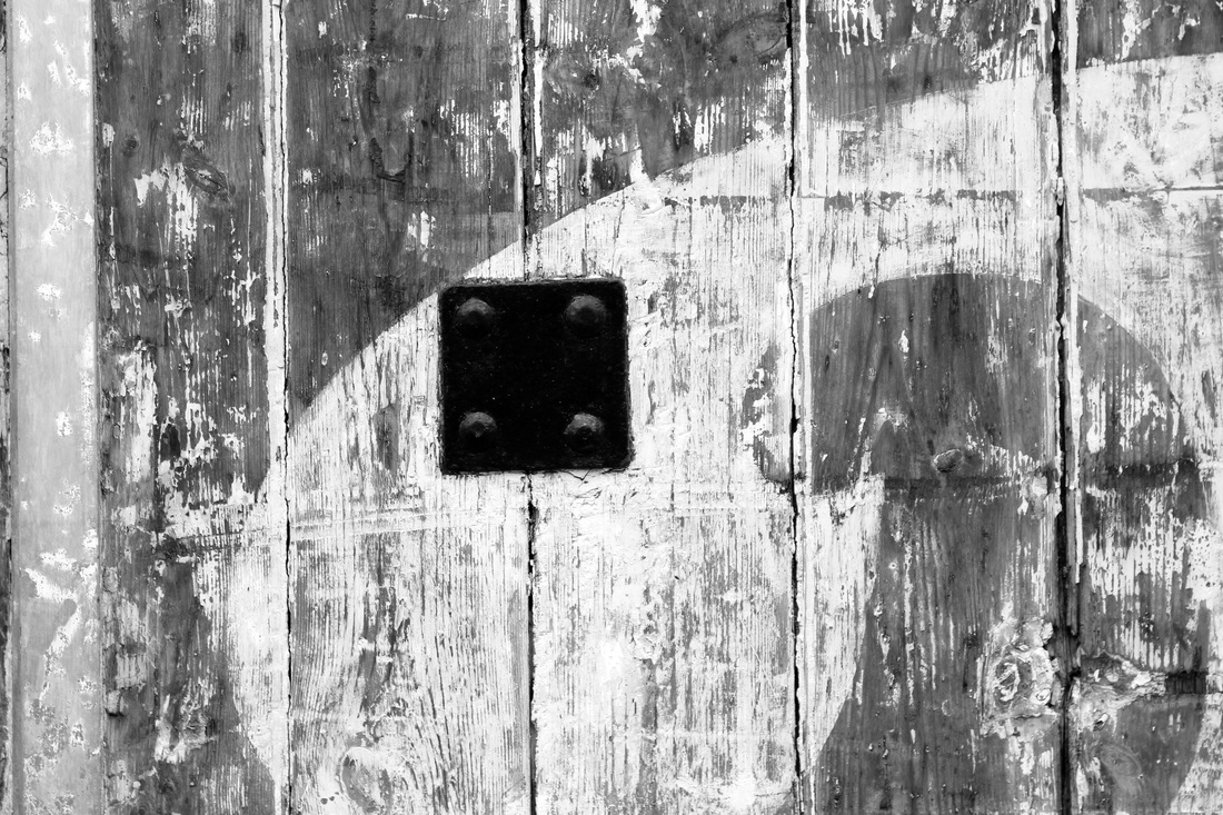
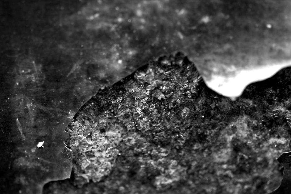
First Response
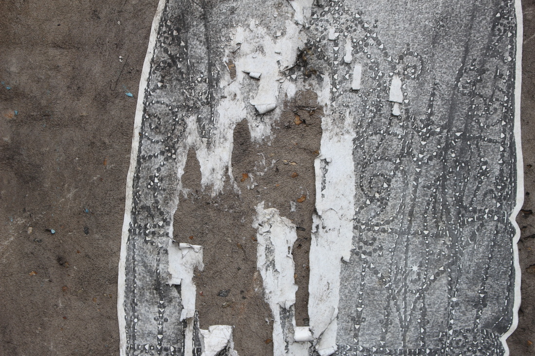
For my response to Aaron Siskind, I tried to capture close up images of small details on walls and floors, or other places that were quite dark and dirty. The main things I tried to look for was chipped paint and decaying walls. I also tried framing the photograph to make it appear more abstract and make it harder to tell what the actual subject of the image is. Below are the images that I think worked best, I then edited these making them black and white and changing the levels of the photograph.
Edits:
|
|
|
|
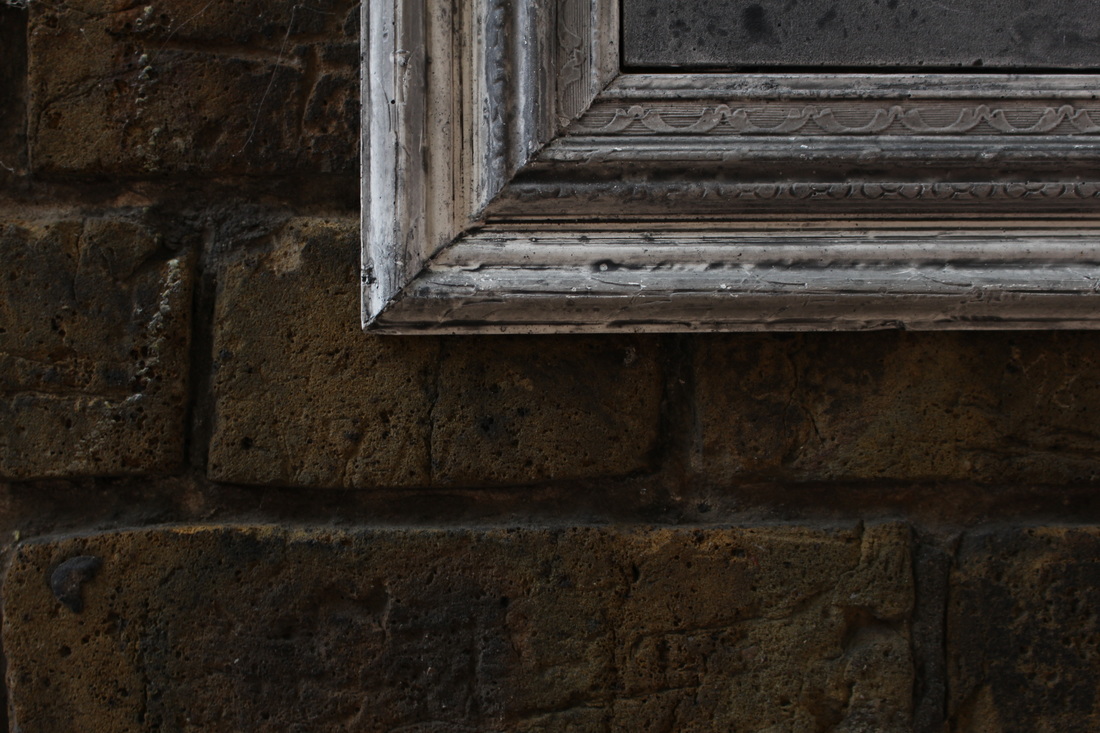
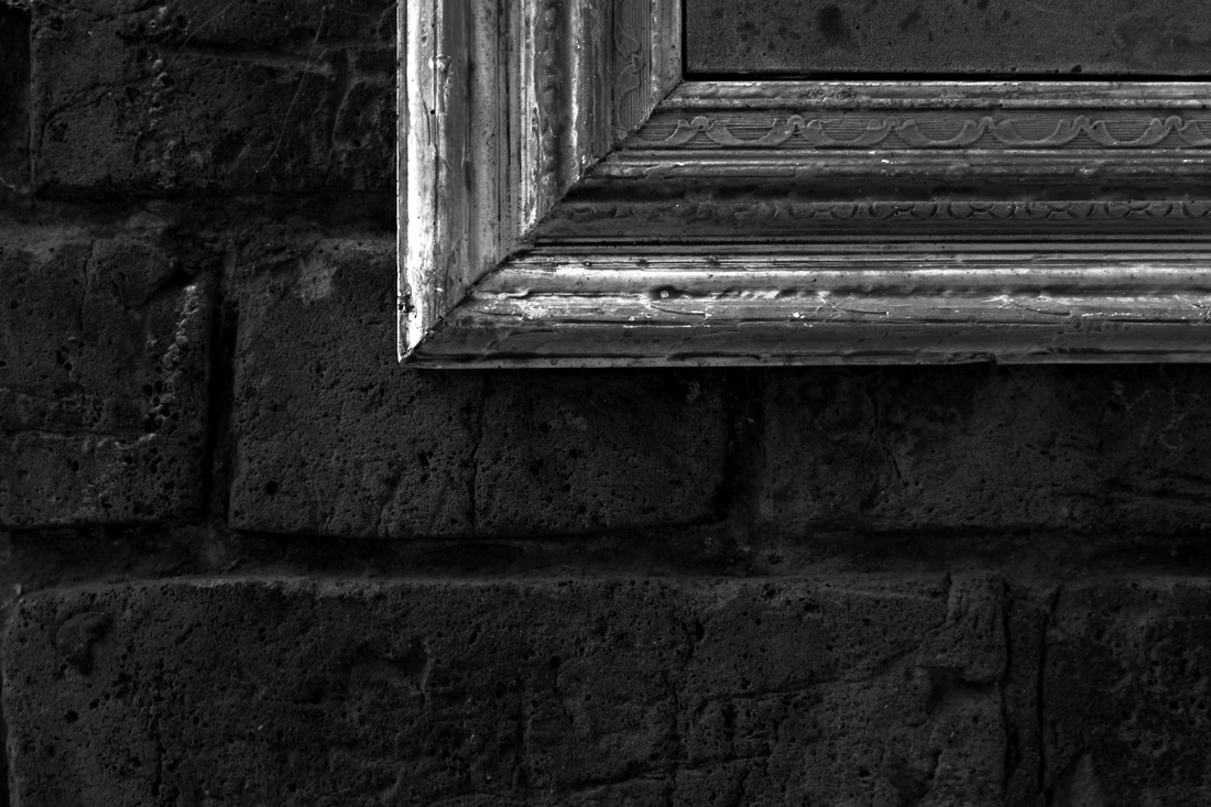
Second Response
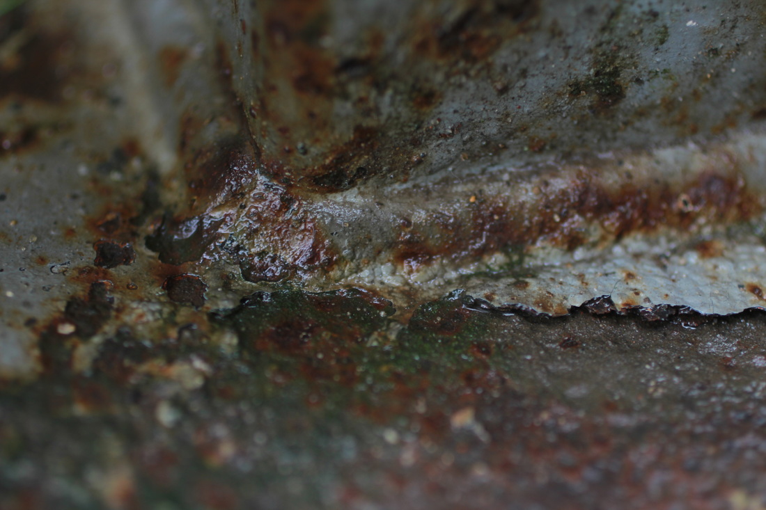
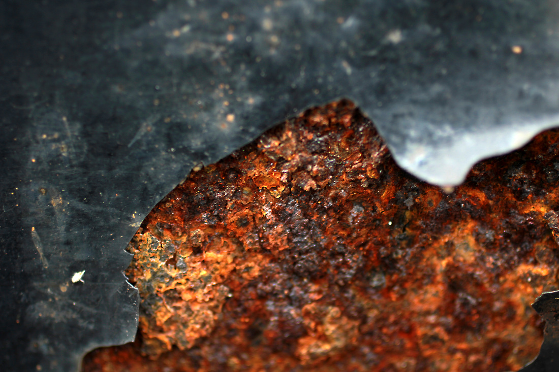
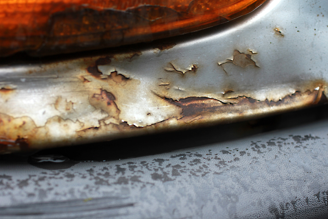
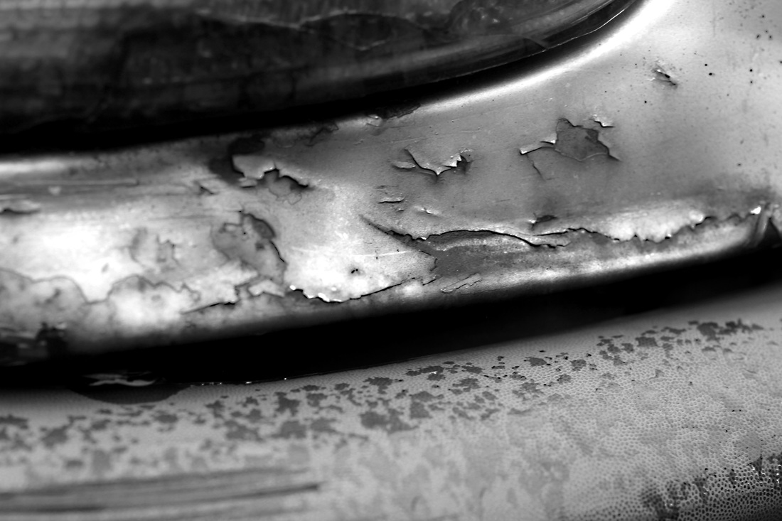
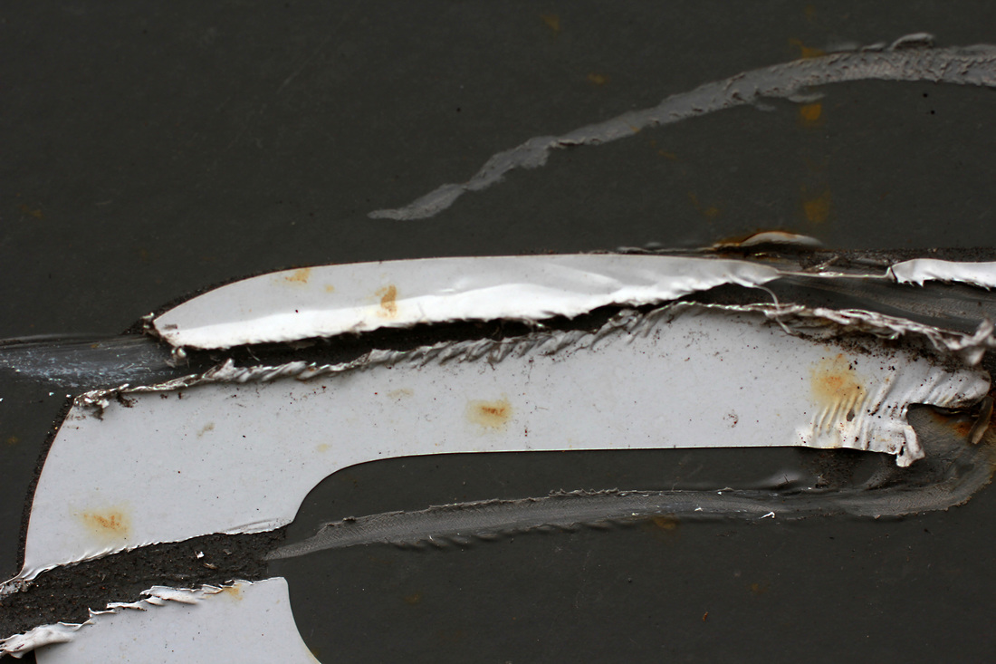
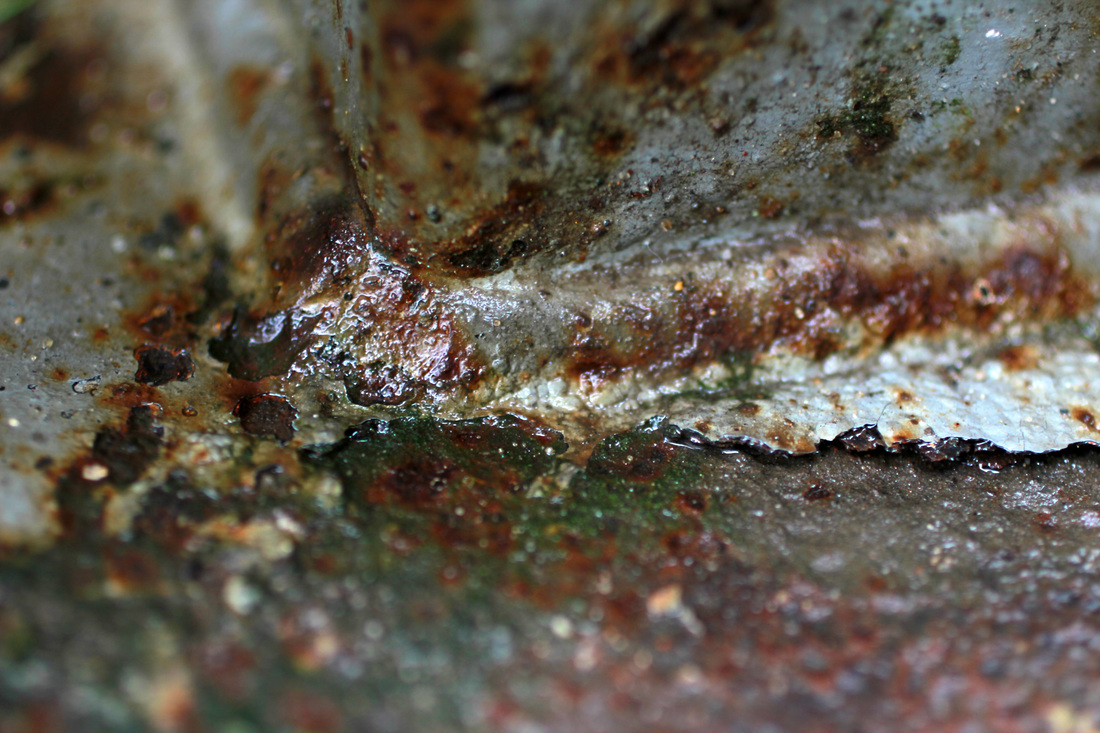
For my second response to this strand I took similar photographs of rust and peeling paint, but I took them more up close to get a greater level of detail. I also tried to get the subject of the image to be as focused as possible which was quite hard to do using a macro lens. Below are all the photographs that I took and the ones that I thought worked best enlarged, also the edited versions of these pictures.

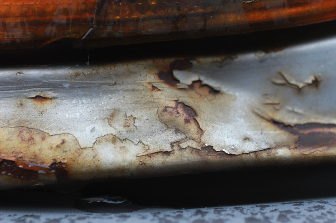

|
|
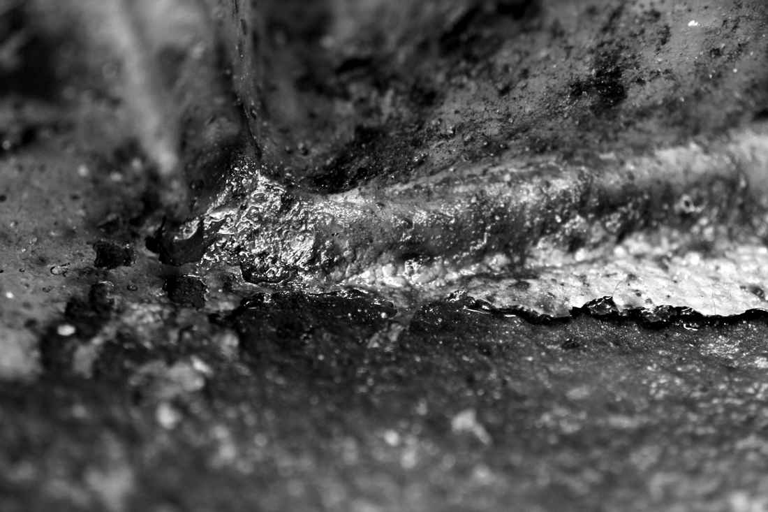
Edits:
|
|
|
|
Process:
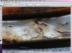
|
To achieve the effect I wanted with these images, I first opened the photograph in Photoshop...

|
|
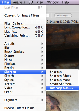
I then went to Filter > Sharpen > Unsharp Mask...

|

|
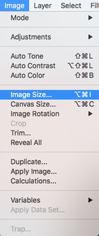
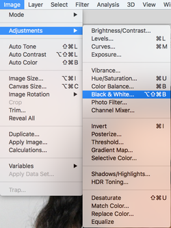
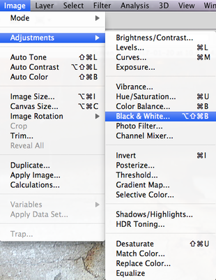
I then went to Image > Adjustments > Black & White...

|
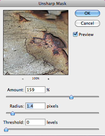
In this window I then adjusted the amount and radius of the mask in order to make the details of the image more defined...
|
|
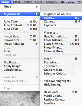
In order to make the black and white image have the right level of contrast and look the way I want it to, I went to Image > Adjustments > Levels...
|

|
In levels, I adjusted the levels so that the arrows met where the black levels start and end...
|

Finally I saved the final edited image.
|
Second Strand
Uta Barth
Uta Barth is a contemporary photographer who lives and works in Los Angeles, California. Barth received a bachelor of arts degree from the University of California, Davis and a Master of Fine Arts from the University of California, Los Angeles. From 1990 to 2008 she was a professor in the Art Department of the University of California, Riverside, where she currently is a professor of art emeritus. After receiving the MacArthu Fellowship in October 2012, she noted that she still plans to teach on a part-time basis because teaching forces her to "put language to" what she is thinking.
"We asked Uta Barth, an artist that has focused on what we experience in the periphery, moments that pass without particular attention, to comment on the role of rhythm in her photographs. Her work, and how she presents the photographs, reference the subtle unperceived rhythms that live in the subconscious." - Laura Henken
"We asked Uta Barth, an artist that has focused on what we experience in the periphery, moments that pass without particular attention, to comment on the role of rhythm in her photographs. Her work, and how she presents the photographs, reference the subtle unperceived rhythms that live in the subconscious." - Laura Henken
|
|
"For seventeen years I have made work that consists of sequences in order to talk about the passage of time while looking at things that don't change much at all. The strategy is about duration, and about vision for vision's sake. Nothing much changes in these sequences except maybe the light or a slight turn of the camera in order to follow it.
I want to slow the viewer down. I want a slow rhythm from image to image and from work to work when the pieces are installed for exhibition. Slowing down the viewer is hard at a time when people race through exhibitions. But I watch people in my shows, watch many of them move slowly, return to the beginning of a sequence, circle the room once again. Viewers who are not art writers talk about my work as being quiet, being slow and being calm. I think that is only one aspect of the work, but I always find myself smiling when I hear it." |

|
This photograph is interesting because of the level of blur used by Barth. The subject of the image is clearly a building, however the blur used on this particular image makes it unclear what is the background of the image and around the subject. This adds to the element of abstraction as it leaves part of the photograph up to the imagination of the viewer. Furthermore, the colours used in this image are quite cool toned and simple. This gives the photograph subtle, clean look and doesn't distract much from the subject of the image. The contrast of the small, black window against the bleak white of the building is dramatic and also makes the photograph look cleaner and sharper, even though the entire image is blurred. The movement between photographs here allows the viewer to see more of the scene and also make more sense out of the blurred image.
|
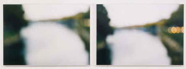
In this second image, the colours within the photograph are more vibrant and obvious. For example, the green tones within this photograph are prominent and give the photograph are more naturalistic feeling. In this image, it is clear that the subject is a body of water with trees and plants surrounding either side. However, the blurred lights on the side of the image add mystery to the photograph as it is not clear what these lights are, Barth allows the viewer to infer what the lights around the subject could be. Furthermore, the way that Barth has laid out the two photographs side by side gives them both a feeling of movement. In the first photograph, more of the left side of the scene is shown, whereas in the second more of the right side is shown.
|
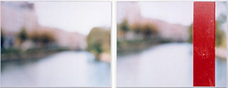
This final image from Barth is different to the previous two as it has a much more obvious use of vibrant colour. Throughout most of the photographs, the colours are quite simple and cool toned; similar to the the previous two images. However, in the second photograph within this image, the camera appears not to have moved, but Barth has placed a bright, vibrant red pole in the right side of the image. This makes the photograph much more abstract as it leaves more questions behind the image. It is unclear what the red bar in the image is, it also appears out of place as it is the only thing in the photograph that is in focus. This is interesting as it is the part of the photograph that isn't clear, whereas the blurred parts of the image can still be seen as specific scenery.
|
First response
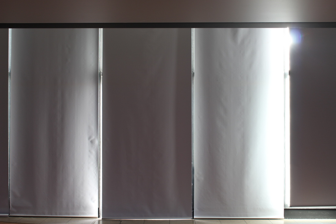
For my response to Uta Barth, I tried to capture blurred images of colours that I thought would make the final image more interesting. For every photograph that I thought worked well, I experimented with different levels of blur, different angles and different perspective. I did this so that when it came to editing them I could line two similar photographs next to each other using photoshop, similar to the way that Barth presents her photographs. Below are all the images I took in contact sheets and the three best, edited images that I took.
|
|
third Strand
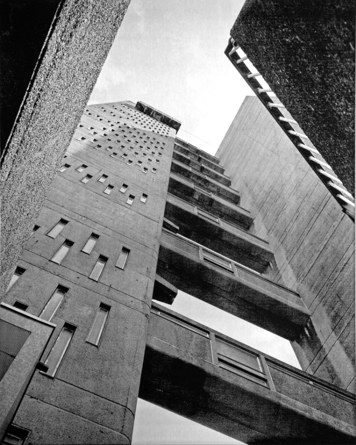
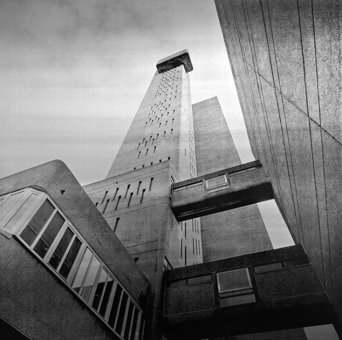
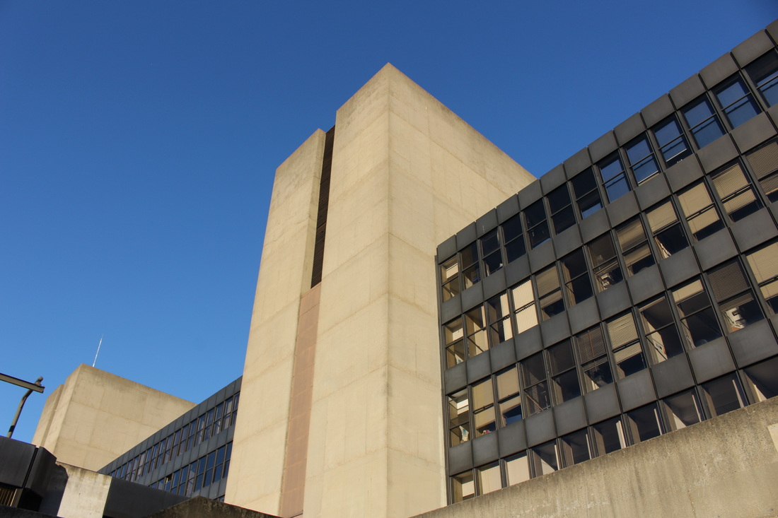
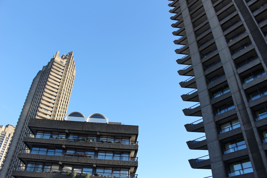
Simon Phipps - Beton Brut
Simon Phipps is a London based artist whose work focuses Modernist and Brutalist architecture. Phipps is the photographer for "The Brutalist London Map" published by Blue Crow media and supported by the twentieth century society. His book, "Brutal London", is a photographic survey of Brutalist architecture in inner city London, published by September Books, it will be released in November 2016. Phipps is also working with Darren Umney on a project about Netherfield: "Between The Rational and The National: Netherfield in The New Suburban Landscape" will be shown at the Architectural Association and the Milton Keynes gallery in 2017.
|
|
|
|
|
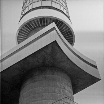
Simon Phipps has spent the last 15 years photographing and documenting Brutalist and buildings in the UK, creating a survey of photographic images that demonstrate the breadth of his contentious architectural style. Beton Brut showcases a new series in architectural photographs screen printed in monochrome onto airbrushed aluminium. Phipps' careful selection of materials for his work captures one of the properties of Brutalism, 'it's not concerned with the material, but the quality of material, what can that material do?' The use of halftone screen and the aluminium moves the photograph away from the representational; it becomes more sculptural within the enhanced materiality of surface and ink. His photography plays with the viewer's perspective of the buildings; he has an innovative way of looking at these dynamic constructions finding interesting new vistas and perspectives to capture our imagination. A selection of Phipps extensive photographic inventory is also displayed in Beton Brut where the curatorial arrangements highlight typological similarities and differences, revealing an analysis of form and structure. Using the placement of colour to highlight architectural details; stemming from Le Corbusier's Polychromie Architectural, Phipps has used colours from the buildings he has resolutely documented and faithfully used these colours as an integral part of the exhibition in The Foundry Gallery. Benton Brut is curated by Elizabeth Goode.
My Response
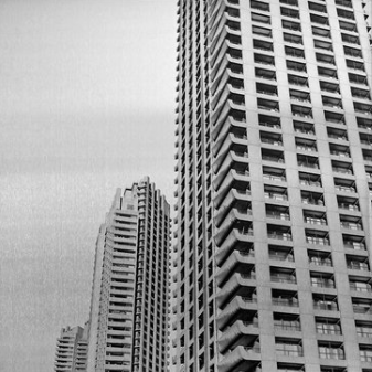
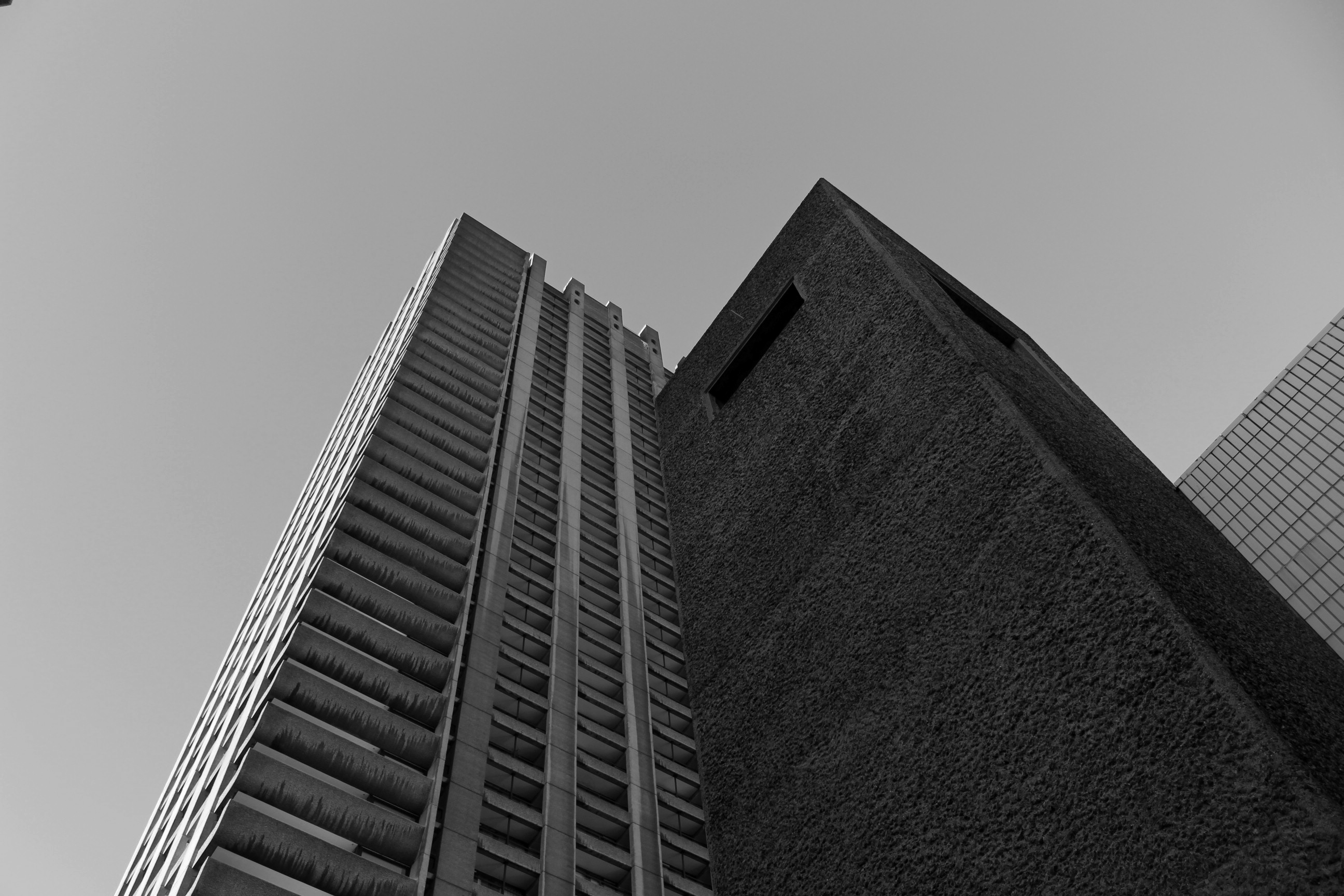
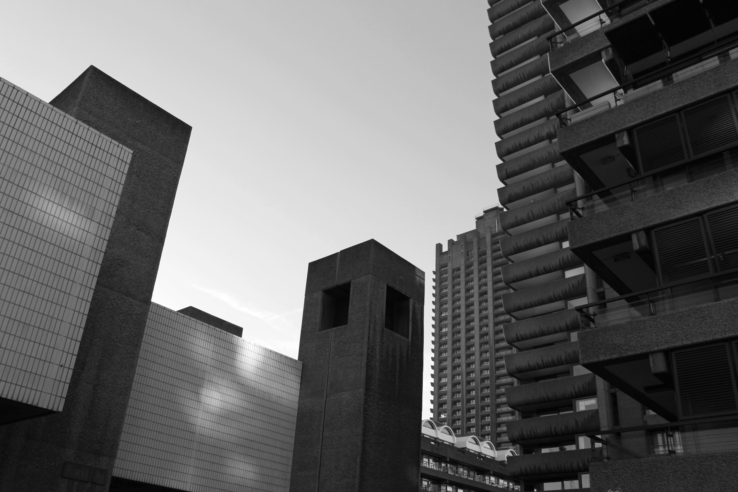
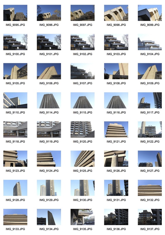
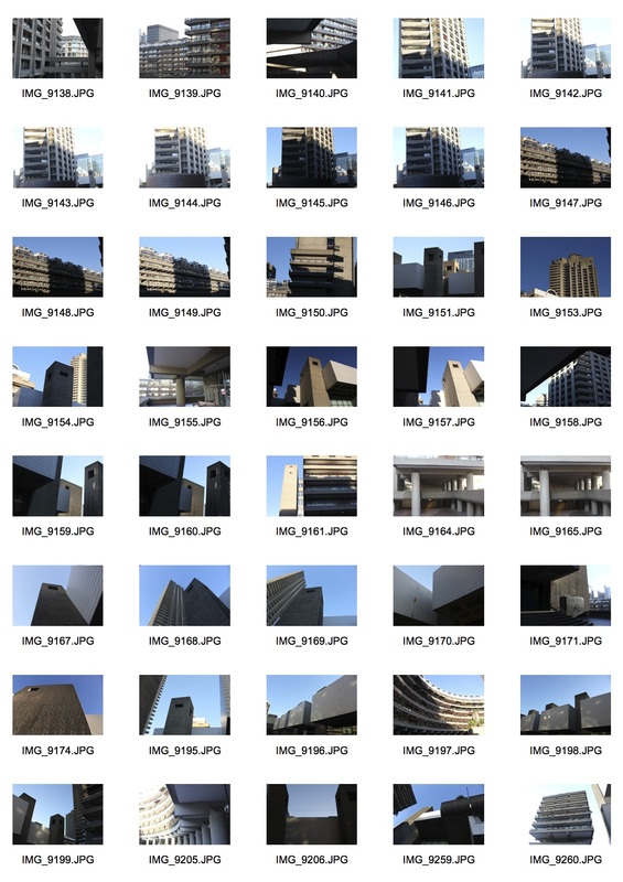
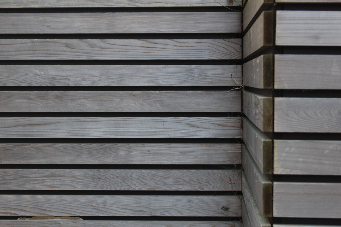
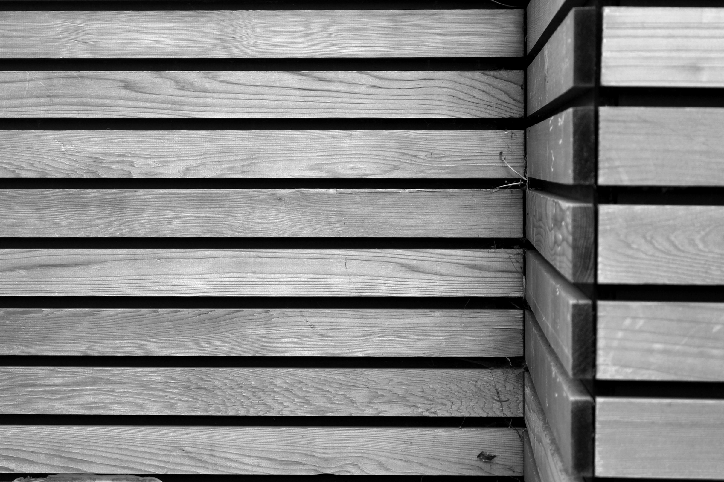
For my response to Simon Phipps, I took several pictures of Brutalist architecture around London. I tried to make the buildings look imposing and dramatic to replicate the images of Phipps. I think that the photographs I captured work well, however I think that the light in some of them ruin the flatness of the image. Phipps' photographs all embody a flatness that I don't think I managed to capture as well as I should of. When editing the photographs I tried to make them look as grey as possible to resemble concrete.
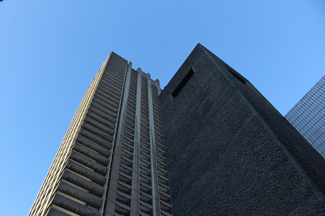
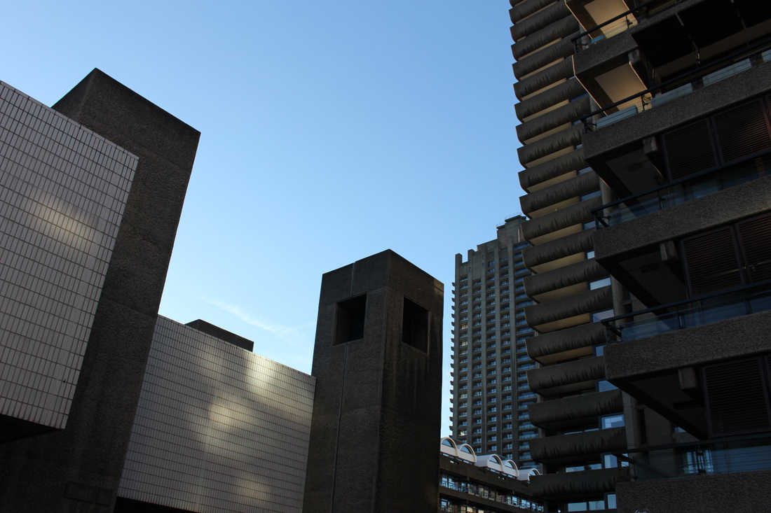
Edits:
|
|
Development

Lewis Baltz
Lewis Baltz is one of the most prominent representatives of the New Topographics movement, which was seminal to the development of conceptual photography. Baltz's photo series document the side effects of industrial civilization on the landscape, focusing on places that lie outside the bounds of canonical reception: urban wastelands, abandoned industrial sites, warehouses. His photographs uncover the correspondences between spatial forms that occur in the everyday world and advanced forms found in art. Baltz manages in his work to extend the notion of the documentary; he "emphasizes the paradoxical position of photography within the art history of its time" (Sheryl Conkelton). Baltz's minimalist and reduced image compositions explore the photographic style as a process, and refer not only to the art of photographers like Lee Friedlander or Robert Frank but also to painters and sculptors of his day such as Donald Judd, Frank Stella, Jasper Johns or Sol LeWitt. Convergences are to be found in his formal and aesthetic compositional patterns as well as in the content he fixes on, which Baltz subjects to a highly critical analysis, without however losing sight of essentials. The focus is on universal aspects instead of particularities, as expressed above all in his "Prototype Works".
|
|
"My work on public projects is site-determined. The place, its history, its particularities dictate the work that I make and the way in which I choose to have it enter the public arena. As a polemical tactic I brought the idea of warfare to the very peaceful city of Groningen, a radical antidote to the famous repressive tolerance of Dutch political discourse. I did this not to seriously propose that the Dutch revert to Hobbesian savagery, but to point out as strongly as possible the failure of Dutch political practice to harness the terrible commercial energies that in fact will decide Holland’s future. The development and filling-in of space in the Randstad region has raged out of all planning control in the last decade, and the historic restraints that the Dutch imposed upon themselves no longer seem to be in force. Holland is a very rich country; it has always been a very rich country. Historically the Calvinistic Dutch have always had, and have benefited from, a discordant relationship with their own wealth. Dutch democracy is many respects a model for the world. Capitalism moves faster. Issues that would have been the subject of protracted public debate as recently as thirty years ago are now presented as faits accomplis long before any questions can reach the table." - Lewis Baltz
|
|
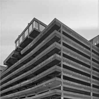
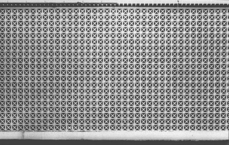
In this first photograph by Baltz, the scene that the picture has been taken in is unclear. Although the contents of the image is perfectly symmetrical and aligned, the viewer can not distinguish exactly where the photograph has been taken. This gives the photograph an element of abstraction and mystery allowing the viewer to imagine where the image has been taken. Furthermore, the repeated pattern made by the tiles makes the photograph appear much more busy than it really is. In this image, the only thing within it is a wall, but by capturing such a repetitive pattern Baltz manages to create the illusion that the contents of the image are really crowded and busy. This further adds to the abstract element of the photograph.
|
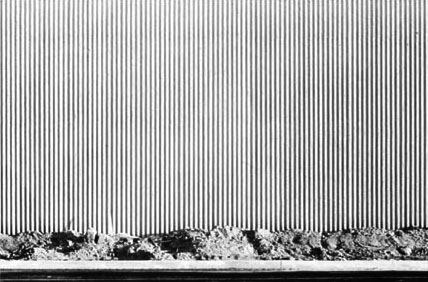
In this second image, there is more within the photograph than the previous. There is also more of an abstract feeling to this picture as the subject is unclear. The perfectly straight, vertical lines all along the background of the image make the objects on the bottom of the photograph look more out of place and odd. The shapes of the objects along the bottom of the image are irregular and not perfectly symmetrical. This highly contrasts with the lines along the background of the image, further emphasising the abstraction within the photograph. Something that Baltz often shows in his images is a thin strip of the floor underneath the subject of the image. This adds to the symmetrical element, emphasising the neatness of his images.
|
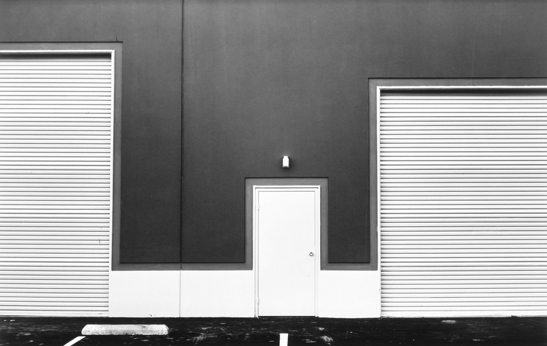
This final photograph doesn't portray as much abstraction as the previous two because it is obvious to the viewer what the subject of the image is. This photograph is interesting, however, as it uses heavy contrast of white and black. This effect makes the image seem much more sharp and clean cut, this is also enhanced by the perfect symmetry used by Baltz here. The black and white contrast along side the symmetry creates an aesthetically pleasing image as the contents within the photograph are so neat. This also shows the work that Baltz puts into his images when setting them up, taking time to make them look completely perfect before taking them and editing them after to make them look more dramatic and contrasting.
|
First Response
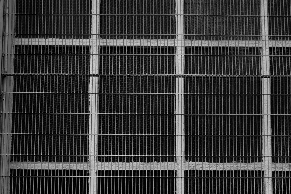
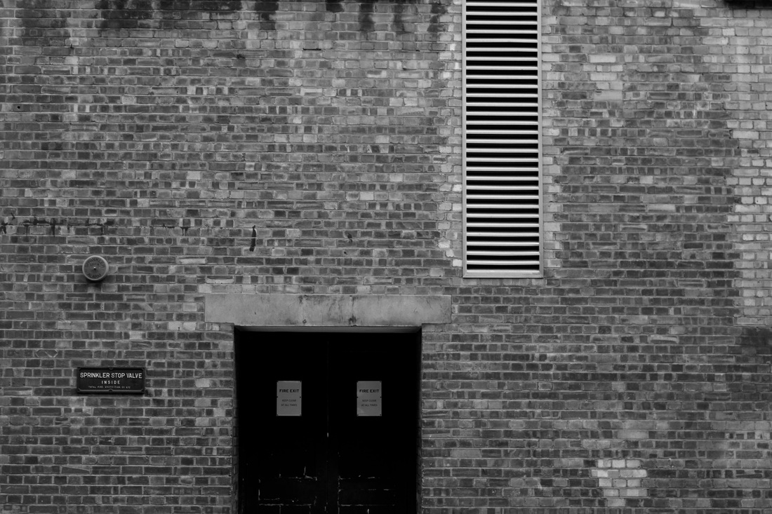
For my response to Lewis Baltz I tried to capture symmetry using windows, doors and close ups of symmetrical architecture. I then edited the photographs I took, straightening them to make them look more symmetrical and clean and making them black and white. I then changed the levels of the picture to get a good amount of contrast and make the black and white images look more interesting and similar to Lewis Baltz's. Below are the three images I thought worked best, their edits and a contact sheet of all the pictures I took.
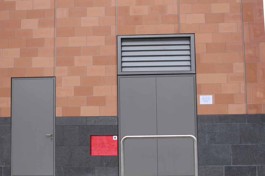
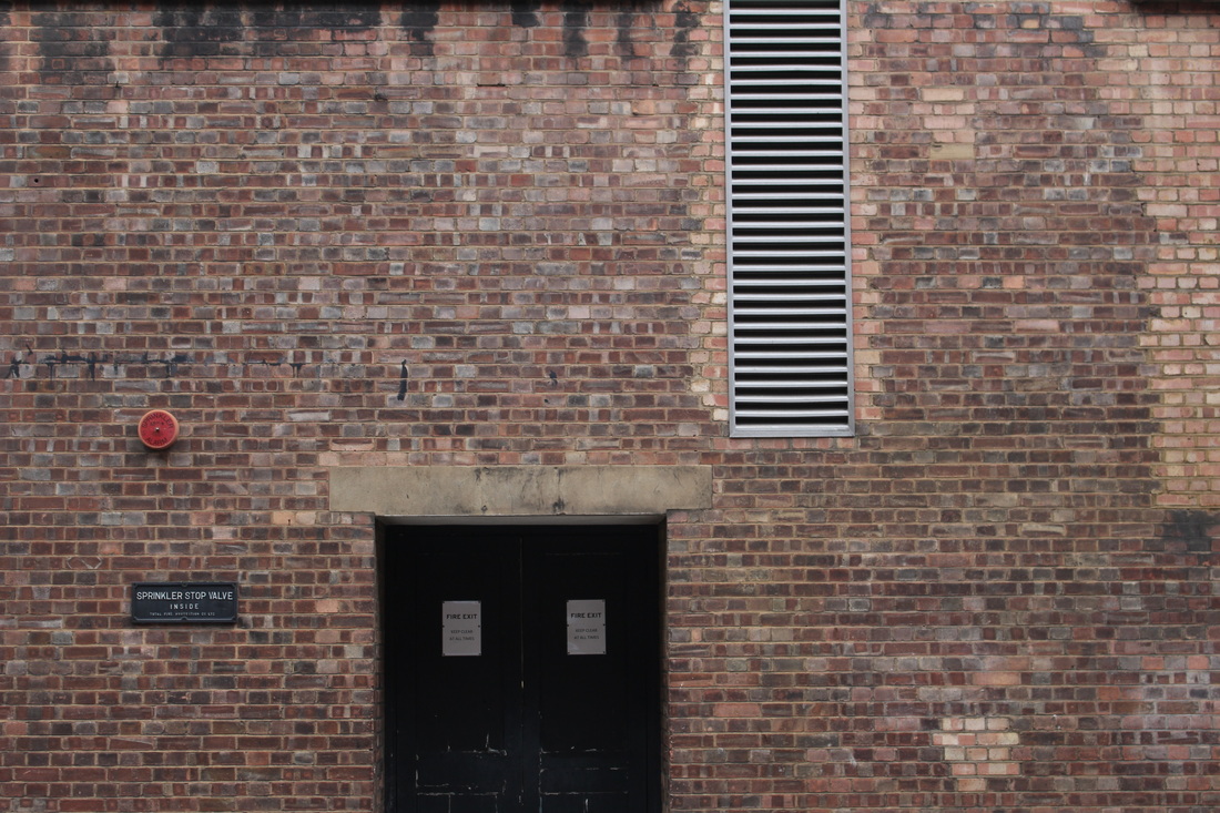
Edits:
|
|
|
|
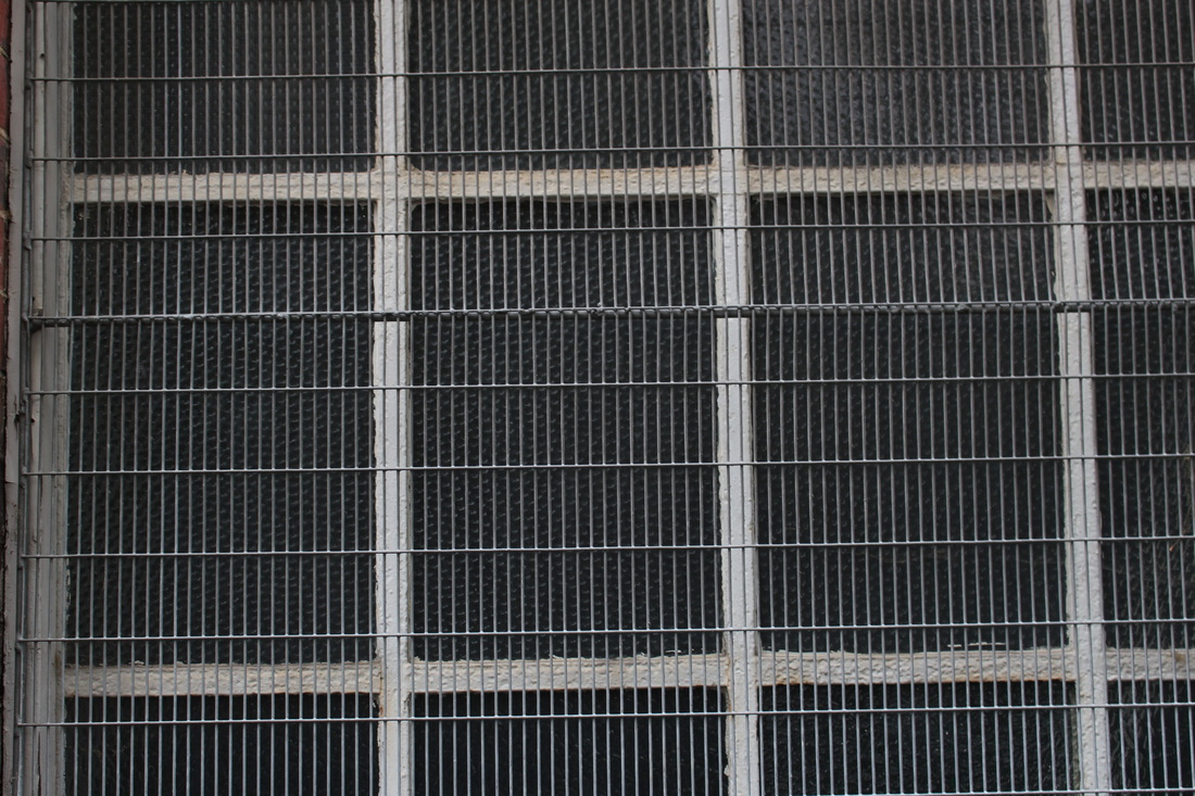
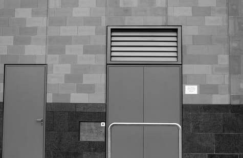
Second Response
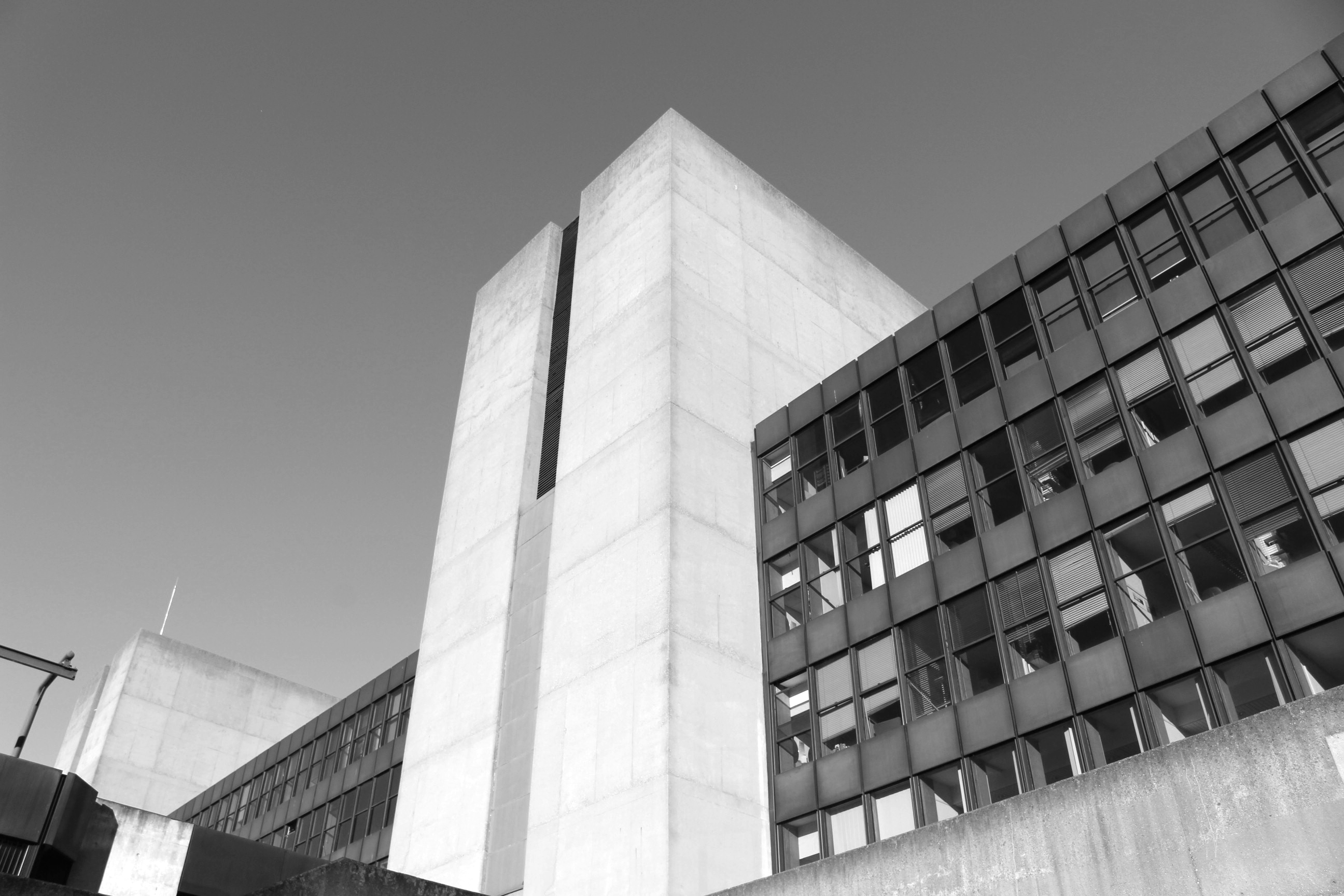
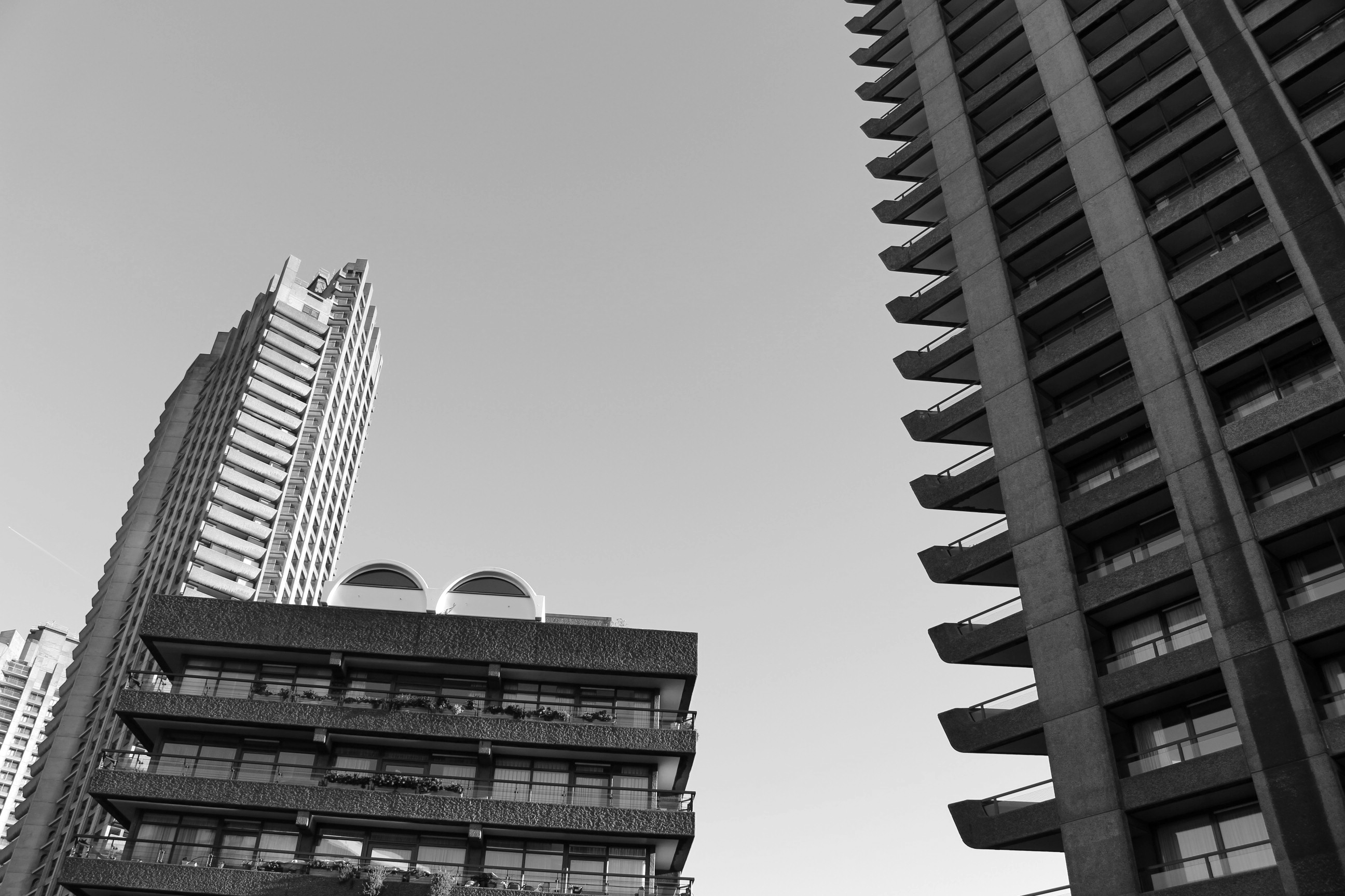
For my second response to Lewis Baltz I tried to improve my photographs by standing further away from the scene I wanted to capture and zomming in on it in order to make it more straight. I also went to the Barbican to take the photographs as I thought it would be a better suiting location. I edited the pictures that I thought worked best by making them black and white, changing the levels and using the ruler tool in photoshop to make sure the lines within the photograph are as straight as possible. I think my second response worked better than my first, however I think that there could be better locations to capture images more similar to Baltz's.

Edits:
|

|
|
|
Development

Final Development
Gilles Coulon
Gilles Coulon began his career photographing different facets of French society, under the supervision of the French daily newspaper Libération. The Paris “banlieue”, precariousness at work and immigration were his central themes.
In 1989, he went to Mali for the first time. He then moved away from his previous subjects with “White Night”, a photographic research project on light bulbs, photographed in hap hazard situations around the world, carried out over a period of four years. This documentary is now presented in a book published in 2005 by the Steidl Editions.
'White Night' was first worked on in 2000 during a journey across Niger. In the beginning, there was this one picture of a neon light in a night market in Niamey which stood out, then the fluorescent tube became an object, and the main subject for every photograph. This light – a symbol which is universal, commonplace and yet highly suggestive – became the object of an obsessive fascination. In Shanghai, Paris, Bamako, Helsinki, New York, Khabarovsk, Marseille, Cairo, Niamey, Bordeaux, Beijing and Bagnolet, these photographs invite us to imagine the atmosphere of these cities and of each spot lit place. Be it in a restaurant, in the entrance hall of a building, in the street or in an underground car park, each photograph inspires us to look at these very familiar places under a whole new light.
|
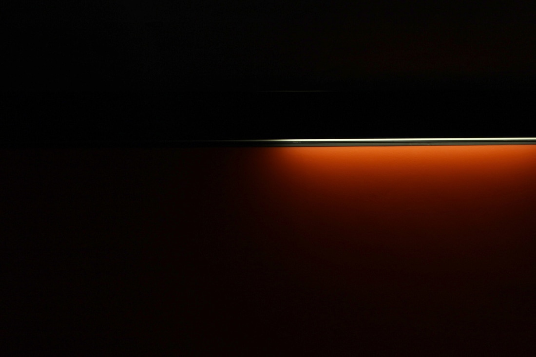
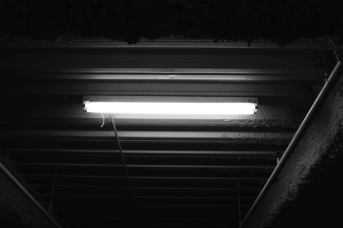
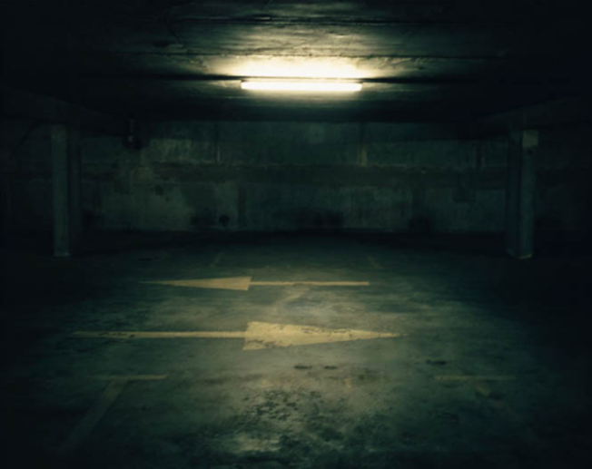
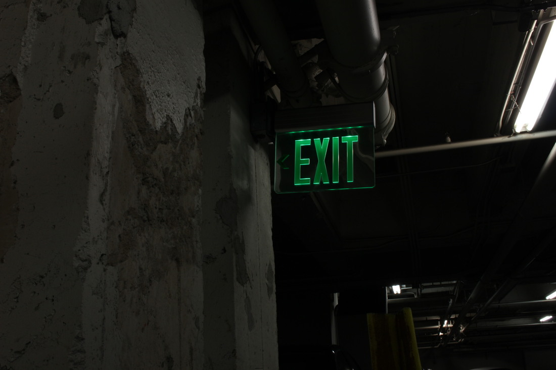
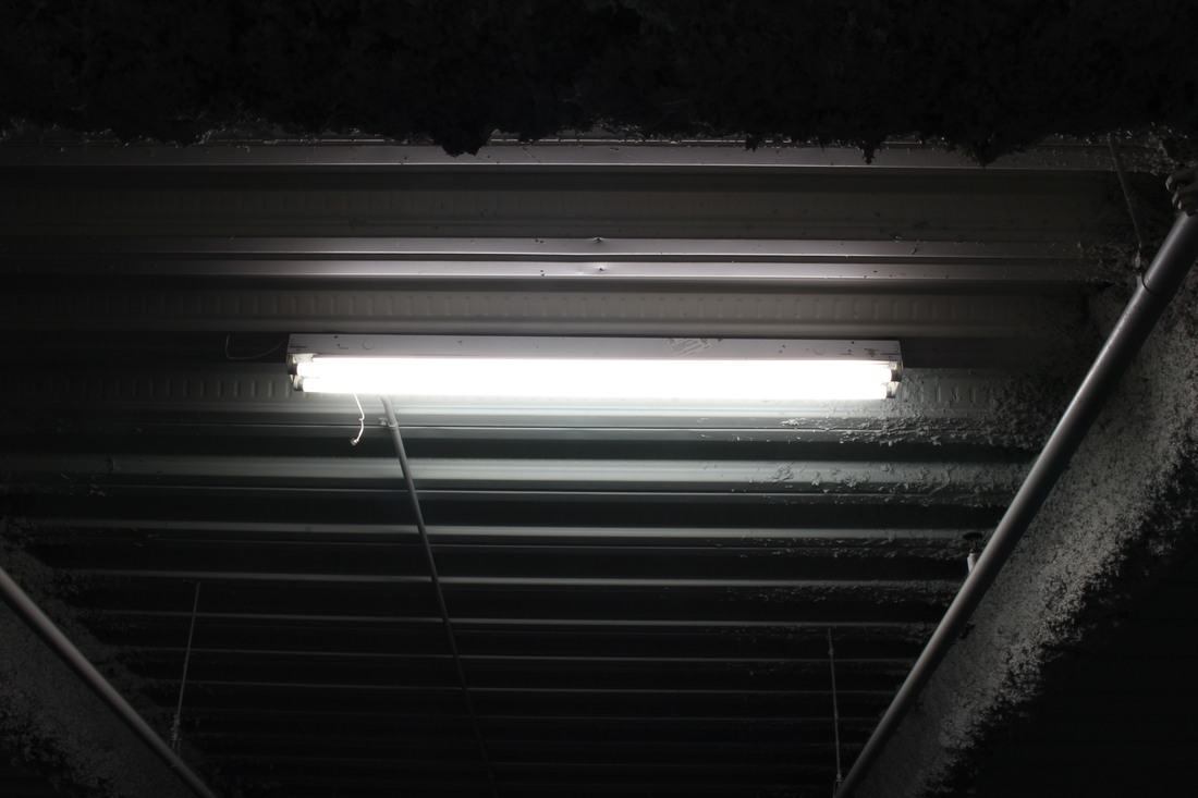
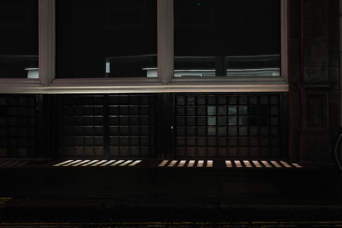
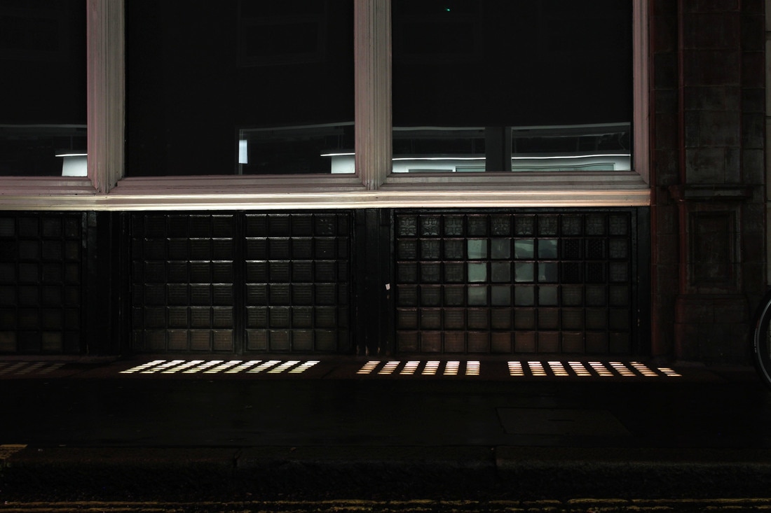
In the series "White Night", Coulon captures several different decaying, or old looking environments at night with single, artificial light sources allowing the viewer to see certain, focused details of the image. I think this technique is interesting as it creates a contrasting effect: it allows the photograph to be very detailed whilst also being quite limited. For example, in the above photograph, you can see the small, intricate details on the ceiling of the parking lot, and some small cracks and bumps on the floor. But, you can only see the details in the centre of the image, not the sides because of the way the atmosphere is lit. I think this gives the photograph a lot of depth, as it seems like the edges of the image are fading out and then centre is just glowing through the things around it. I also think that in this particular photograph there is an element of fear. The way that Coulon has angled the camera to look into the building directly, with the light in the very centre makes the middle of the photograph appear deeper than the rest, like it goes on for longer. Also, the way he has taken it from far away makes the building seem longer and more mysterious.
|
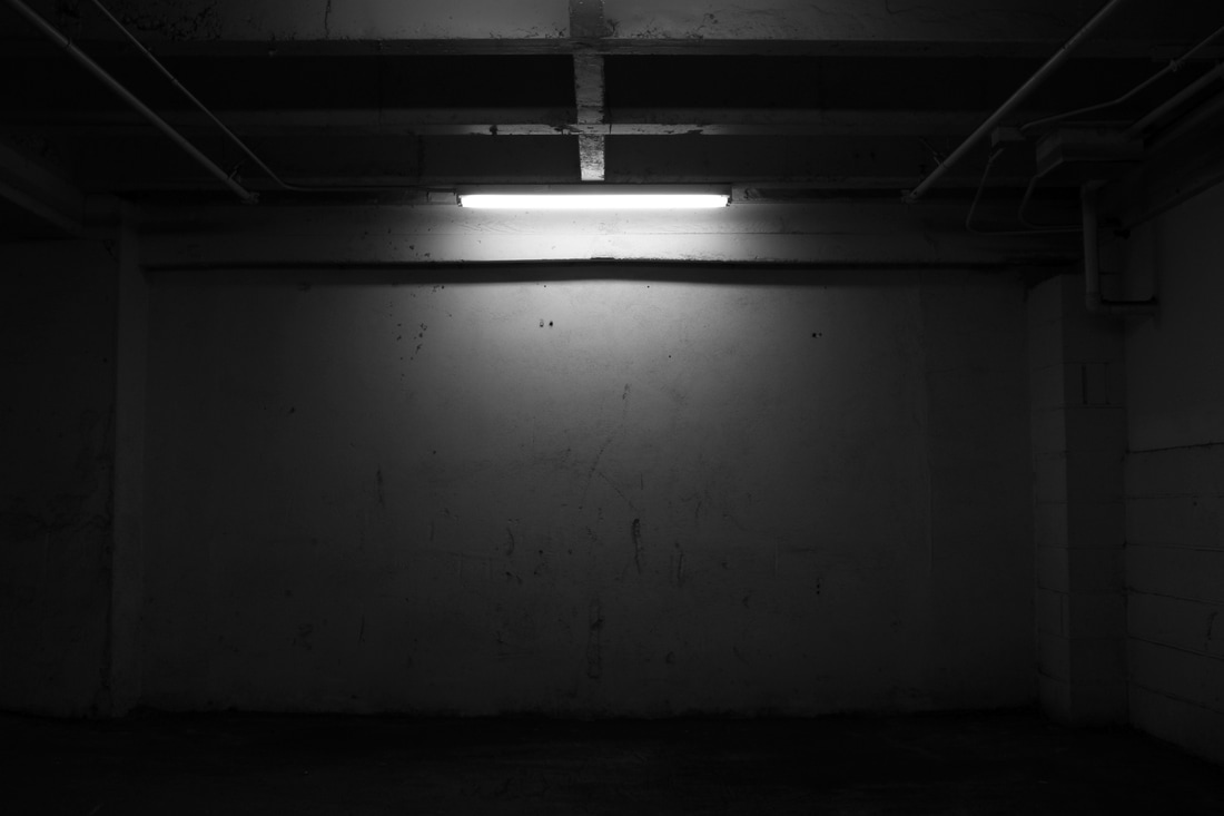
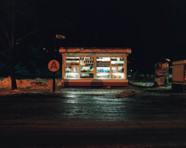
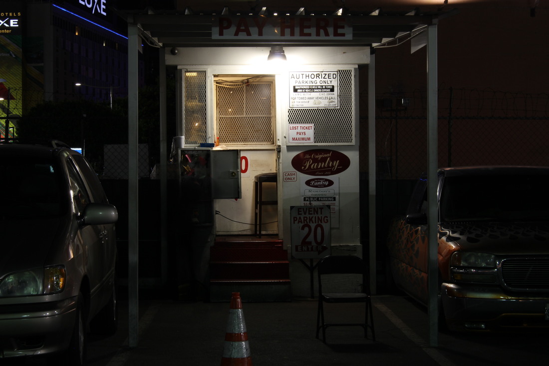
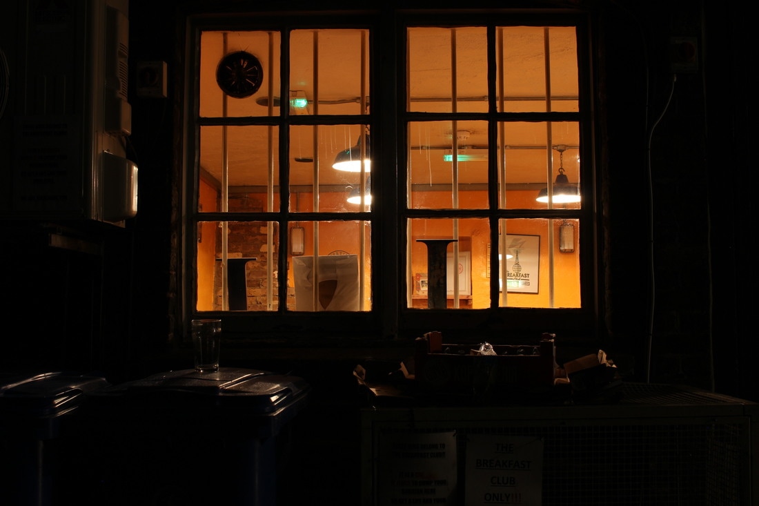
This photograph has quite a different feeling than the last, as the subject of the image isn't interior of a building, it's exterior. I think this is interesting to compare to the last photograph as you can see very obviously the effect that taking the photo from the outside makes on the entire feeling that the image gives off. I think here, there is a lot stronger feeling of contrast as opposed to the previous image, where the edges of the photograph seemed to fade out as you get further from the centre. Here, the feeling is quite opposite as the edges of the photograph are almost pitch black, with some dimly lit objects leading out into the blackness from either side of the structure in the middle. Similarly to the previous image, Coulon has taken the image standing quite far from the subject, emphasising the contrast between the bright light of the store and the pitch black of the night. In doing so, he has captured a sort of pathway that the light escaping from the shop windows create. The two trails of light leading from the store into the road further emphasises the depth of the photograph, making the subject seem further away and smaller.
|
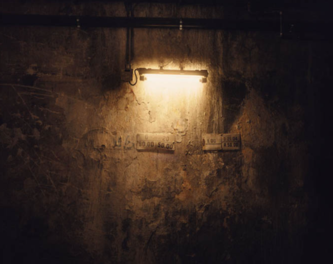
This final photograph is quite different to the previous two images as it doesn't really have much of the same type of depth. However, I think it makes this particular photograph more effective that Coulon has chosen to capture the photograph close up, focusing on the detail of the decay on the wall. If he'd captured this image in the same way he took the previous two, it wouldn't be as effective as the viewer wouldn't see all the small details around the light source. I also think it is interesting how Coulon has taken a small object and focused in closer, to make it appear larger and more significant, whereas in the previous two images he has done the opposite and made bigger subjects look less significant and smaller. This is effective as it shows how the photographer can play with perspective in order to get the exact desired outcome. In all three images that I have analysed I notice that there is a certain extent of symmetry within the image. I think in these types of photographs, this is effective as it allows the viewer to see more of the detail lit up by the light source. If Coulon had angled the images off centre, the details within wouldn't be as obvious.
|
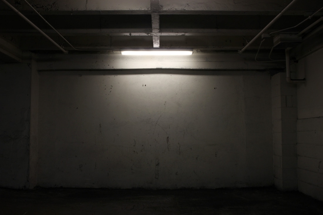
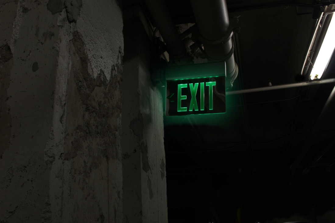
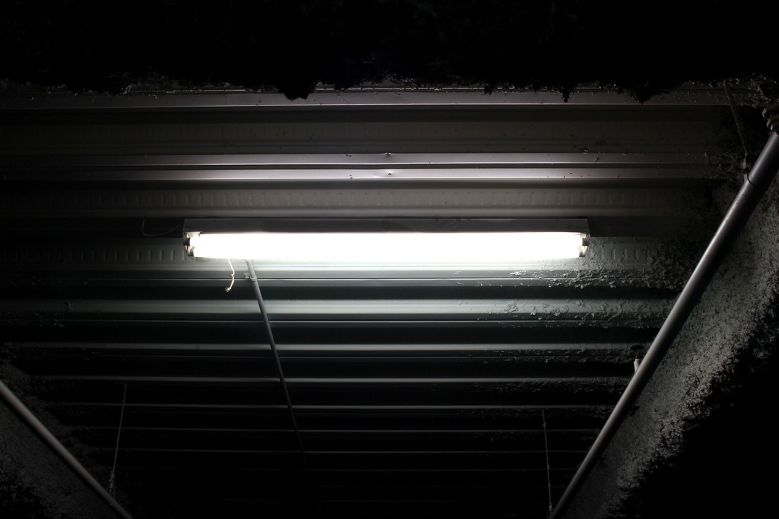
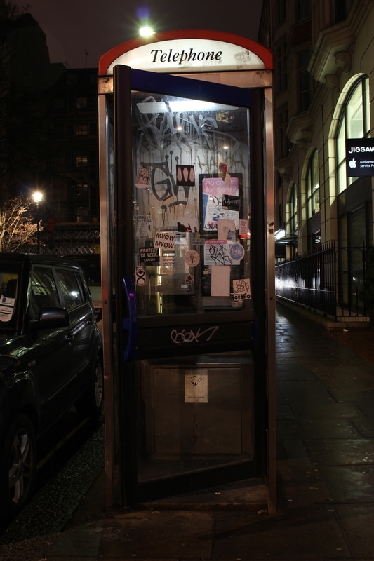
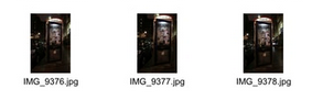
My Response
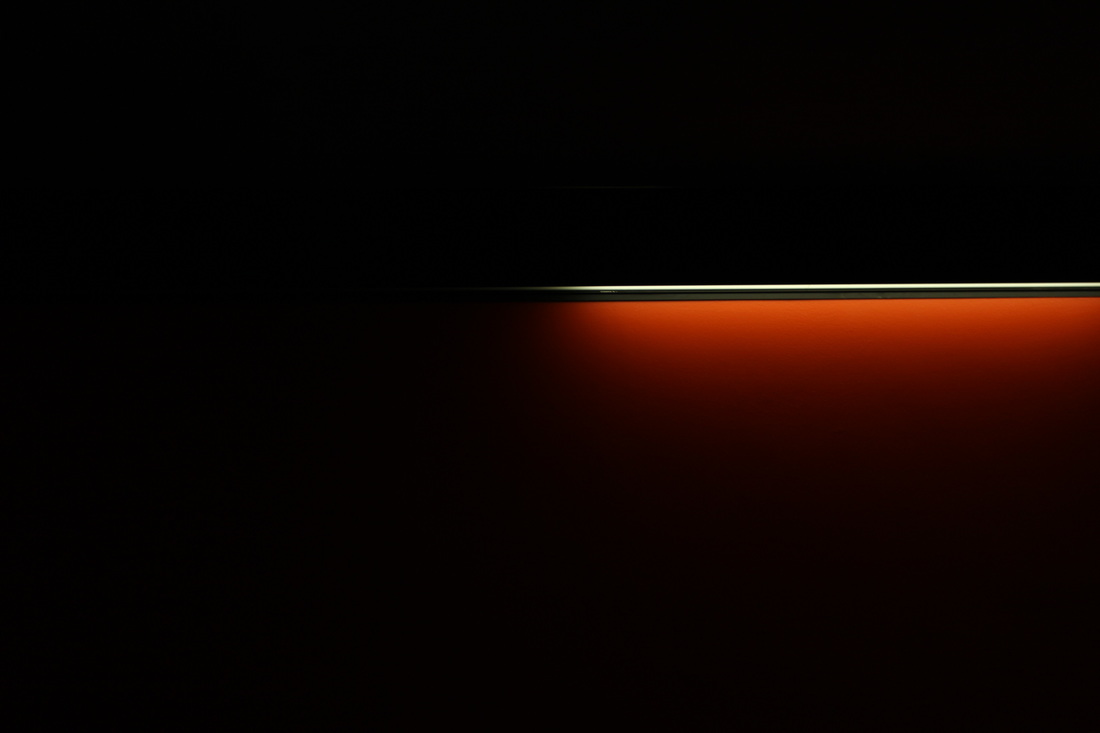
For my response to Giles Coulon I tried to go to locations that I thought would be decrepit and dirty, but also have strip lights and local lighting. For this I thought that car parks would be the best suited location. I think the photographs that I captured were successful in looking similar to those of Giles Coulon in 'White Night'. However, if I were to improve the photographs in any way I would probably try to find even better suited locations and maybe even bring my own local source of light when taking the photographs as I found this quite difficult to find at times. When editing on the photographs I chose, I tried to focus on the light source in the image and making it stand out more. I also wanted to do this to give the entire photograph a more contrasting look as I think this works well with these kinds of images.
|
|
|
|
Edits:
Development

For my second response to this task, I took photographs in locations that I thought would be better suited. However, I feel that the images I took in my first response were stronger than these. The images that I took in in door locations using local lighting in my first response, I think, work better than most of the images I got in my second response. Both sets of photographs could be improved by using better fitting locations and better use of local lights.
|
|
Edits:

Development

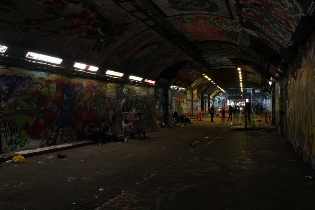
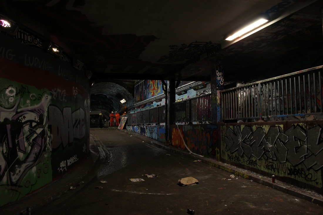
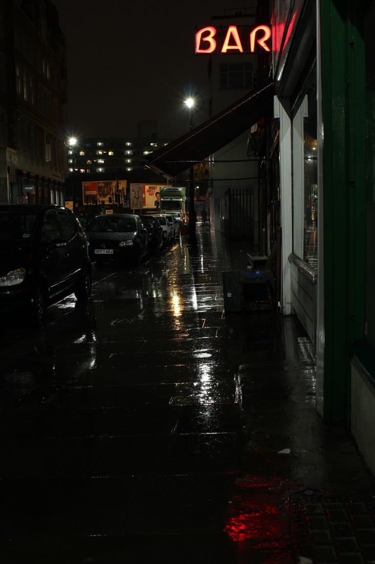
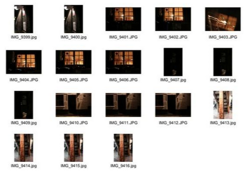
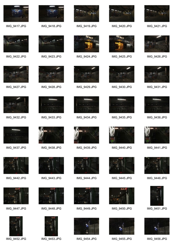
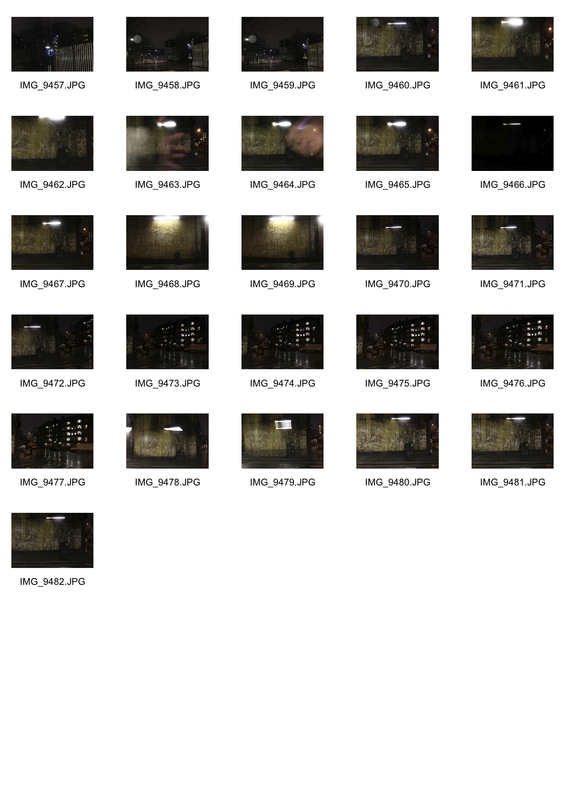
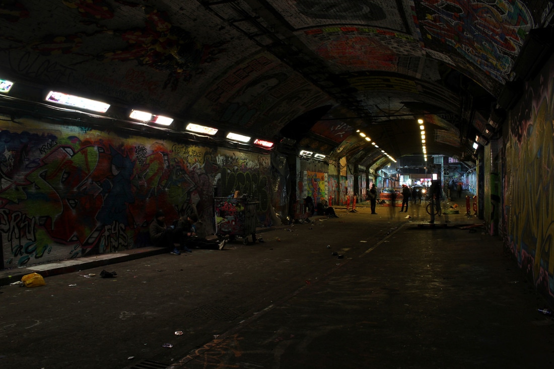
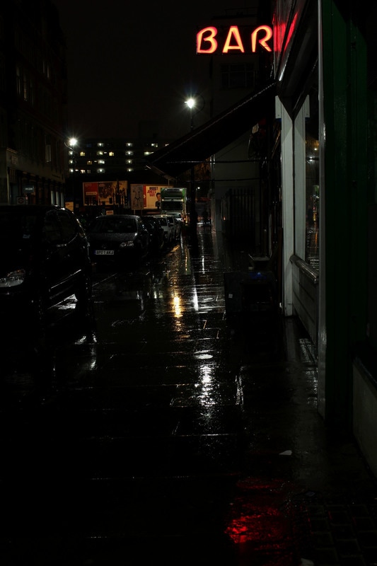
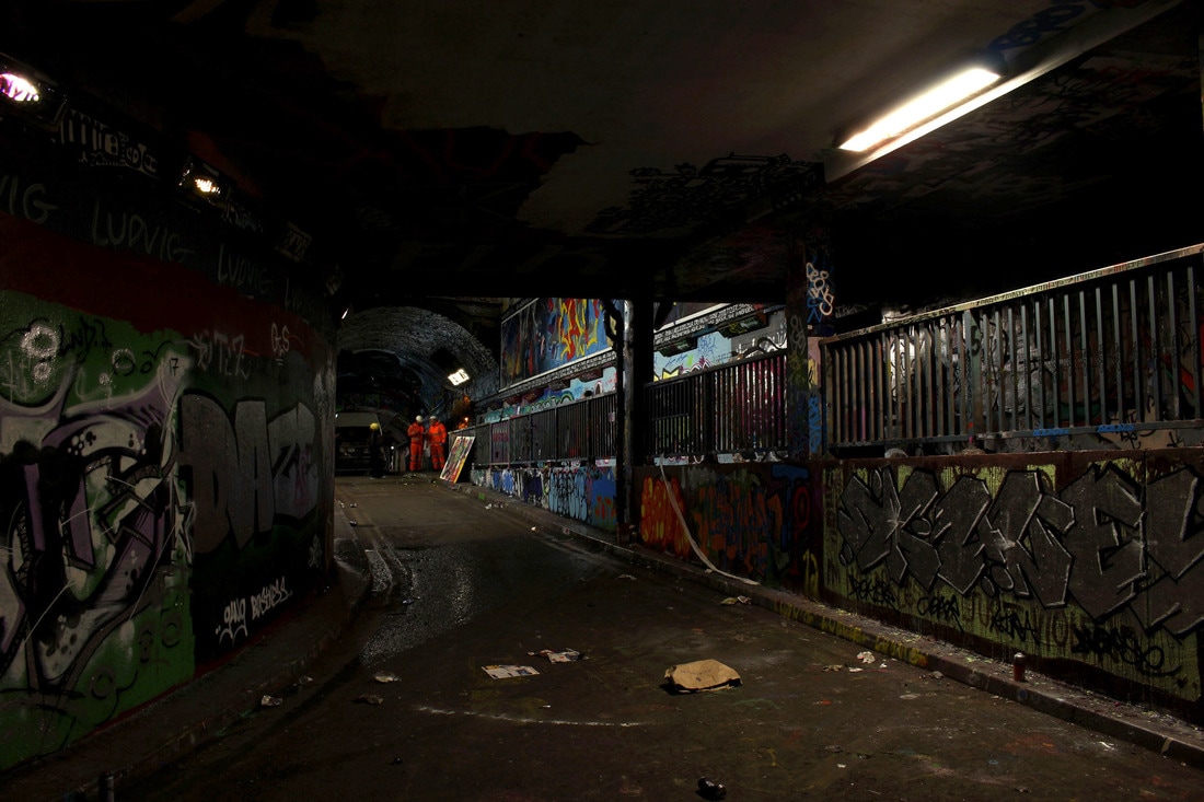
For my further developed response I went to locations that I thought would better suit the type of images I wanted to take. I think that these images worked the best of all my responses as when I took them the weather was rainy and dark which gave the pictures a moody and darker feeling. I think this adds to the effect that the images give off and creates a more interesting atmosphere. Below are all the images I captured in contact sheet and enlarged are all the ones that I thought worked best and their edits.
|
|
Edits:
Final Piece

Although my final overall piece for the abstraction project does not contain the last set of photographs that I took, I thought that the more abstract images further up my project simply worked better and were ultimately stronger. Below are the photographs from this project that I thought were my best responses and best managed to capture the abstract form of light.