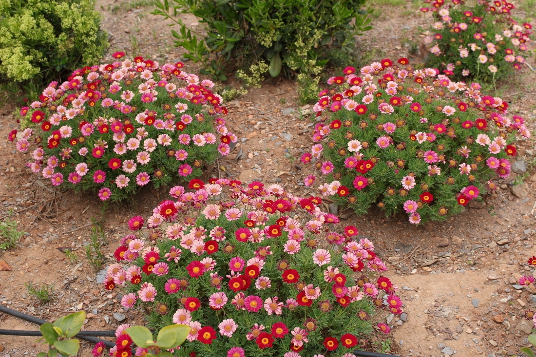
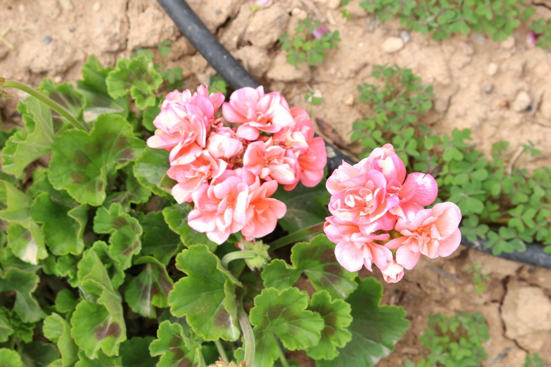
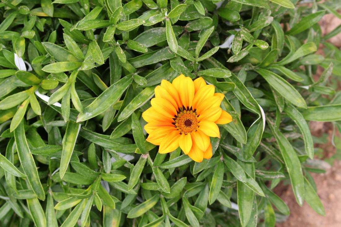
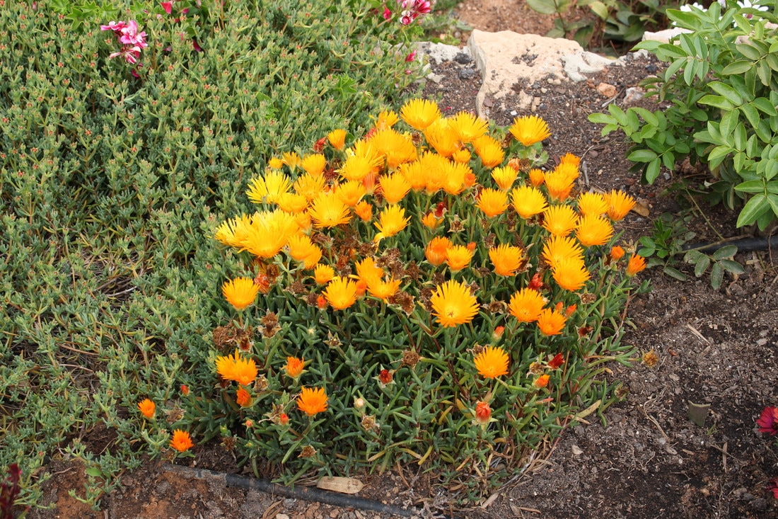
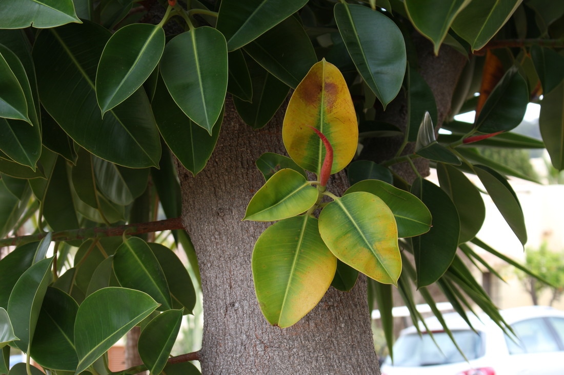
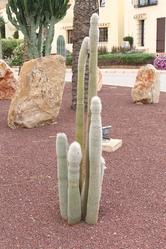
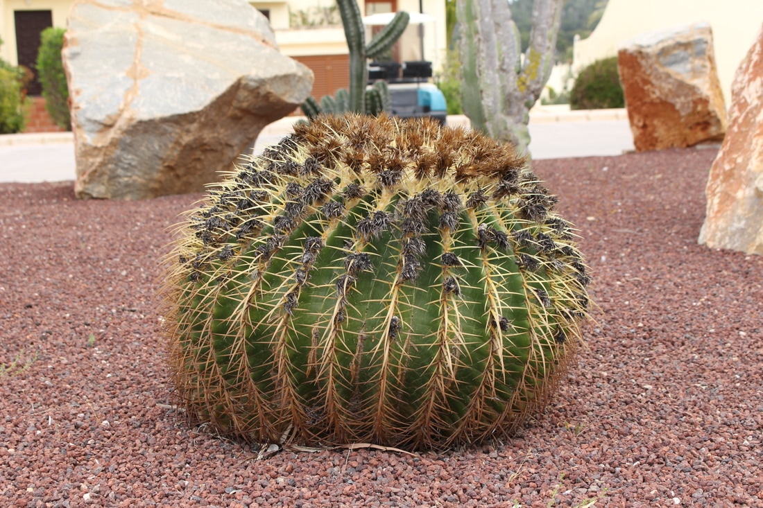
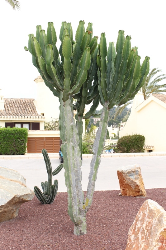
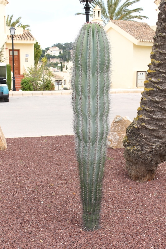
pinterest Board
exhibition Visit: The Radical Eye
This is a once-in-a-lifetime chance to see one of the world’s greatest private collections of photography, drawn from the classic modernist period of the 1920s–50s. An incredible group of Man Ray portraits are exhibited together for the first time, having been brought together by Sir Elton John over the past twenty-five years, including portraits of Matisse, Picasso, and Breton. With over 70 artists and nearly 150 rare vintage prints on show from seminal figures including Brassai, Imogen Cunningham, André Kertész, Dorothea Lange, Tina Modotti, and Aleksandr Rodchenko, this is a chance to take a peek inside Elton John’s home and delight in seeing such masterpieces of photography.
Artists in the modernist period explored what the camera could do that the human eye alone could not, and how this could be harnessed to present a new modern perspective on the world. Artist and theorist László Moholy-Nagy proclaimed that photography could radically change not just what, but how we see. He called this the ‘new vision’. Rather than emulating other art forms, photography began to embrace qualities unique to itself, from its ability to reproduce the world in sharp detail to its capacity to create new realities through the manipulation of light, chemicals and paper.
Artists in the modernist period explored what the camera could do that the human eye alone could not, and how this could be harnessed to present a new modern perspective on the world. Artist and theorist László Moholy-Nagy proclaimed that photography could radically change not just what, but how we see. He called this the ‘new vision’. Rather than emulating other art forms, photography began to embrace qualities unique to itself, from its ability to reproduce the world in sharp detail to its capacity to create new realities through the manipulation of light, chemicals and paper.
|
|
This re-evaluation of photography coincided with a period of upheaval. War, revolution and economic depression led to mass movements of people and great social change. The idea of the avant-garde took hold and dada and surrealism emerged, challenging both the art and social norms that had come before. At the same time, new art schools such as the Bauhaus in Germany and Vkhutemas in Russia fostered the role of the professional artist and challenged divisions between art and design.
The Radical Eye is arranged thematically and charts a changing emphasis from the subject of an image to the visual qualities of the photograph itself, irrespective of what it represents. The many vintage prints in this exhibition – made soon after the photographs were taken – give a rare insight into the artists’ processes and creative decisions, and foreground the photograph as a physical object. All works are shown in the frames in which they are displayed in the home of Sir Elton John and David Furnish. |
|
Room 1: Portraits
|
Room 2: Experiments
|
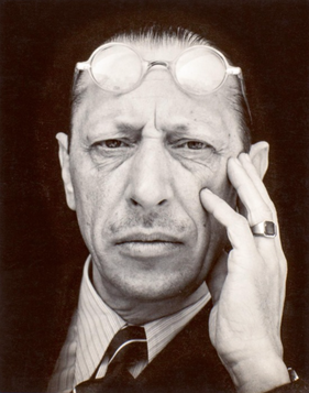 Edward Weston, Igor Stravinksy, 1935 Edward Weston, Igor Stravinksy, 1935
Modernist portraiture harnessed photography’s capacity to render an accurate likeness in clear, sharp focus and detail. But at the same time, artists and sitters pushed the conventions of portraiture with innovations in pose, composition and cropping.
Many of the portraits in this room are of artists, writers and musicians, giving a cross section of key cultural players of the time. Issues of control and collaboration arise particularly when the subject is an artist, raising the question of who is responsible for conveying the sitter’s persona. The modernist period also saw a boom of the illustrated press. Magazines reproduced photographic portraits of well-known figures which were instrumental in shaping their public images. "They collect themselves. Carefully, as if tying a cravat, they compose their features. Insolent, serious and conscious of their looks they turn around to face the world." From ‘Men before the Mirror’, published alongside portraits by Man Ray, 1934 |
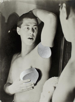 Herbert Bayer, humanly impossible (self portrait) 1932 Herbert Bayer, humanly impossible (self portrait) 1932
This was not a period of discovery but of rediscovery. Artists were rewriting the preceding century’s rules of photographic technique, harnessing ‘mistakes’ such as distortions and double exposures, or physically manipulating the printed image, cutting, marking and recombining photographs. These interventions could occur at any point in the process, from taking the image to the final print.
Used in portraiture, such experiments allowed for more psychologically charged representations. However, the transformative power of a particular technique often becomes much more important than the particular subject of the image. Above all, the rich creative possibilities of the photographic process come to the fore. While artists were seriously investigating the medium, the results are often surprising and playful. |
|
Room 3: Bodies
|
Room 4: Documents
|
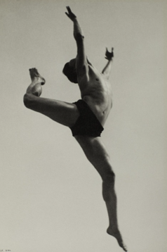 Isle Bing, dancer, willen van loon, paris 1932 Isle Bing, dancer, willen van loon, paris 1932
Experimental approaches to shooting, cropping and framing could transform the human body into something unfamiliar. Photographers started to focus on individual parts of the body, their unconventional crops drawing attention to shape and form, accentuating curves and angles. Fragmented limbs and flesh were depersonalised and could be treated like
a landscape or still life, dissolving distinctions between different genres. Thanks to faster shutter speeds and new celluloid roll film, photographers could also freeze the body in motion outside of the studio for the first time, capturing dancers and swimmers with a clarity impossible for the naked eye. "The camera should be used for a recording of life, for rendering the very substance and quintessence of the thing itself, whether it be polished steel or palpitating flesh." Edward Weston, 1924 |
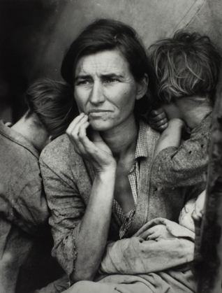 Dorothea Lang, Migrant Mother, 1936 Dorothea Lang, Migrant Mother, 1936
During the 1930s, photographers refined the formula for what we now know as social documentary. To compel the public to look at less palatable aspects of contemporary society they married creative manipulation with an appeal to viewers’ trust in the photograph as an objective visual record. This combination proved itself uniquely capable of eliciting empathy but is fraught with artistic and ethical complexity. These works highlight the vexed position of documentary photographs: historical evidence, instruments of propaganda and, latterly, works of art.
The development of new technology – particularly the portable camera and roll film – allowed photographers to capture spontaneous moments unfolding in the everyday world. Taking viewers into neighbourhoods where they might never set foot, street photography and documentary opened up new perspectives socially as much as visually. |
Room 5: Objects, Perspectives, Abstractions
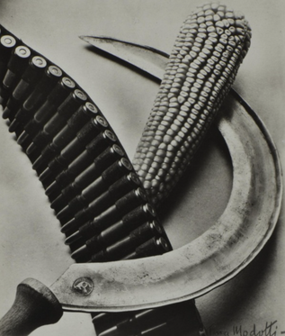 Tina Modotti, Bandelier, Corn and Sickle, 1927
The subjects and approaches of modernist photography vary widely, but are united by a fascination with the medium itself. Every image asks what photography is capable of and how it can be pushed further.
This final room brings together three interlinked approaches. It shows the still life genre reimagined by photographers who used the technical capabilities of the camera to reveal the beauty of everyday things. Objects captured at unconventional angles or extreme close-up become strange, even unrecognisable.
A similar effect of defamiliarisation was accomplished by taking photographs from radically new perspectives, positioning a camera at the point of view of the ‘worm’s eye’ or ‘bird’s eye’. This created extreme foreshortening that transformed photographs from descriptive images of things into energetic compositions hovering between abstraction and representation.
Abstraction pushes against photography’s innate ability to record objectively. Radical techniques such as cameraless image-making simplified the medium to the point of capturing the play of light on photosensitive paper. By stripping it back to its most basic components, artists celebrated photography, not as a tool for reproduction, but as a creative medium capable of producing new imagery.
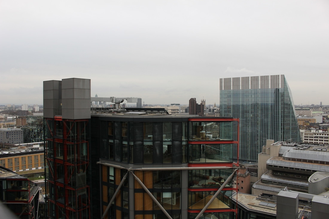
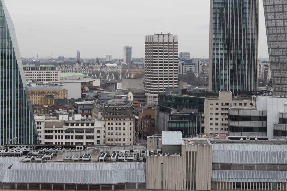
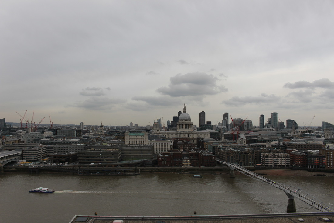
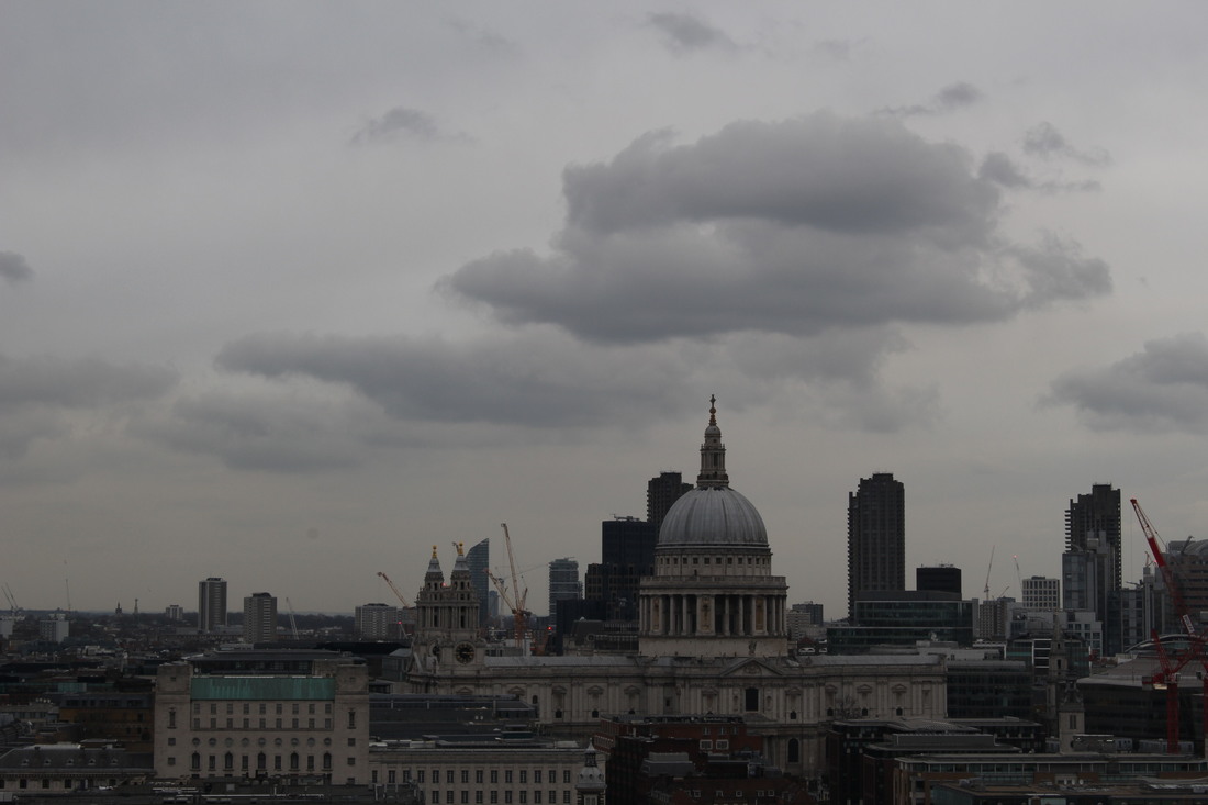
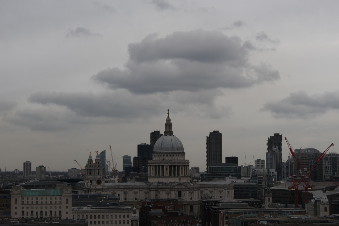
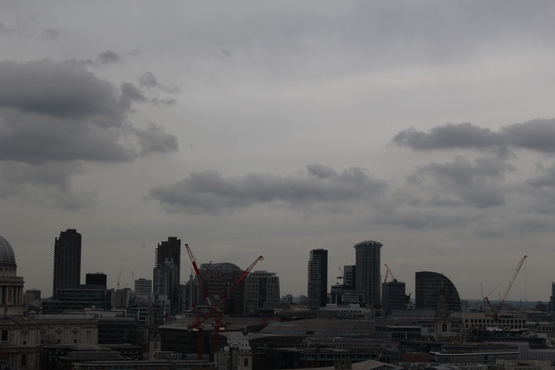
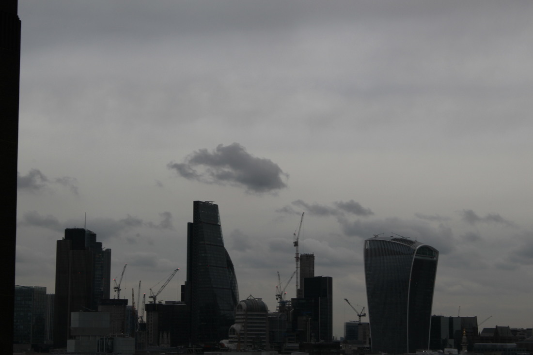
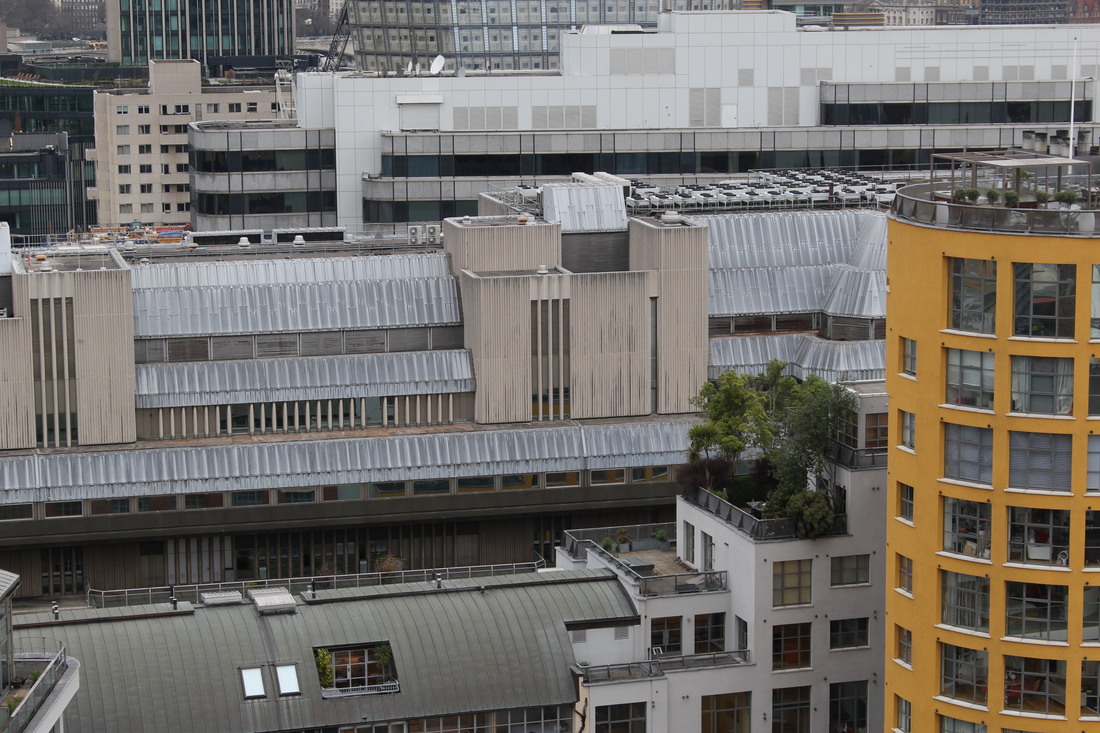
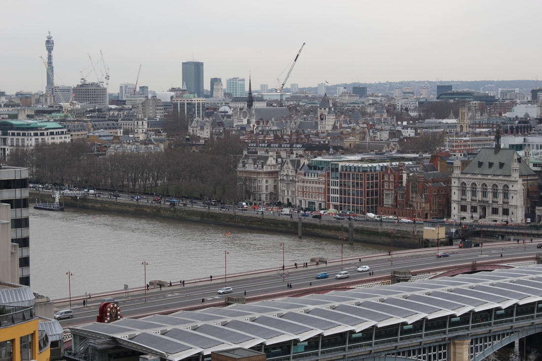
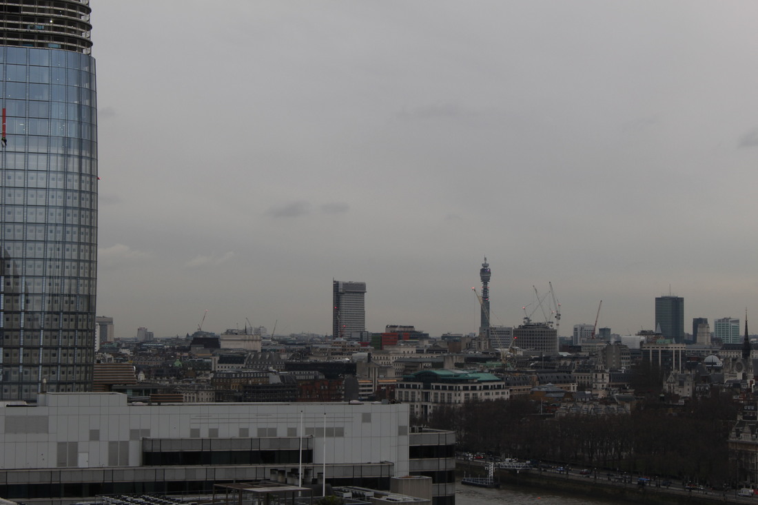
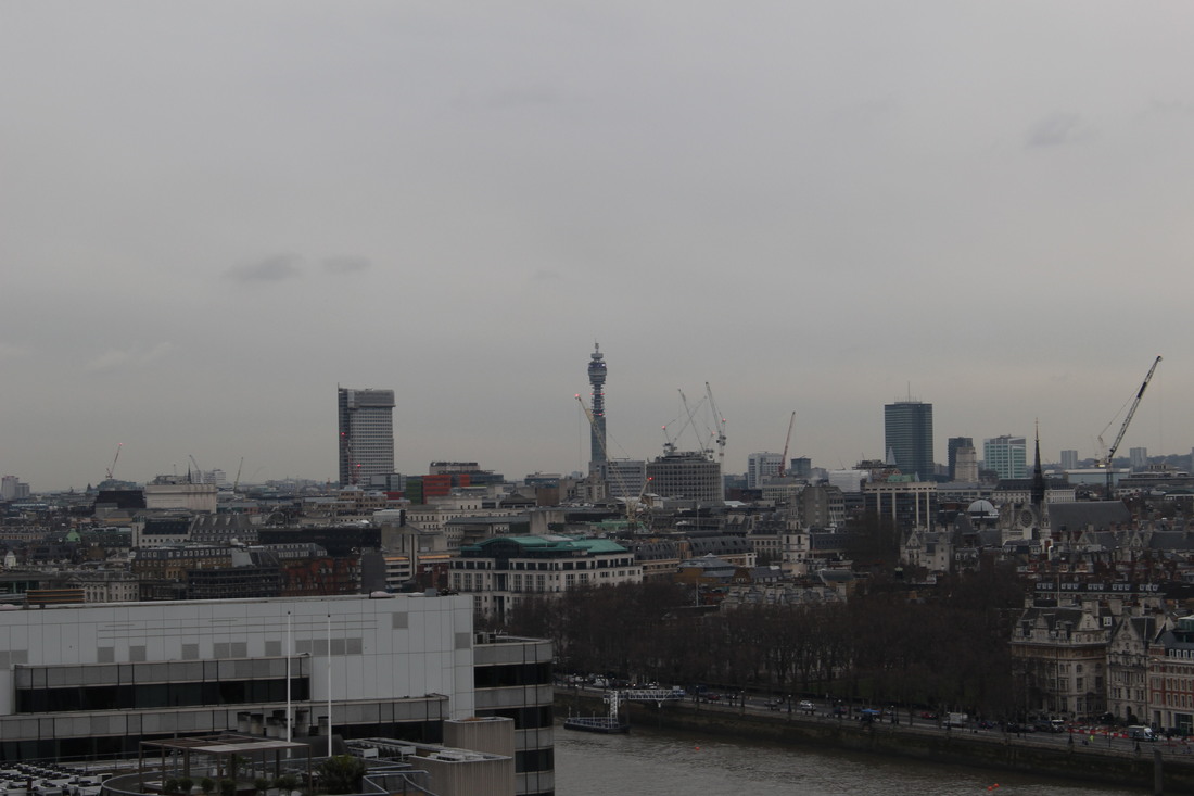
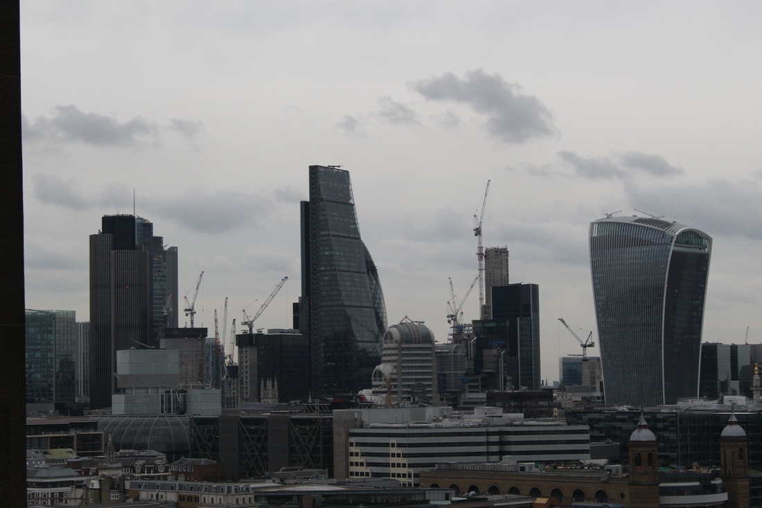
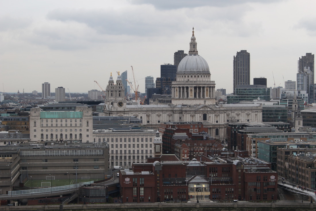
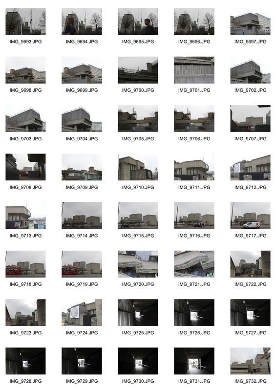
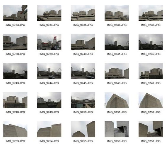
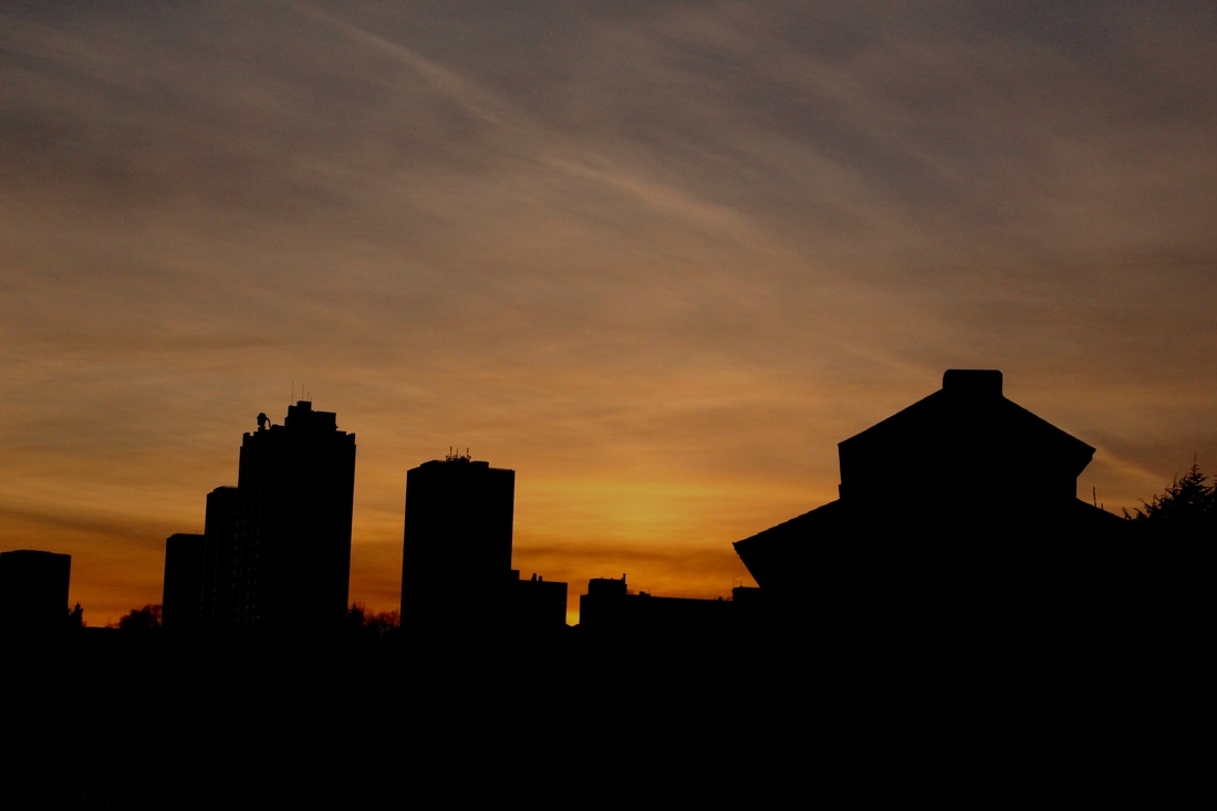
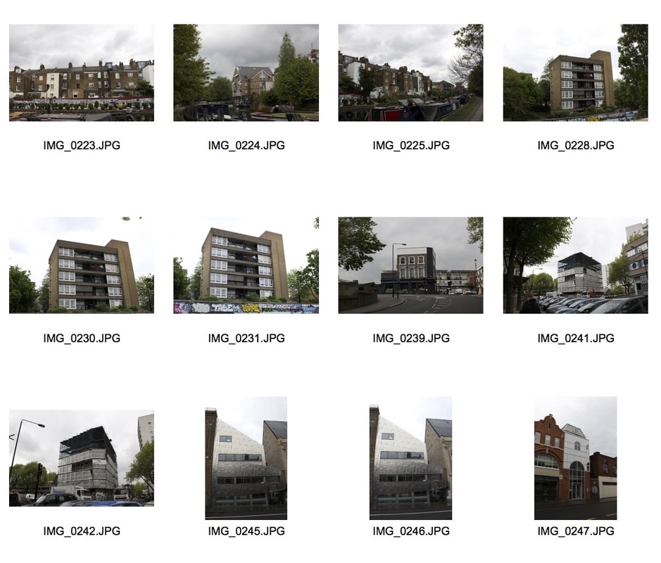
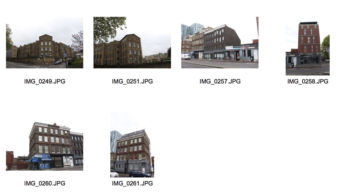
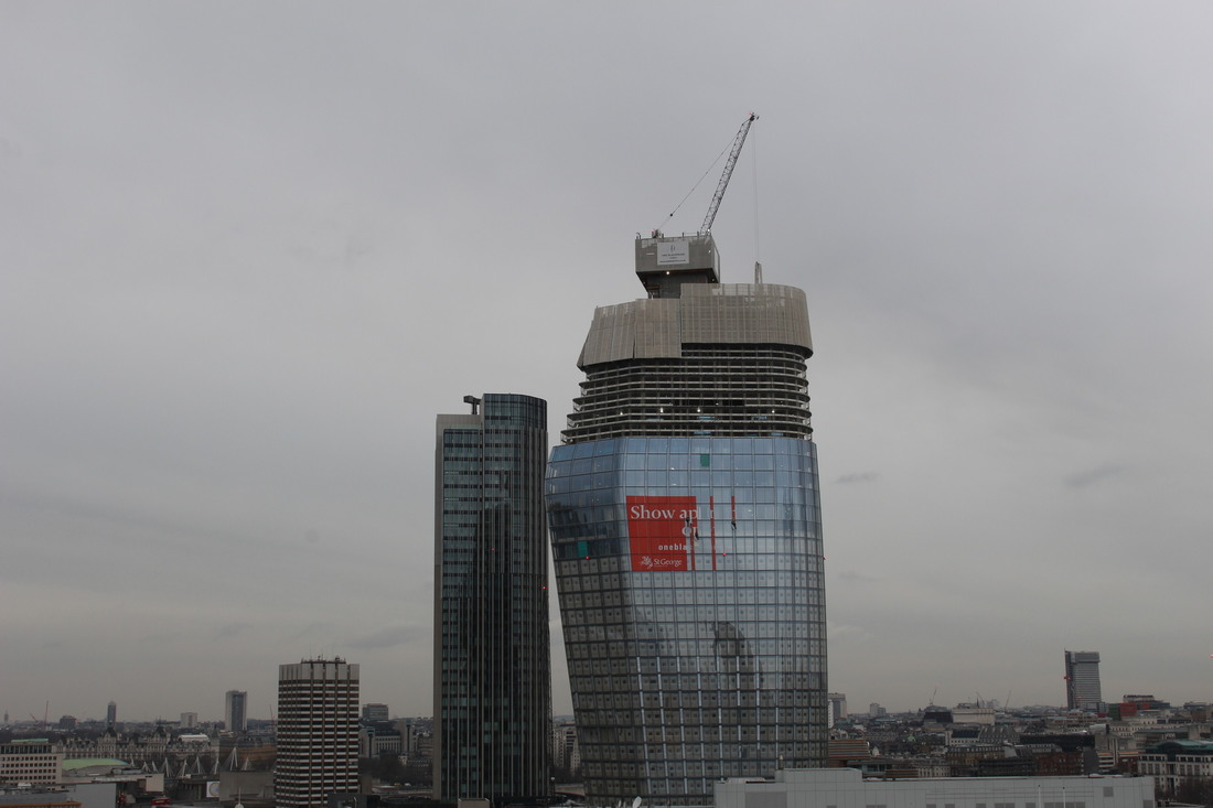
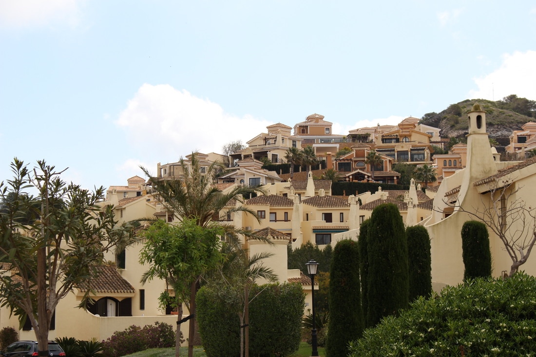
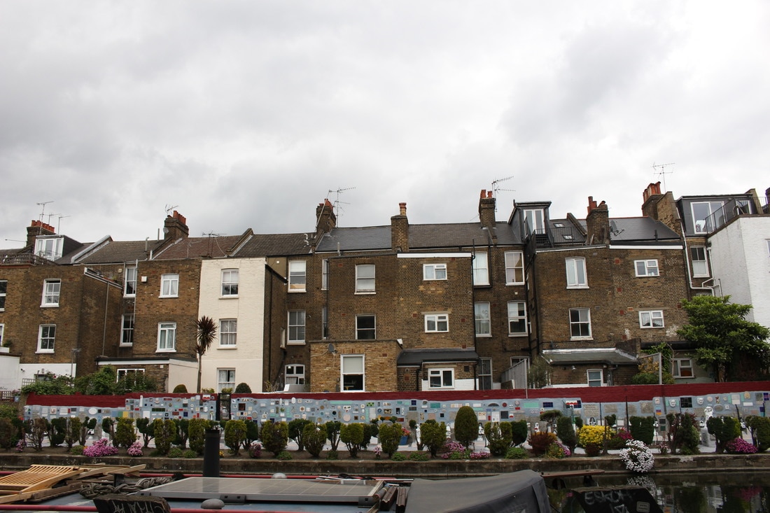
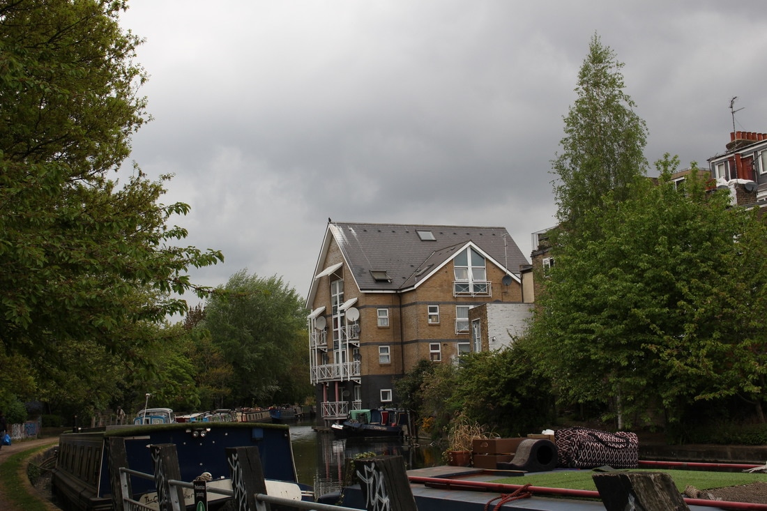
Photographs From The Tate
On the Tate visit, I tried to capture photographs, from the top of the building, showing structure in some way. Most of the images, if not all, show structure in the form of buildings or skylines.


|
|
|
|
Structure In Nature
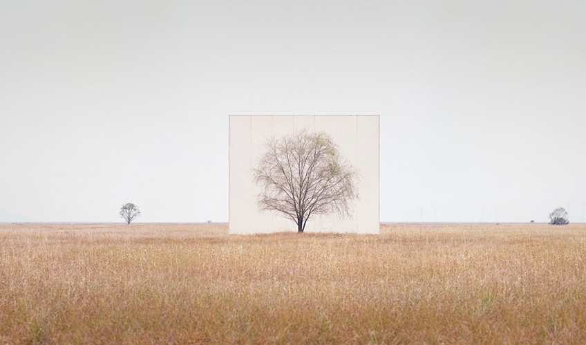
Myoung Ho Lee
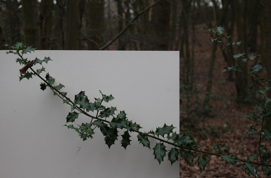
Myoung Lee is a young artist from South Korea. He has produced an elaborate series based around trees and nature: a beautiful and intellectual meditation on trees, nature, environment and perception. Simple in concept, complex in execution, he makes us look at a tree in it's natural surroundings, but separates the tree artificially from nature by presenting it on an intense, white background, as one would see a painting or photograph on a billboard. In separating the subjects of his images from their surroundings, Lee deranges the difference between subject and image. His work reveals nature by twists and turns, a little fabrication and optical illusion. Myoung Lee enacts his work as 'a series of discourses on deconstruction in the photography-act'. His works are largely composed of the following four procedures: selection of the subject, separation of the subject, photographing, conformation of the separation. The procedure of separating the subject from its environment makes the subject appear neutral from its original context.
Lee explains what inspired the series: "When you think about 'art', or creating art, a common scene that comes to mind is the anguished writer sitting in a studio, trying to put something on a white canvas. Instead of trying to put something meaningful on top of the canvas I placed the canvas behind a tree. Trees are one of the most common things we meet in everyday life, but we often overlook them; we forget their value and just pass by. Trees are there, but not really there... So to speak."
Lee explains what inspired the series: "When you think about 'art', or creating art, a common scene that comes to mind is the anguished writer sitting in a studio, trying to put something on a white canvas. Instead of trying to put something meaningful on top of the canvas I placed the canvas behind a tree. Trees are one of the most common things we meet in everyday life, but we often overlook them; we forget their value and just pass by. Trees are there, but not really there... So to speak."
|
In this first image from the Tree series by Lee, the subject is placed directly in the centre of the image. Like most photographs in this series, the viewer is automatically drawn to the main subject as it is centred. However, in this particular image, there is a similar tree to the subject in the far left-hand corner of the photograph. This is interesting as it shows the tree in both an isolated sense, and in it's natural surroundings. This contradicts Lee's trying to 'separate the subject' but also supports it. Furthermore, in this image, the sky is a similar colour to the canvas that Lee has used to isolate the main subject giving the separation between the subject and it's surroundings a more subtle, less obvious effect. Still, the same effect has been achieved, in placing the canvas behind the subject, Lee has separated nature from it's natural surroundings and isolated it making it stand out by itself.
|
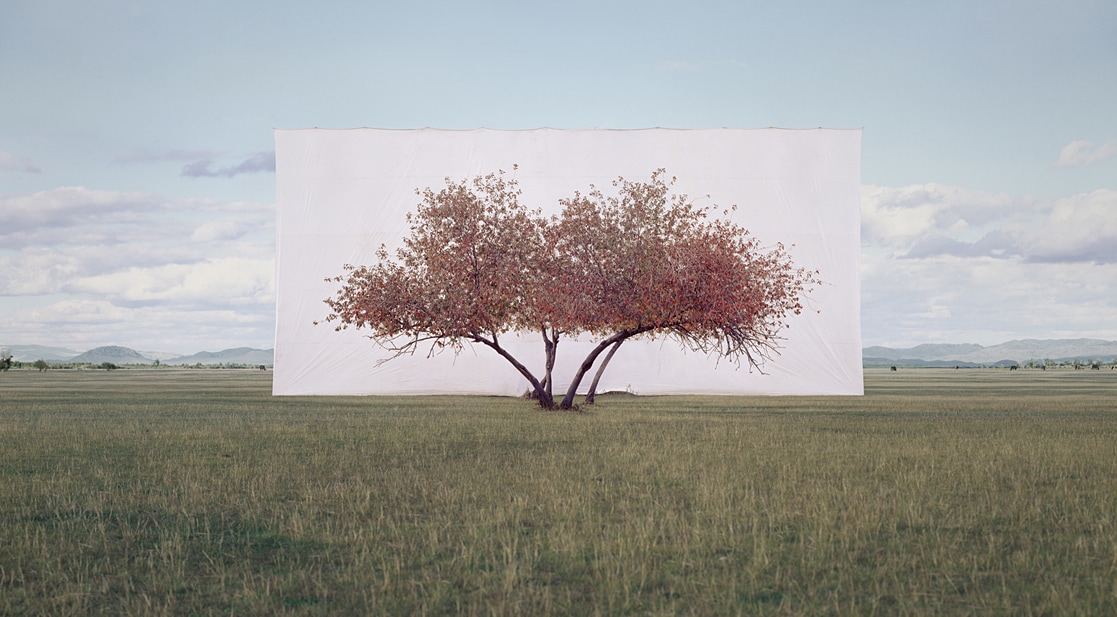
Within this second photograph by Lee there are much more vibrant and happier than the previous. The use of this gives the entire photograph a much different feeling and evokes a different emotion in the viewer. Furthermore, the tree in this photograph stands out a lot more than in the other two photographs for two reasons: one being the contrasting colours of the branches against the bleak, white canvas and another being the size of the tree and the canvas. The tree in this photograph takes up the majority of the centre of the frame making it a lot more obvious to the viewer what the subject of the photograph is. The size of the tree and the canvas gives the illusion that the image has been taken at a closer distance than the previous image, making this photograph seem to have a lot less depth than the previous. The sky in this image also brightens the photograph a lot more making it appear lighter.
|
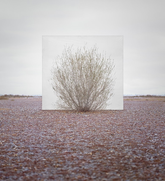
In this final image, Lee plays with the distance of the subject. The tree in this image is much closer to the camera as opposed to the previous two making the isolation of the tree wider, there is much more isolation within this photograph compared with the first. This is interesting as it shows how Lee can manipulate the image to get the exact desired effect that he wants and change the way the viewer sees the picture. Furthermore, the colours in this image are much cooler toned and softer than both previous images. This changes the feeling of the photograph entirely as it shows a completely different mood and atmosphere within nature. Finally, the sky in this image is more dramatic, making the image appear moodier and more emotive. For example, the edges of sky around the white canvas are almost the same colour as the canvas itself, whereas the outer corners are darker and greyish as opposed to white.
|
My Response
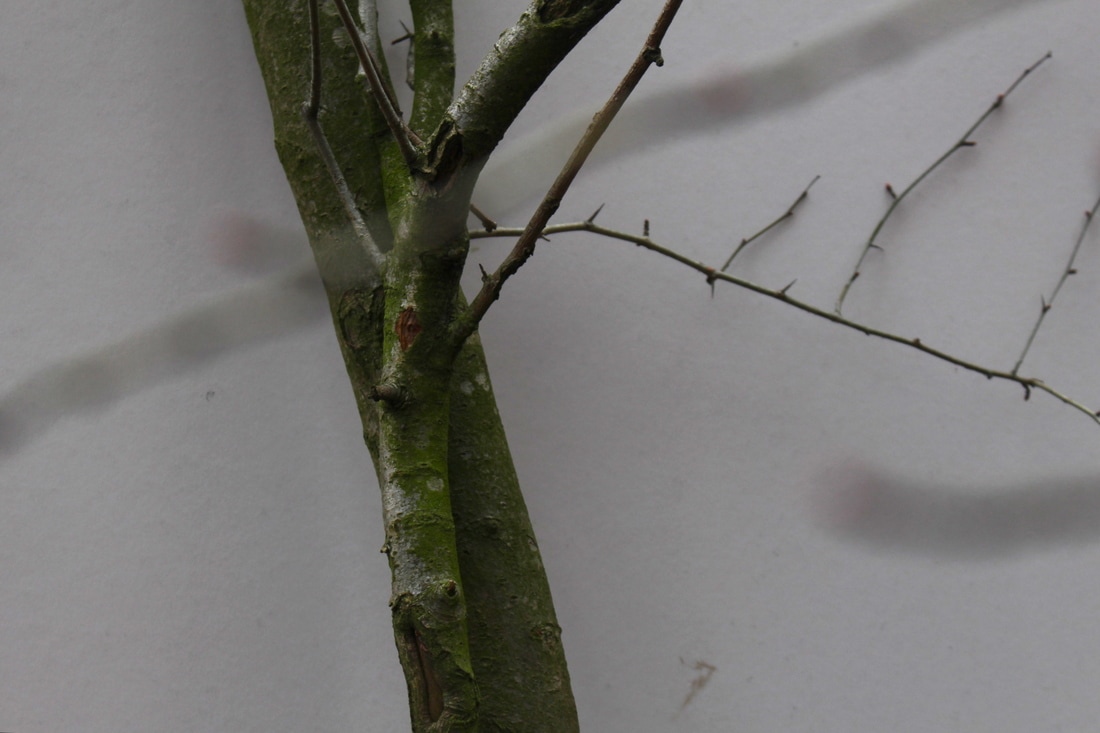
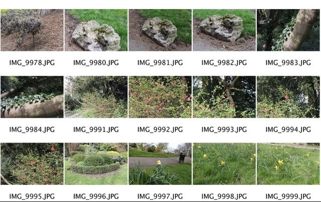
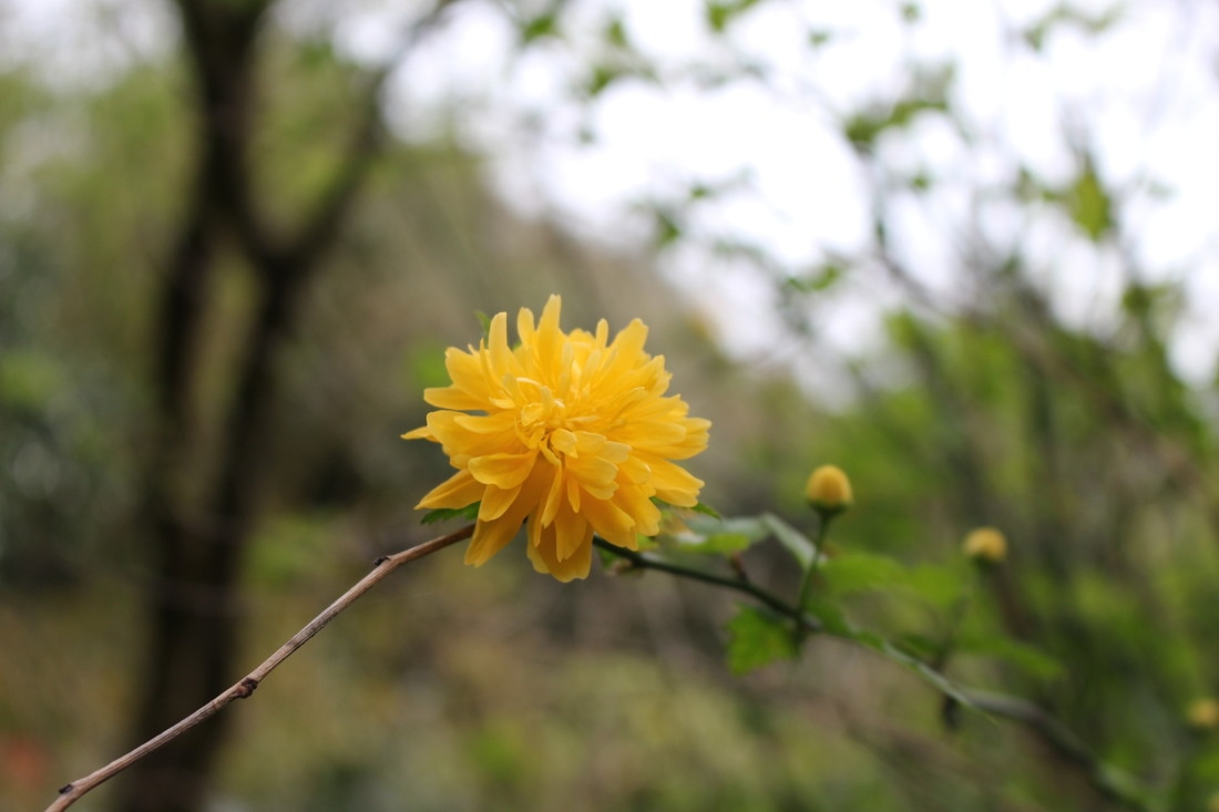
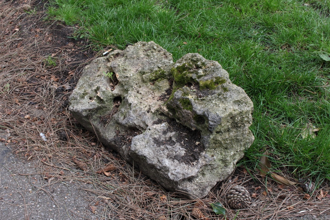
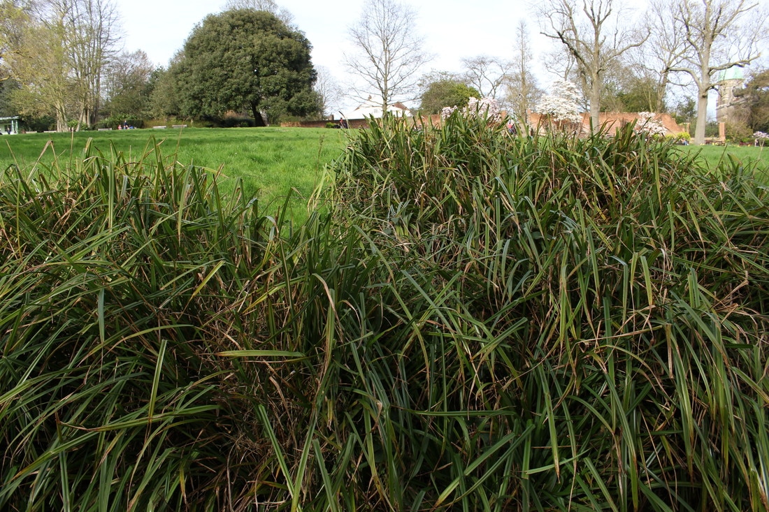
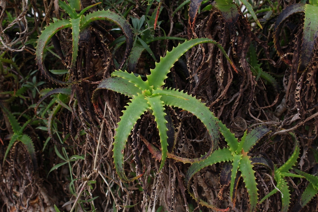
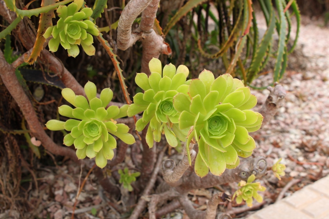
For my response to Lee's work, I took a variety of images of nature using a large white piece of cardboard as my canvas, isolating the objects in nature from their surroundings. When taking these photographs I tried to capture the objects against the background with their surroundings in the background, but I also experimented with simply removing the background from the image completely in order to isolate the nature further. Below are all the photographs I took with the three that worked best enlarged.

|
|
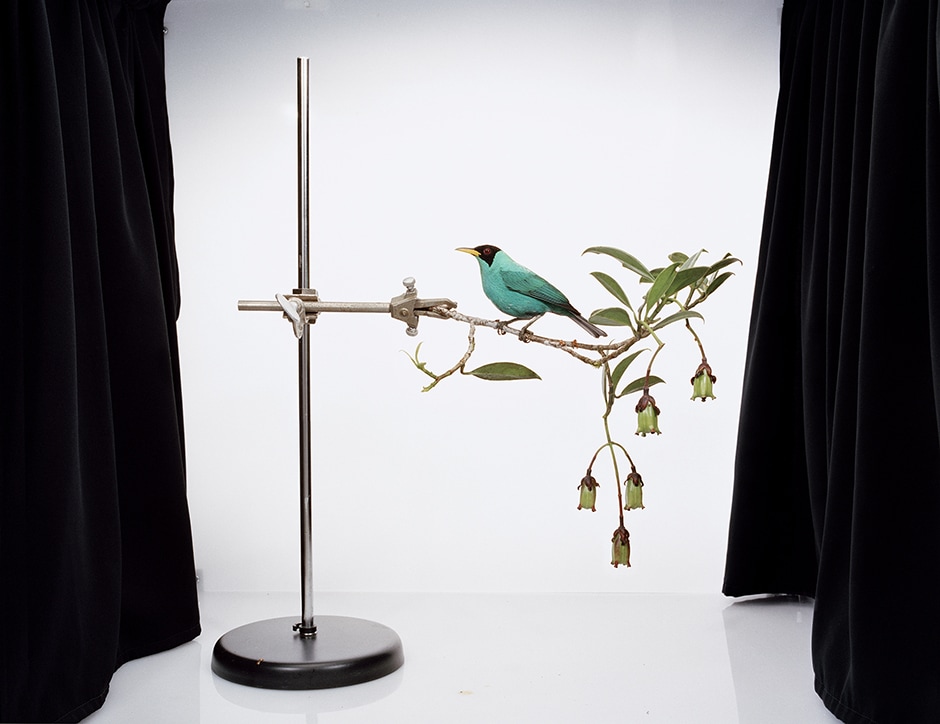
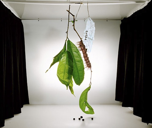
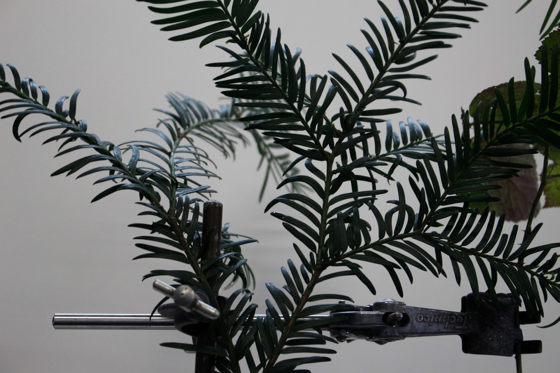
Sanna Kannisto
My work explores the relationship between nature and culture. In my artistic work I aim to study the methods, theories and concepts through which we approach nature in art and in science. As an artist I am attracted by the idea that when I am working in a rain forest I am a ‘visual researcher´. In my series 'Private Collection' and 'Field Studies' I was interested in borrowing methods of representation, as well as working methods from natural sciences, anthropological and archaeological practices and from still-life painting tradition, to use in my photographic work.
Taking photographs in a field studio has become one of my most important working methods. The portable photography box I have constructed is like a stage showing scenes from nature, which I direct. When the object has been taken out of its original setting - out of nature - it becomes special. The aspect of a white background that suggests scientific recording and documentation interests me. These compositions in the field studio have also allegoric nature. For me, photography is a medium, which in itself documents the transience of life.
Taking photographs in a field studio has become one of my most important working methods. The portable photography box I have constructed is like a stage showing scenes from nature, which I direct. When the object has been taken out of its original setting - out of nature - it becomes special. The aspect of a white background that suggests scientific recording and documentation interests me. These compositions in the field studio have also allegoric nature. For me, photography is a medium, which in itself documents the transience of life.
|
One of my aims is to use irony and humour to investigate the concept of truth in photography and to ask how we actually want to view nature. According to Claude Lévi-Strauss, during the course of cultural evolution, man changes a raw and unpalatable nature into one that is cooked and digestible. Photography can resemble a cooking process of sorts. The photographed objects are made intelligible by being photographed, thus incorporated into our culture. In the same way as in science, art is used to try and control the world. The impossibility of this task is also linked with a certain absurdity that I have noticed in my pictures. The pictures in the 'Private Collection' and 'Field Studies' series were taken at biological field stations in Brazil, French Guiana and Costa Rica in 2000-2006. - Sanna Kannisto
|

|
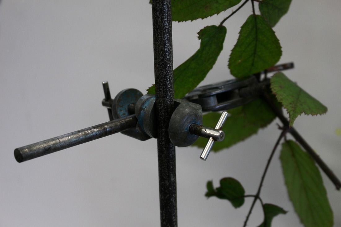
In this first image from Kannisto's Field Studies series, vibrant colours are used to draw attention to the centre of the image. The bird in the middle of the photograph is the main focal point, drawing the viewer in with it's bright blue. The contrast of the deep, black curtains on either side of the image against the bleak, white background of the photograph gives the entire image a more dramatic look. This is something Kannisto uses throughout the series, choosing the keep the black curtains in the frame instead of cropping them out to have only the white in the background also shows the viewer more insight into how the picture was taken; it shows the studio in which she took the image. Furthermore, the image shows structure by using the metal stand to hold up the natural aspect of the photograph, this could also be seen as another element of contrast in the photograph.
|
This second photograph is different from the first as it also shows the ceiling of the studio as well as the black curtains on either side. There is also a label hanging in the centre amongst all the nature, giving the image a scientific look. Different from other pictures in this series, there is no obvious form of structure that is holding up the natural element, this leaves more up the imagination of the viewer as it isn't obvious how the leaves are being held up. Additionally, Kannisto has placed more nature along the bottom of the picture, spreading it more across the image as opposed to in other photographs in the series. This photograph, in particular, features a lot more nature than the others in the series and also less elements of structure making the image more natural overall in a literal sense and a less obvious sense as well.
|
This final image is similar to the first two in that it displays all the features of the studio in which Kannisto takes her photographs. However, this particular image features less vibrant colours than the first. This gives the entire image a less contrasting element. The way Kannisto uses different ranges of colours and tones depicts how a photographer can manipulate the contents of an image to get their desired effect. It is interesting that in this photograph Kannisto has used wood as well as metal to show structure. This, in a way, incorporates nature into the scientific elements that Kannisto uses throughout her Field studies series. Furthermore, this image is also a sort of action shot while featuring conventions of a still life image. The bird in the image is singing and Kannisto has placed a small microphone to draw the viewers attention to this, making the photograph also humorous.
|
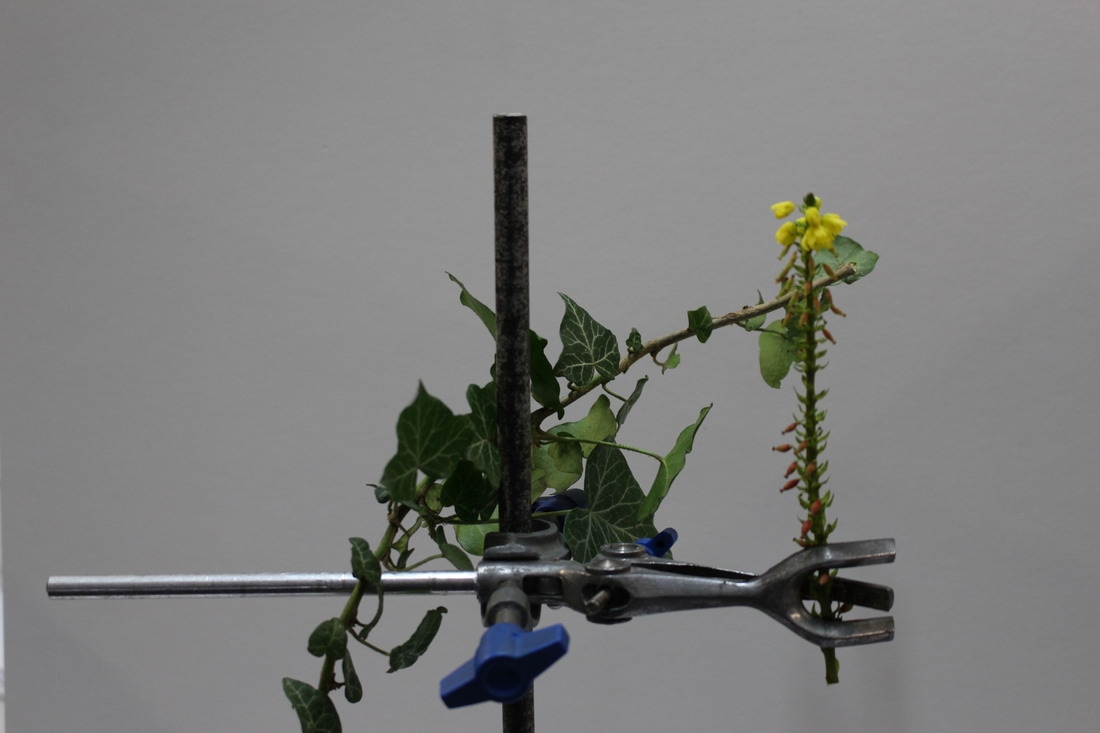
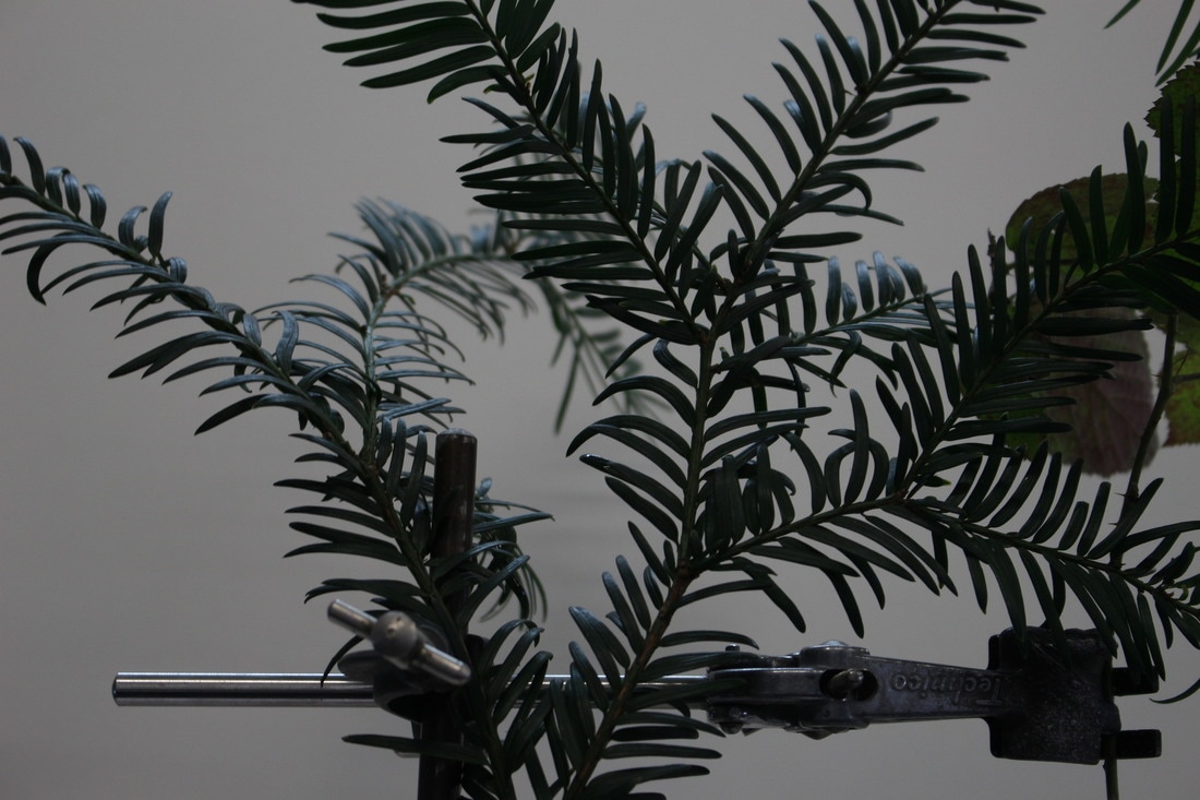
My Response
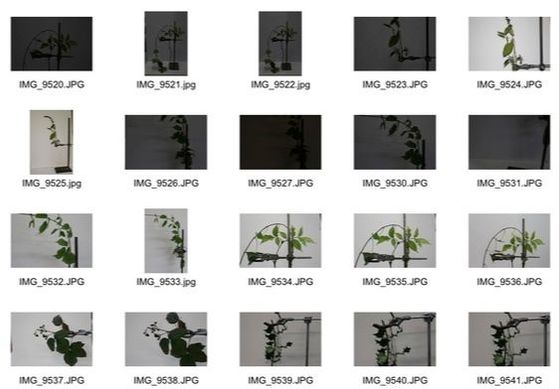
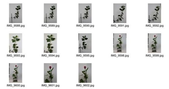
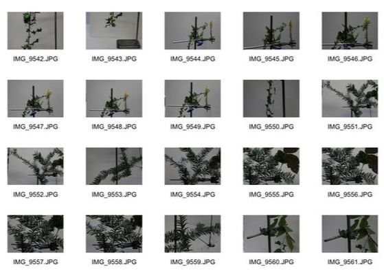
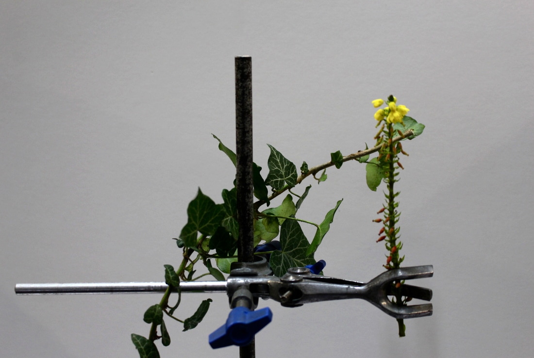
For my response to Kannisto I took several photographs of different plants held up in metal structures. My response is different to Kannisto's, however, as the images are focused more on the subject of the image as they are closer up and don't show any other aspect of the photograph. I think my final results were successful and came out how I had hoped. Below are the three best images, enlarged and their edits and contact sheets of all the photographs I captured.

|
|
Edits:
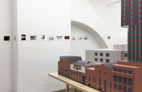
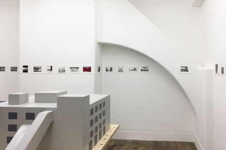
Exhibition Visit
Caruso St John
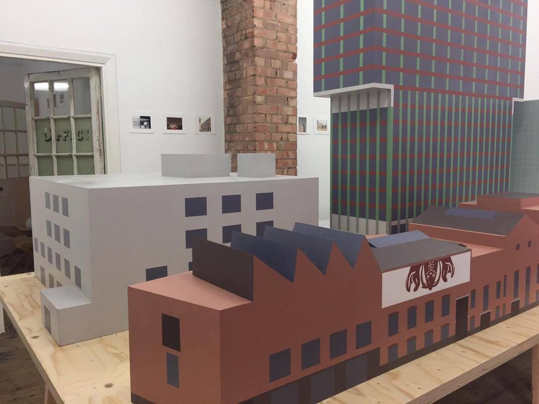
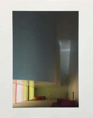
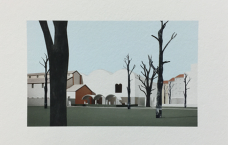
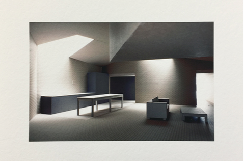
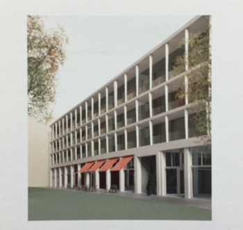
The exhibition presents a selection of models for competition as well as the model of the Newport Street Gallery. The models belong to buildings the architects worked on during the last few years. In Adam Caruso's words: "The buildings that are represented in the models are very different, but we have used only five colours to represent all of their details. This serves to bring together their diverse forms and scales." Exhibited together on a table in the centre, these architectural models show a kind of imaginary Caruso St John-city. The pictures on the wall show the interior of these models that Caruso St John have been making for the last 25 years. The images are photoshopped very slightly, only the tones have been changed within the photographs and, in some of the images, trees or real life backgrounds have been photoshopped in to give a more real effect. Adam Caruso describes the nature of the model photographs as follows: "They show a world where the atmosphere of our buildings are explicitly evoked at the same time as being uncanny as to the actual size and material of the models, models that have been only made to produce these images."
|
|
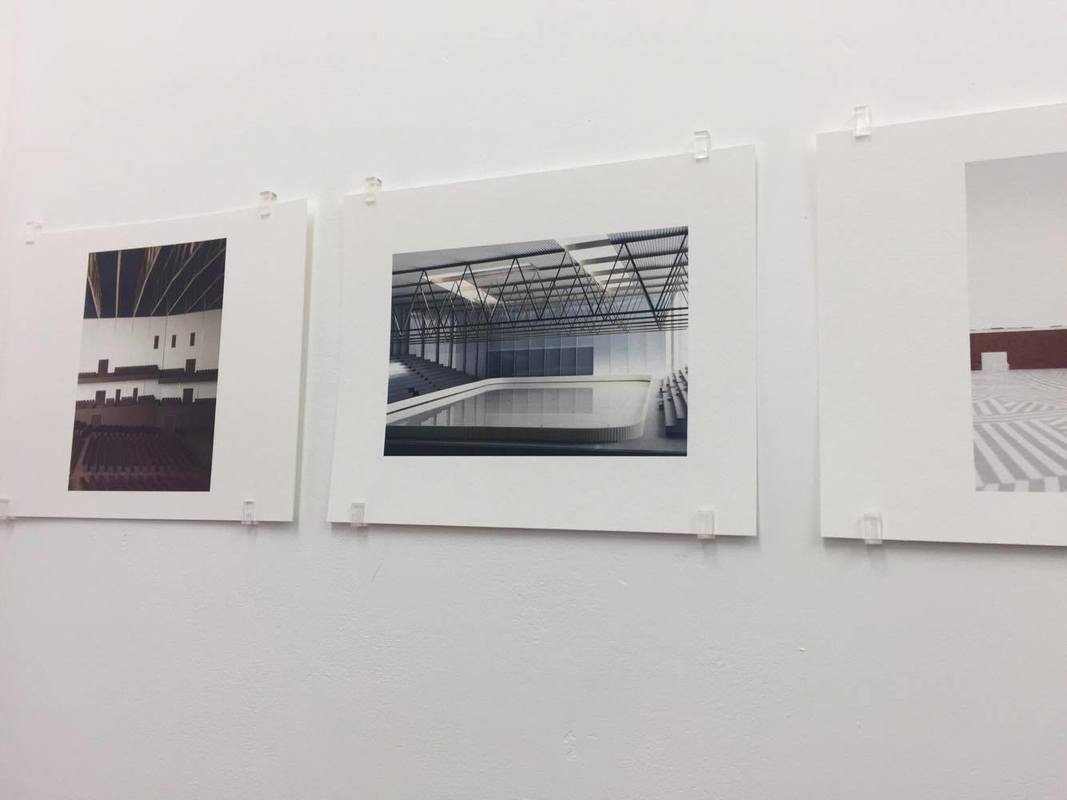

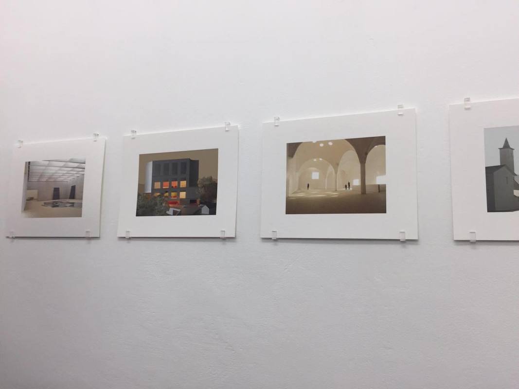

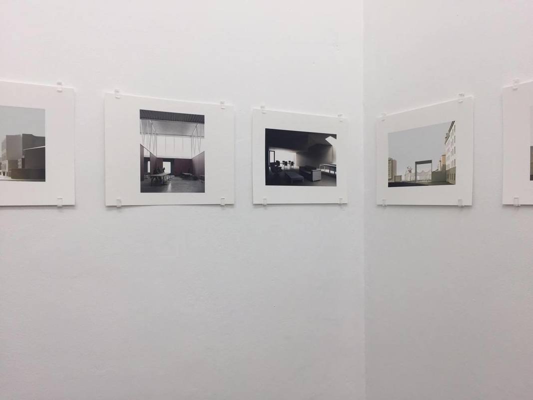
Images from the exhibition:
|
|
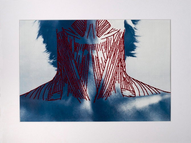
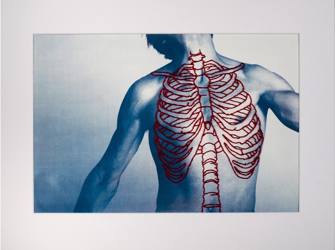
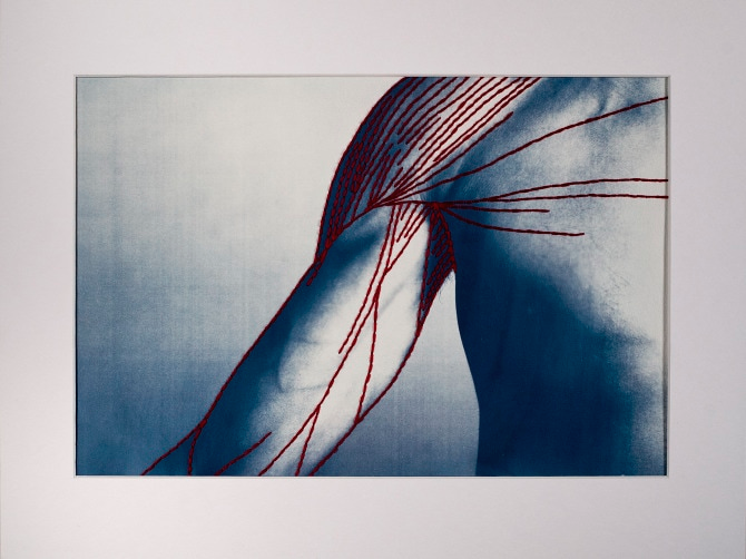
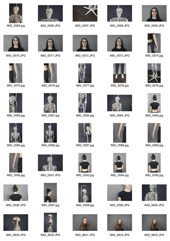
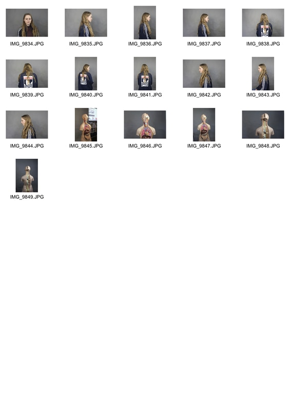
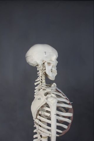
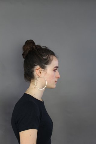
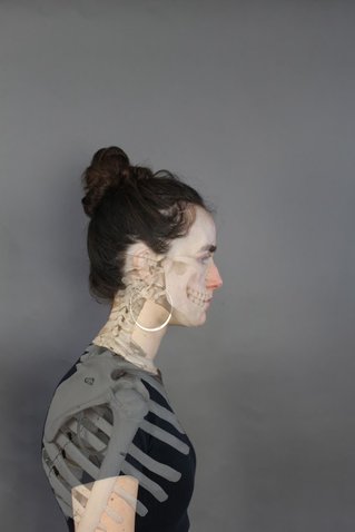
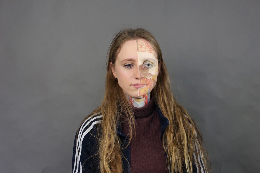
structure of the body
Patrick Hickley
In Hickley's series titled 'Complex Structures', he captures several images of different sections of the body to show structure of humans. By sewing on top of the images, Hickley represents different parts of the body that can't be seen in the images he has taken. The stitching above the skin of the model shows veins, arteries and bone structures. Hickley achieves the blue tone within the images as he hand prints cyanotypes on to watercolour paper. His method used to create these images is different to many photographers as he does a lot by hand to manipulate the photographs instead of editing them on the computer. His stitching shows, quite accurately, one internal aspect of the body in each image, bringing focus to the image and combining science with art in a visually creative way.
|
In this first photograph from the series, Hickely has positioned the model in a certain way in order to better show the details of veins using stitching. This shows how he can manipulate the model to get the exact look that he wants, also that he thinks about the type of stitching that he wants to do when taking the images. What is also interesting about this photograph, and others in the series, is that he has not covered the entire model with stitching; some of the models body has been left plain without stitching. This emphasises the areas of the body that has the stitching to represent structure. Furthermore, the blue tone of the image corresponds with the red colour of the stitching that Hickley has used. The blue tone of the skin makes the model look as though they're ill and have a lack of blood, where the red colour can be seen as the blood in the models body.
|
This image is interesting as it shows the model posed to look as though they are strained slightly. This would make it more difficult for Hickley to stitch the insides on to the image as the body is in an un-relaxed position. In this photograph, Hickley has chosen to sew on the bone structure that would be under the skin instead of veins or arteries. This is interesting as it gives the photograph a different effect to the previous. I think the display of bones on top of the image gives a more interesting look than the veins shown in the previous. This is because it is easier to imagine the body as a skeleton as opposed to a structure built out of smaller veins, therefore the photographs makes more sense to look at and also invites the viewer to imagine the skeleton of the model and what it might look like. Finally, the stitching in this image covers a larger surface area of the model than in the previous image.
|
In this final image from Hickley's Complex Structure series, the model is positioned in a much more natural, relaxed position than in the previous two. The effect of this is that the photograph looks much more scientific as opposed to art. The muscle structure shown by the stitching also allows for the photograph to have minimal stitching on it, making it also appear more simple as opposed to the first image which is lot more detailed and intricate. The stitching in this image, although minimal, runs along the entire photograph, diagonally, from top to bottom which further highlights its minimalistic nature. This is different to the first two images as they are both much busier. Finally, the photograph is taken closer up to the model than in the previous two which allows Hickley to show more detail of the structure of the models arm by using the stitching.
|
My Response
|
|
Edits:
|
|
|
|

|
|
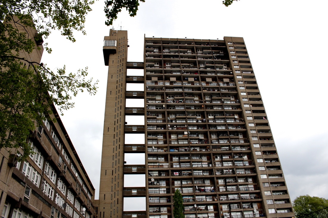
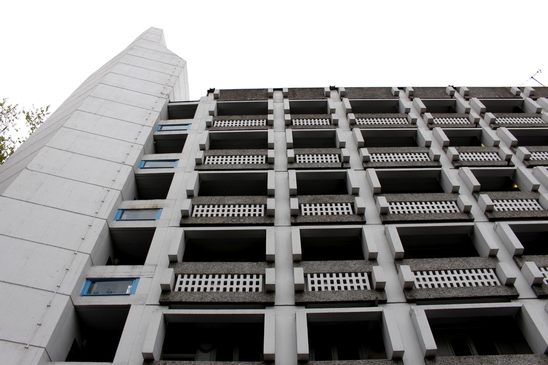
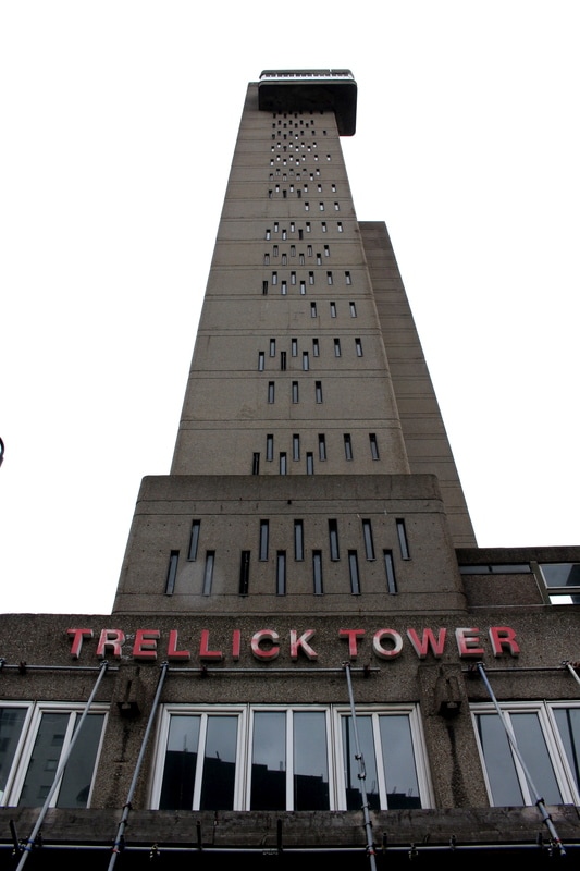
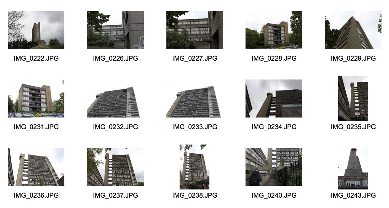
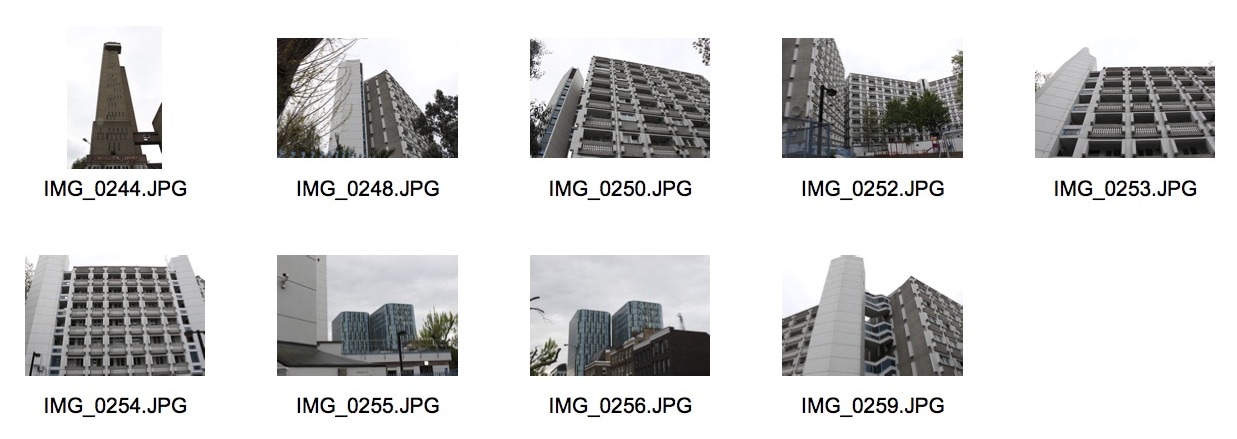
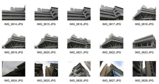
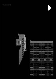
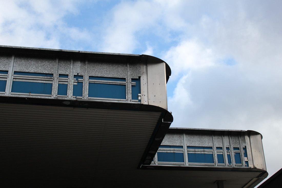
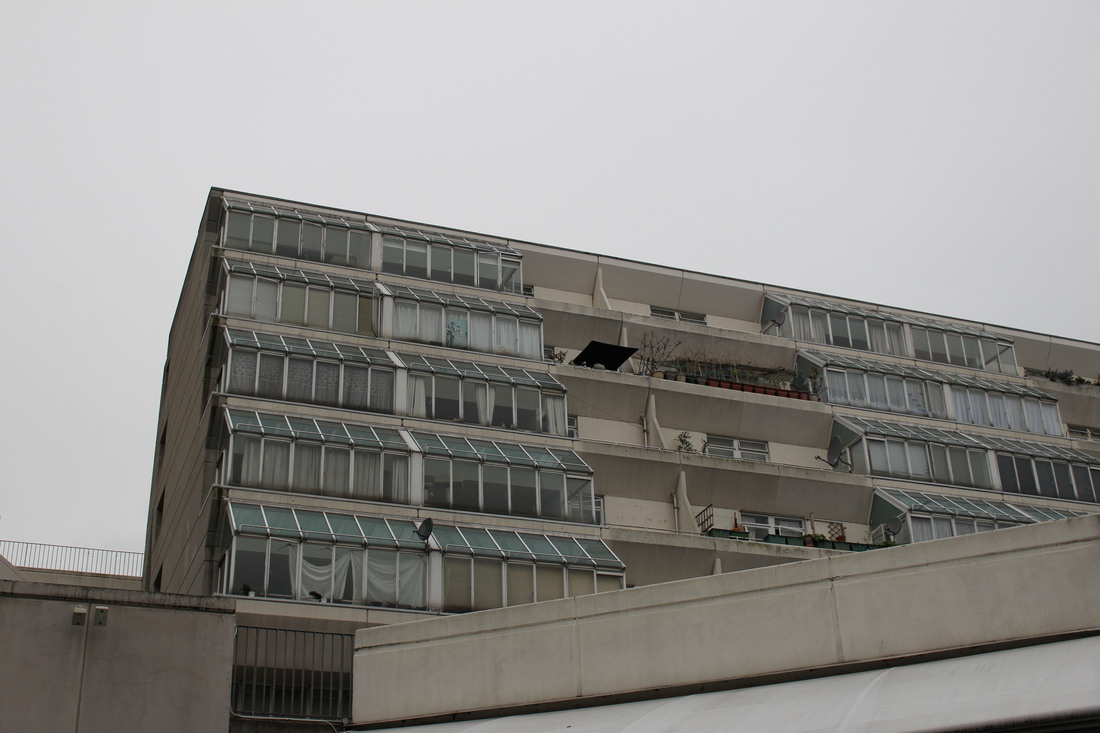
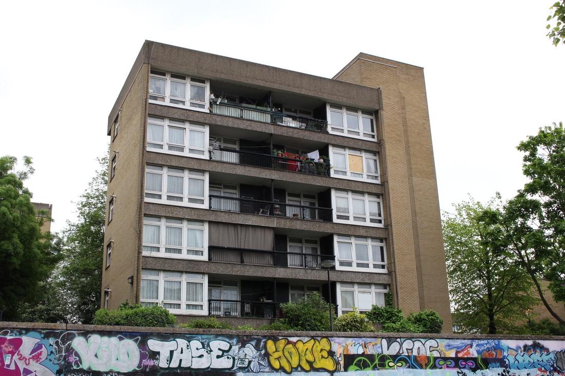
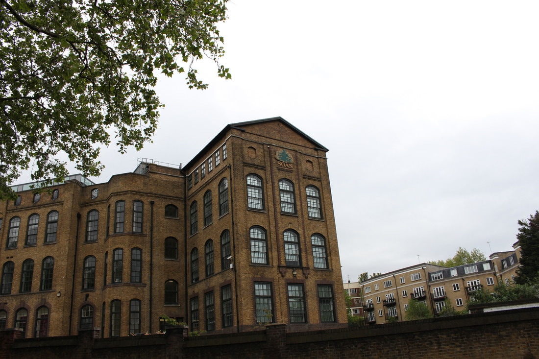
First Strand: Brutalist Structure
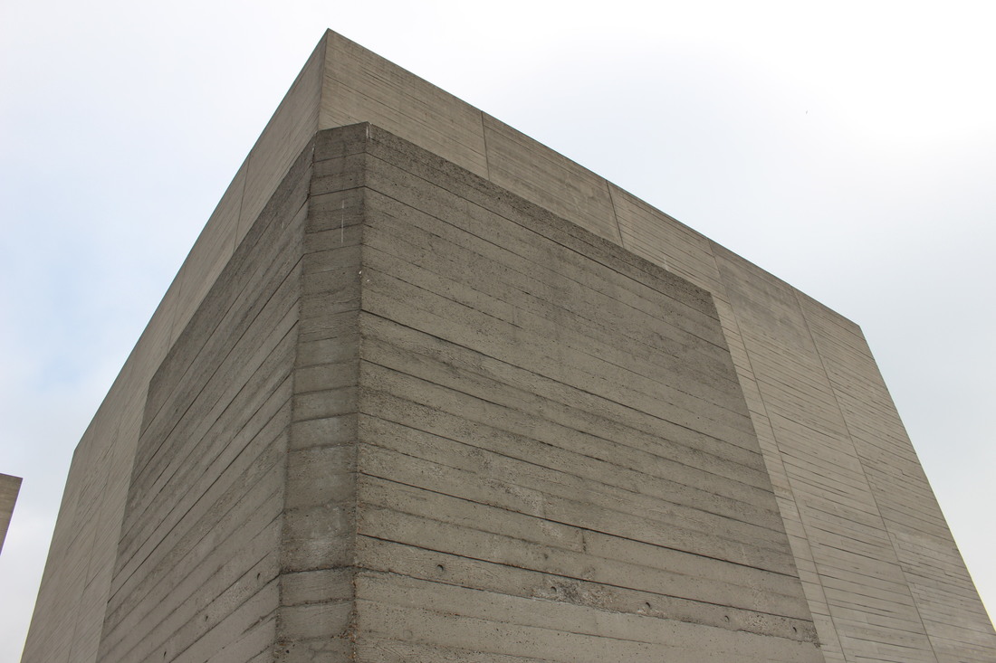
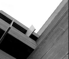
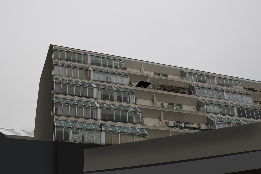
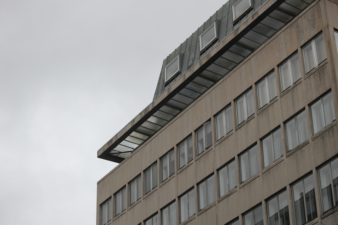
For this this task I went to Trellick tower to capture brutalist architecture in my images. I also went to another brutalist structure in Kings Cross, but did not take enough pictures. I think my first response to this task was unsuccessful as I didn't go to a location with enough brutalist architecture around the area, when I go to improve this response I will try and choose a better location and also take a higher quantity of images.
|
|
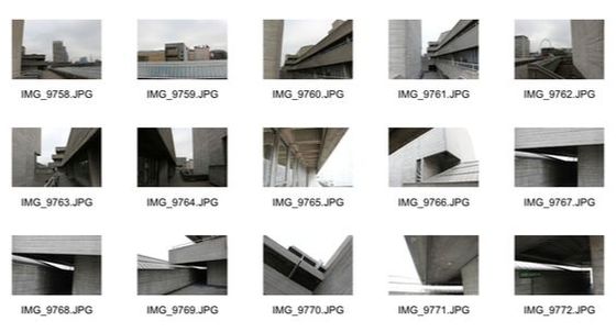
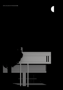
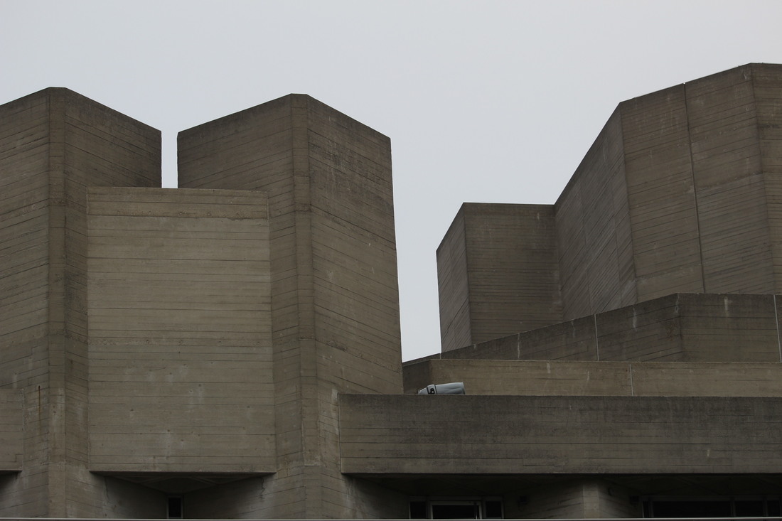
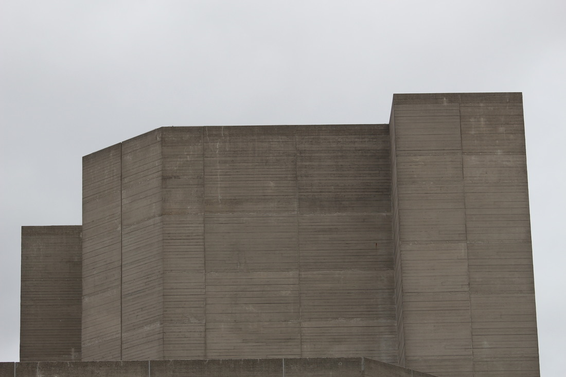
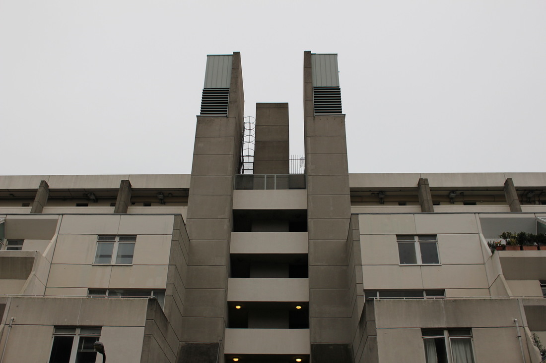
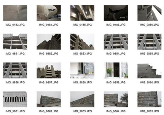
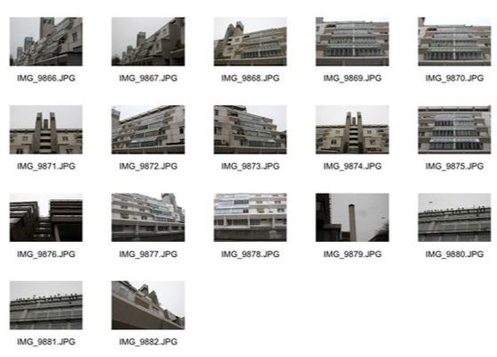
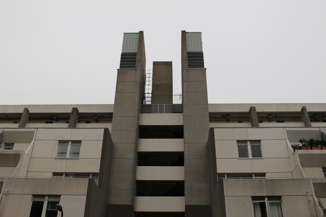
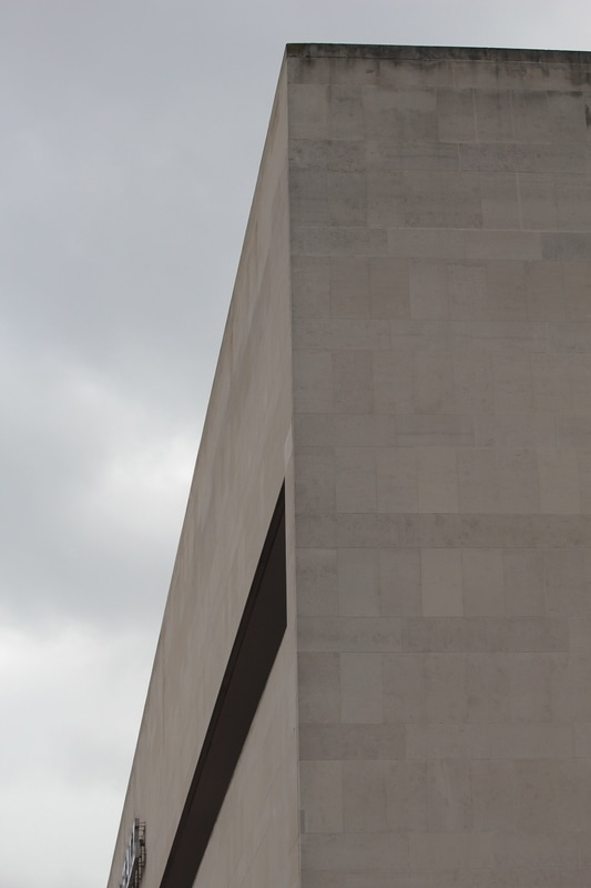
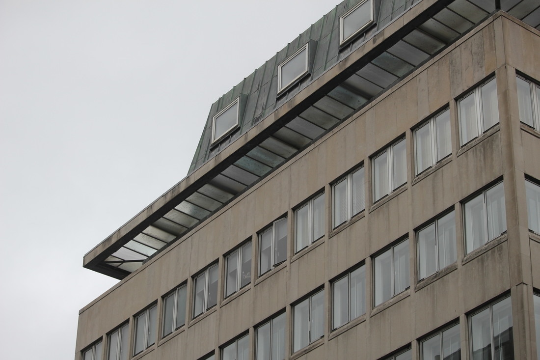
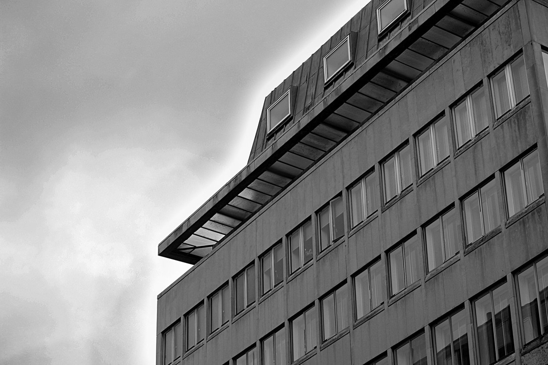
Second Response
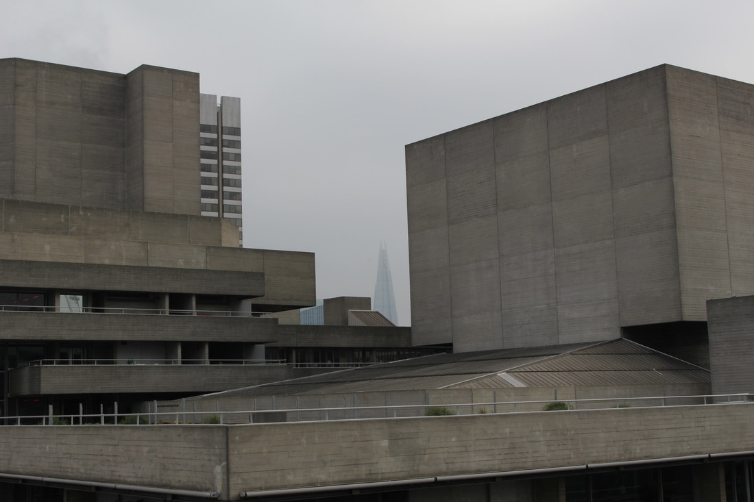
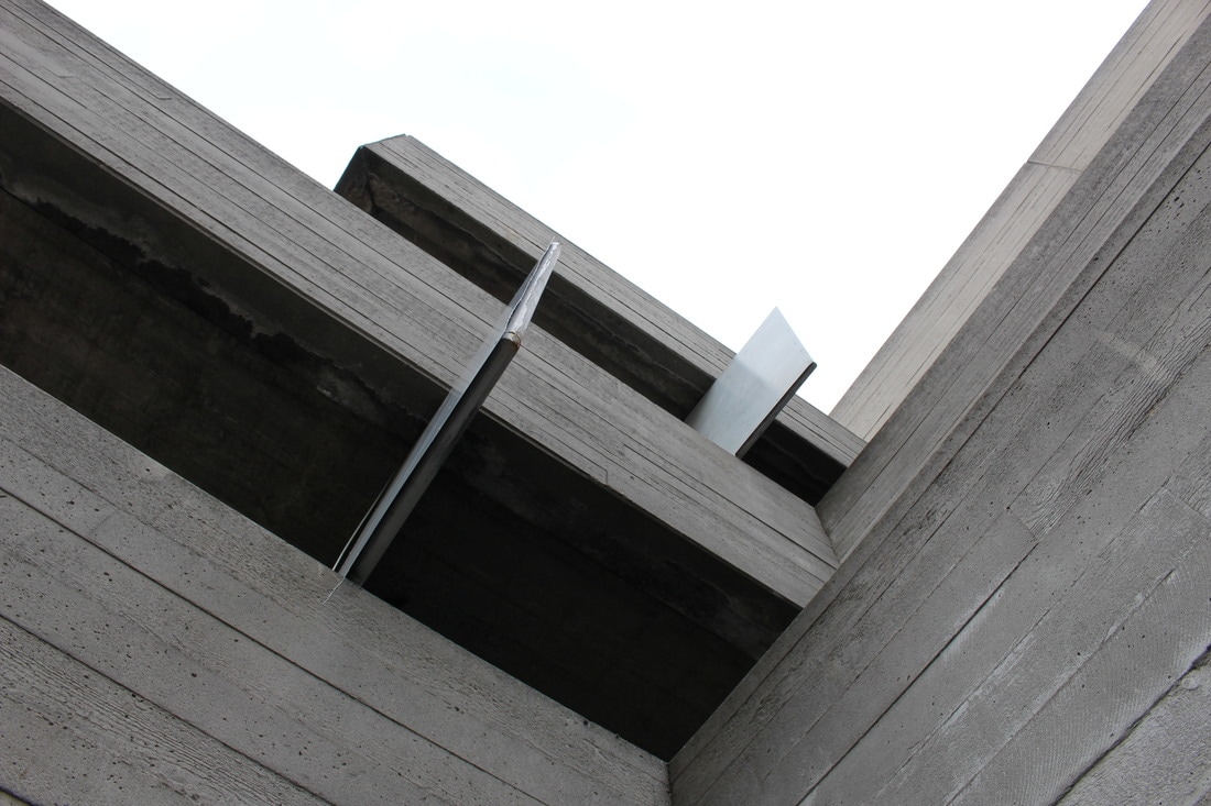
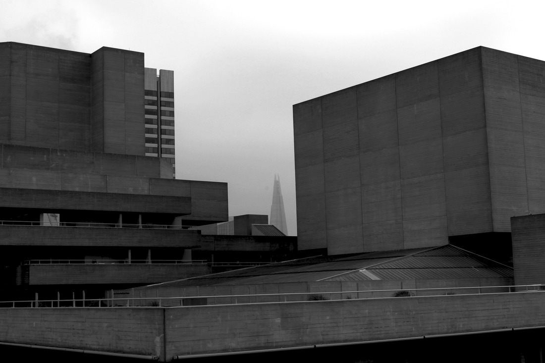
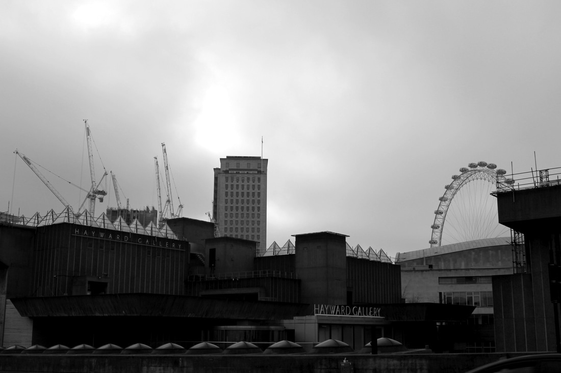
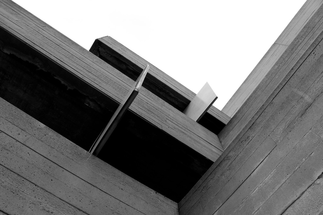
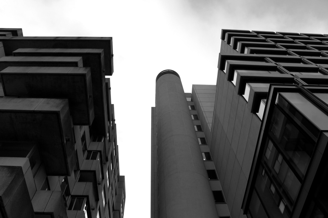
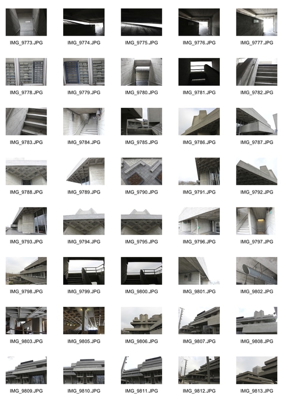
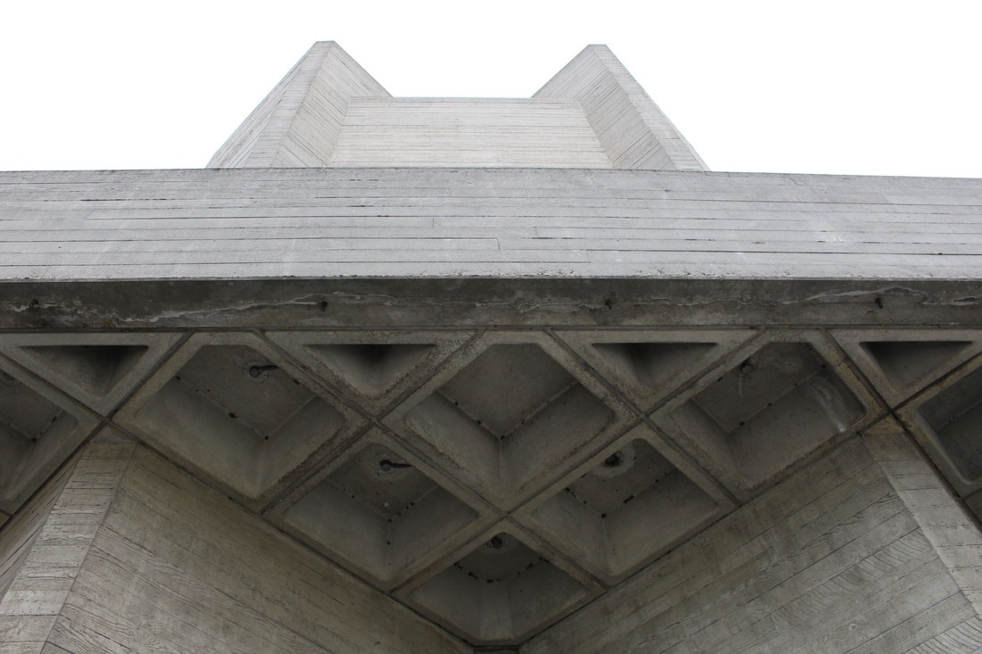
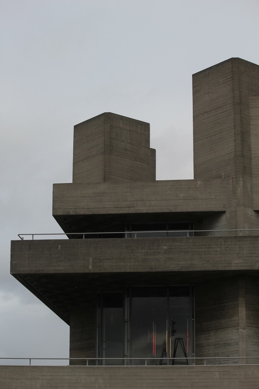
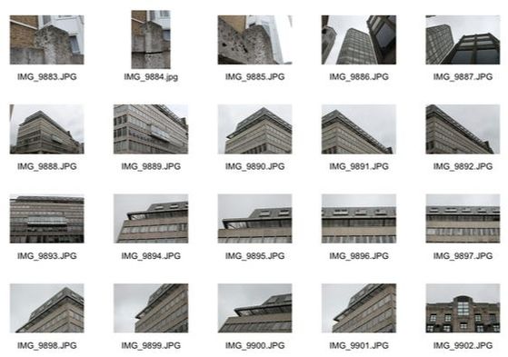
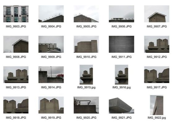
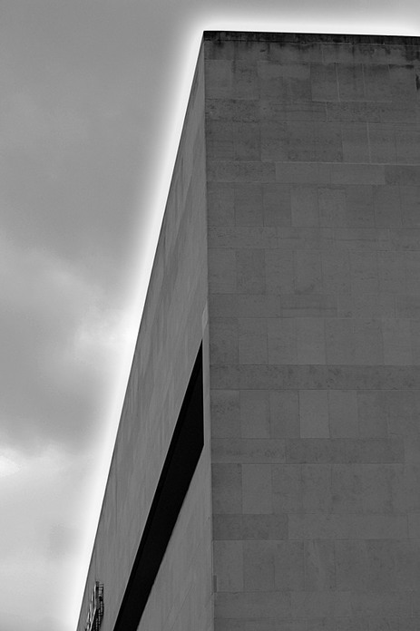
For my second response, I went to the National Theatre and tried to capture more photographs exploring different ways of capturing the brutalist structure. In taking these images, I also attempted to use a variety of angles and capture the lines of the building in order to present the architecture better. I think that these images worked well in exploring perspective and capturing the architecture. Below are all the photographs I took in contact sheets with the ones that I think worked best enlarged and edited.

Edits:
|
|
|
|
Development

Thomas Danthony
Thomas Danthony is a French artist based in London. Often narrative, Thomas's work is characterised by a clever use of light, bold compositions and a dose of mystery. In trying to recreate Danthony's work, using Photoshop, the photographs appear like basic, colourful drawings. However, in my own work I use very little range of colour in capturing brutalist architecture. Danthony's client list includes, among others, Ray Ban, Google, The New York Time, TFL, Mondo, Liberty, Penguin, English National Opera, Netflix, Arte, Nokia, Sadler's Wells Theatre. Thomas has also been developing his painting over the last few years, leading to his first solo show in Paris in 2015 Sergeant Paper Gallery.
|
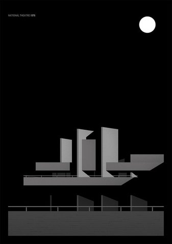
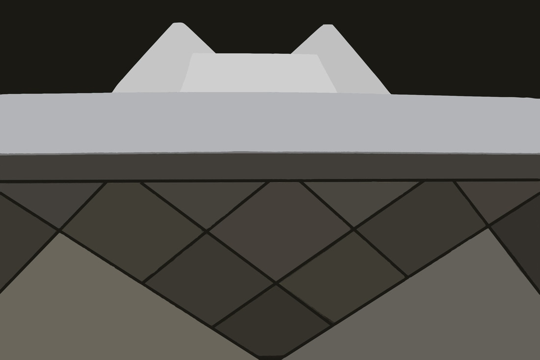
In the largest image shown to the left here from Danthony's brutalist series, the artificial lighting used appears to be represented by the white circle in the right hand corner of the image. For example, like all the photographs in this series there are heavy shadows within the whole image, however in this particular picture most of the building is lit up and there is less shadow than the other two photographs from the series. By using a full circle in the right hand corner of the image Danthony represents the amount of light used and, potentially, the direction in which the light is coming from. Furthermore, there is nothing else in this shot besides the building which makes the image appear more minimalistic. In the two images below Danthony uses different lighting of the buildings to achieve different effects.
|
My Response
|
Originals:
|
Edits:
|
|
|
|
|
I also experimented with making the background of the image black to look more like Danthony's photographs. I think this works well in making the image more dramatic and imposing...
Process:
|
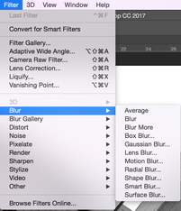
Firstly, I opened one of the photographs that I would work best for this task in Photoshop...
Below is the final outcome from the editing process...
|

This step turned the selection to one tone of grey as shown below...
|
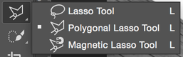
Secondly, I selected the Polygonal Lasso Tool in order to be able to select sections of the building within the image using the straightest lines possible...

|
Then I selected one section of the building that is mostly the same tone throughout...
|

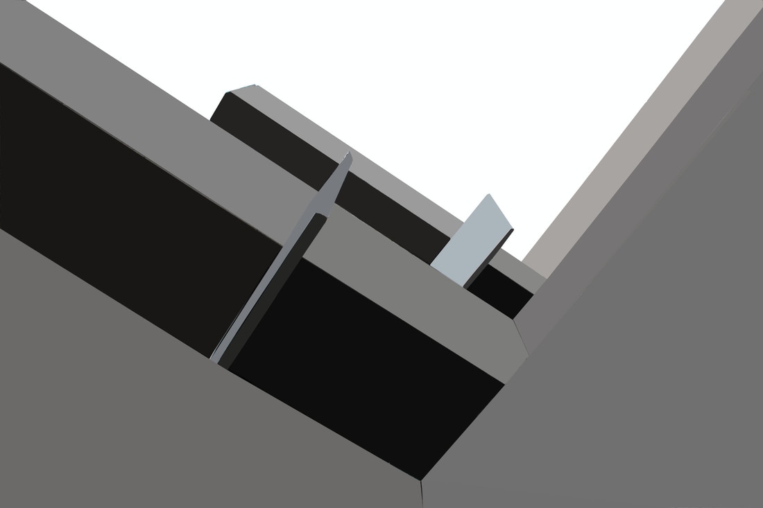
Development

Henrique Folster
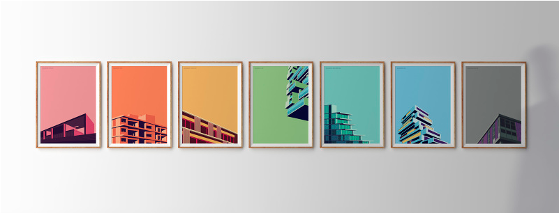
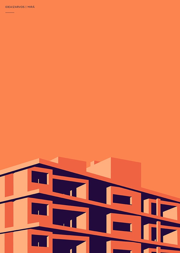
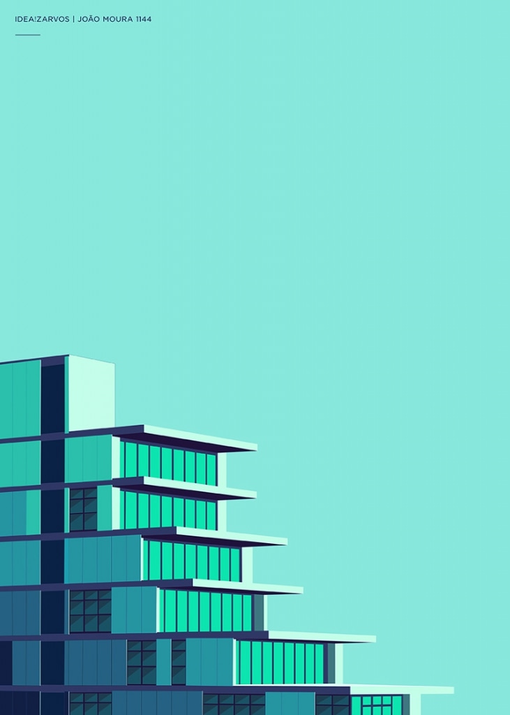
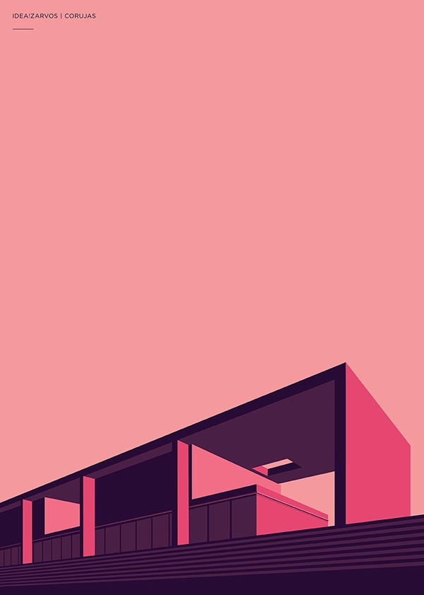
Henrique Folster is an art director, graphic designer and illustrator from Sâo Paulo, Brazil who has done works for major companies such as MTV and The Guardian UK mostly making posters and other kinds of graphics. Folster explores colour, geometry and minimalism in all of his works. In the images shown below, Folster uses inspiration from architecture to create colourful, geometric buildings. All of the photographs shown below are from a series of posters created for Idea!Zarvos, an architecture and construction company. Each illustration takes the essence of the architectural style of the company and translates it into the most minimalistic shapes to create these striking visuals in the individual style of Folster himself. "Idea!Zarvos are developers that create buildings with personality. To emphasise this, I made seven illustrations to portray only the essential lines of some of their buildings, highlighting the visions of the architects. The colours used reinforce how each of the structures look and where they have been built." - Henrique Folster
|
This first photograph by Folster features a very intricate architecture. The building is made up of mostly square and rectangular shapes making the structure look more detailed, but also quite hard with lots of different levels. This is interesting as although photographs by Folster are surreal and could almost be two dimensional if they didn't feature darker sections that look like shadows, the photograph has more depth given to it by the different levels of the building due to the type of architecture. It is interesting how Folster creates an artificial source of light as the buildings have different shades of the same colour. For example, the main colour in this image is obviously orange but on some sections of the building the orange is darker and in some sections, lighter. This makes the photograph much more interesting and also allows the subject of the image to stand out from the background rather than just blending in. Finally, it is interesting how Foster has framed the subject so the viewer cannot see the ground in front, this could be so that the building looks bigger than it really is.
|
This second image features many different shades of blue and in some sections green. This is interesting as it is different to other photographs by Folster because they usually feature all the same colour. The effect of this is that it makes the image have more depth as you can tell which sections of the building are further back and which are closer to the camera. Additionally, the shadows used in this image are a darker shade of blue, this is different to other photographs by Folster as in other images she uses different colours from the main colour of the particular photograph to create shadows. Furthermore, the background of this image is a very cool toned blue, and is much brighter than the other two backgrounds of the other two images. This makes the entire photograph look much brighter and also adds high contrast between the shadows and the background. This shows how Folster can manipulate shades and colours in her images to give different results.
|
In this final image, there is much less of the building shown than in the previous two. This leaves a lot about the photograph to the viewer's imagination. Could the building just be smaller than the other two or has Folster framed the photograph on purpose to make the building look smaller. This is another element of these photographs that Folster is able to play around with to get the desired effect that she wants. As well as creating the colours and shades and shadows within the image, she can manipulate the size of the building to make it look exactly how she wants. For example, this building could be smaller than the others, or the others could be framed to look bigger. This also allows Folster to choose the sections of the building that she finds most interesting and aesthetically pleasing and frame the most favoured sections to be the main focus of the image. Also, in this photograph, the viewer is able to see inside the building as well as just the exterior.
|
My Response
For my response to Foster I edited images I had taken of Brutalist buildings, focusing on one main colour for each photograph. Below are the before and after images and the process of how I edited the pictures to look like Foster's. In order to edit my response images I simply repeated the steps for my response to Thomas Danthony, but instead of averaging the tone I chose a colour and painted the selected sections with the brush tool.
Originals:
Edits:


Development

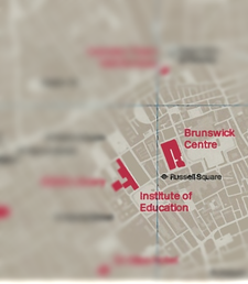
For my further developed response to Brutalist structure, I went to Brunswick and took several pictures trying to capture the idea of structure within the brutalist building. In developing my response to Brutalist structure I will try and edit these images in photoshop to create the artificial shadows and lights used by Henrique Foster, but without editing the buildings into different colours and making them appear two dimensional. I think for this task my photographs were successful I feel I managed to capture the brutalist structure well, however, when I improve these images I will try to go to a location where there is more variety of brutalist architecture and also try to take more pictures. Below are all the pictures I took in a contact sheet and the three I think worked best enlarged.
|
|
Edits:
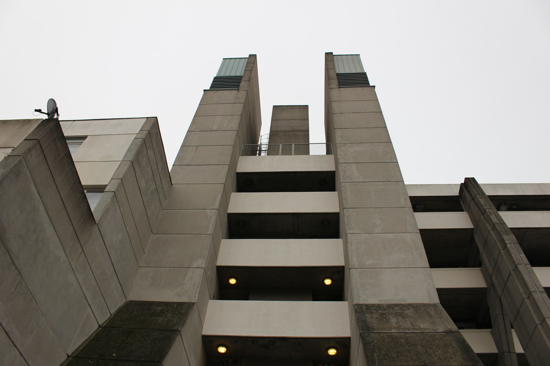
Development

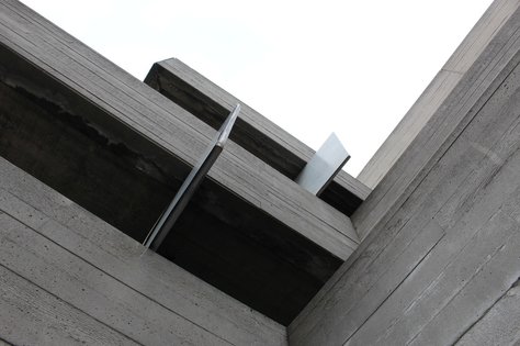
For my development of this task I used a longer lens when taking the images so that I would have a closer, more detailed photograph. I wanted this outcome as I think that it will make the images look more dramatic when I edit them in photoshop, I also think a closer view of Brutalist buildings works well. Below is a contact sheet of the images I took, the ones that worked well enlarged and their final edits.
|
|
Edits:

|
|
|
|
Second Strand: Ruud van empel
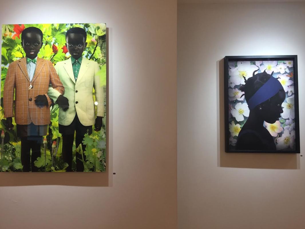
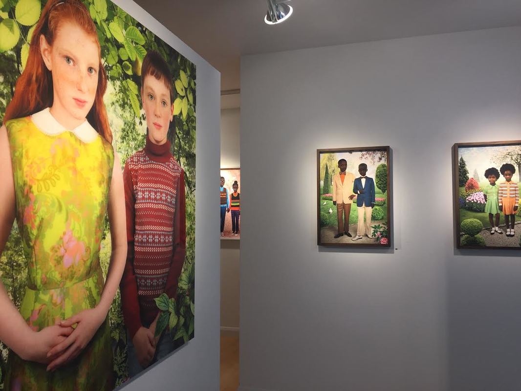
Exhibition
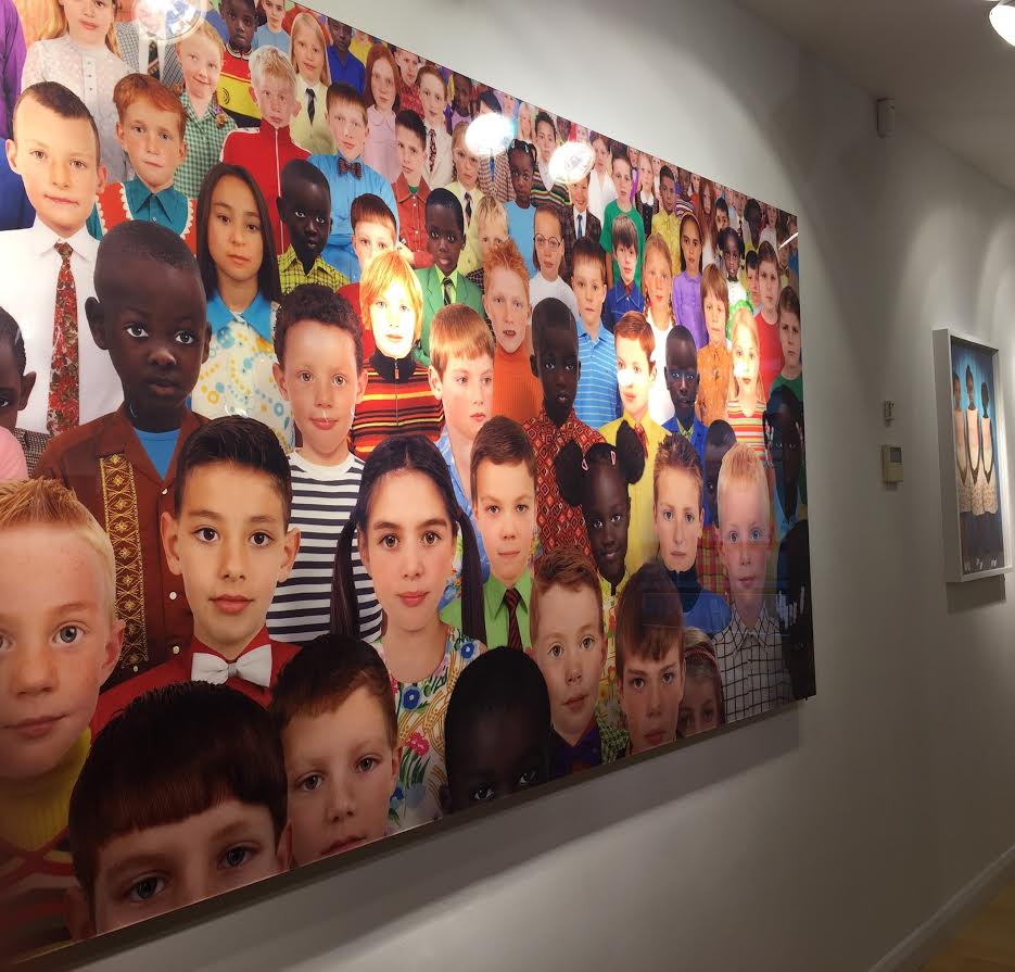
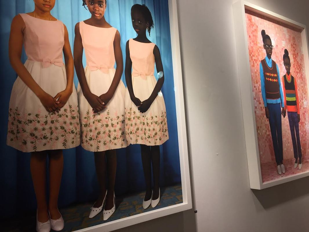
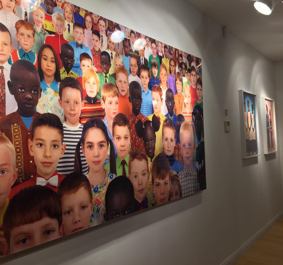
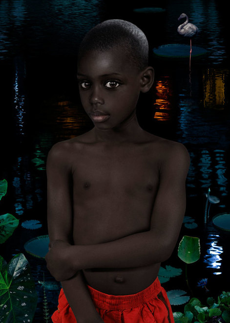
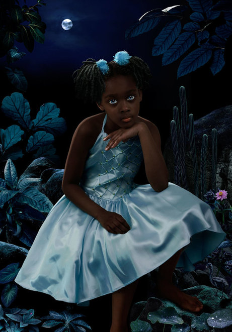
Beetles+Huxley are proud to present the first exhibition devoted entirely to the portraiture of the pioneering Dutch photographer Ruud van Empel. The exhibition will include 21 works, including 12 from the photographer’s latest series, Mood, which has never been shown in the UK before. Ruud van Empel’s distinctive style has evolved through an on going exploration of the tension between straight photography and digital technology. His images are digitally constructed from a synthesis of hundreds of diverse fragments taken from his own photographs. He digitally dissects and reconstructs images to create his works, as eyes, noses and lips are collaged together to create brand new faces. Ruud van Empel skilfully blends the techniques of collage, painting and photography, forcing the viewer to question their own conceptions of the constructed, and the ‘real’. Throughout his career, Ruud van Empel has made photographs that connect with art history, interweaving references including Dutch Old Masters, German Renaissance painters and early photomontage artists into his work. His digitally rendered photographs of children explore notions of youth and innocence. Van Empel gathers his imagery from a wide range of sources including his own personal childhood memories. The artist meticulously choses clothing that echo the formal Sunday dress that he and his siblings would wear to church as a child. This is intended as a comment on the mixed feelings of both oppression and pride that such clothes instilled. So integral is the accuracy of such clothing to his work that van Empel often digitally constructs garments from memory by photographing specific materials and patterns and then "stitching" them together. New works on display, from the series Mood, continue this exploration of lost childhood innocence set against a
|
|
backdrop of cultural conservatism. The images refer to stiflingly upright and formal early photographic portraits, but are given the close-up intimacy of the portrait miniature. Works from the Mood series are master works of pattern, texture and light effects. The dark, earthy tones and strong chiaroscuro give this series, more than any other of van Empels, an atmospheric and dramatic tone. The images from Mood are to be set in the context of earlier works from his series Sunday, Identity, and critically acclaimed Moon and World.
Ruud van Empel was born in 1958 in Breda, the Netherlands and studied graphic design there at the Academie St. Joost. Van Empel worked initially as a theatre set designer. It was in 1995 that van Empel made the transition from stage to staged-photography, and began to experiment with digital collage. |
moon #4, 2007, 33 x 23 1/2 inches
|
moon #7, 2008, 33 x 23 1/2 inches
|
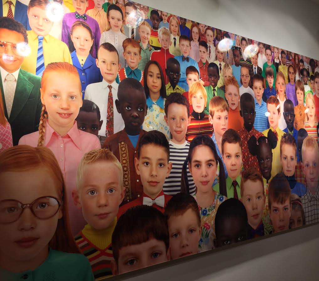
Van Empel draws inspiration from sources low and high. He keeps a collection of postcards featuring sentimental images of roses, religious figures, and backlit couples cavorting in fields. He also looks to the Dutch Old Masters, German Renaissance paintings, and examples of late 19th- and early 20th-century photomontage. These varied strands come together in his own photographs, which often feature children and adolescents immersed in fantastical, luxuriant natural settings. They reflect the artist’s exploration of our notions of childhood innocence and stem from his memories of that time in his own life. “My own youth is a reservoir that I can draw on,” he has said. “You cherish your youth, because life was full of expectations, because everything was so positive, and you had these intensely happy experiences. It is a paradise lost.” A single photomontage can take van Empel up to three months to complete. Working with Photoshop, he stitches together a myriad of individual images into a seamless, albeit surreal, whole. Even his young protagonists’ faces are composed of many different parts. As a result, they appear as impeccable, almost alien creatures—like the two darling girls in Sunday #4 (2012), for example. Standing side-by-side and dressed in what looks like their Sunday best, the subjects stare obediently out at viewers. Their black skin is flawless, their hair styled into high Afros, which appear to echo the shape and texture of the manicured shrubs and trees surrounding them. They seem inscrutable—or are they open? They spring, after all, from the artist’s imagination, standing ready for whatever memories or meanings of youth we might wish to overlay onto them.
Landscapes
Empel also explores landscape when creating artificial scenes. When I attempt to respond to Empel's work I will first try creating a landscape similar to those below, so I decided to look more closely at the type of landscape photographs Empel has created. The photographs shown below are from the two series by Empel titled Study in Green (2003-2004) and Theatre (2010-2013), which both embody several variations of landscape photographs created by Empel. In these images, Empel shows green as the dominant colour of almost every image. This is effective as it makes the nature within the image appear vibrant and bright, making the entire scene dreamy and euphoric.
|
This first image is the 18th photograph of Empel's 'Study in Green' series. Within this image Empel creates a path from the front of the image leading to the very back making the entire photograph look more aesthetically pleasing and also adding depth to the image. For example, Empel's placing of objects in front of each other and at different levels in the picture add an element of realness as any scene in nature would not be flat, or perfectly symmetrical. Furthermore, the use of manufactured light in the photograph gives the nature a glowing look. This is what gives all of the photographs in these series a mythical, fairytale look. Light is also used in different ways throughout the image, like further back in the photograph Empel uses shadows and silhouettes adding darkness and even more depth. Also, Empel uses small details of vibrant colour at the bottom of the image grabbing the viewer's attention.
|
In this second photograph, which is the 3rd in his Theatre series, Empel uses more colours besides green to draw the viewer's attention to different sections of the photograph. By making smaller details of the photograph vibrant, bright colours these little details will stand out and not be over looked when examining the image. This particular photograph has less depth than the first, as the background of the image does not go as far back. The use of this allows the viewer to focus more on the front of the image and at the smaller details that Empel has highlighted in changing their colours. Specifically in this image, Empel has left the centre of the photograph quite simple making the main focus points of the image all around the edges of the image. This is interesting as it would not have the same appealing effect if the image were as deep as the previous.
|
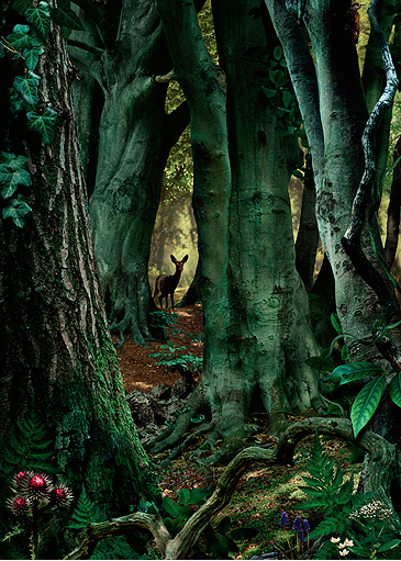
This last image, which is the 8th in Empel's Theatre series, embodies a darker atmosphere than the previous two. There is much more shadowing in the deeper parts of the trees throughout the entire image. Interestingly, the lighting in the background of the image appears to be a different tone than in the first image. Here, the light is much softer but also brighter, even though the rest of the image is more shadowed. It's almost as though Empel is trying to create the image to look as though the sun is setting in the distance. Furthermore, unlike the previous two photographs, Empel has placed a deer in the centre of the image immediately drawing the viewers attention to this part of the photograph. Similarly to the first, Empel has created much depth in this picture and by placing the deer so far back in the image, he has enhanced this depth further.
|
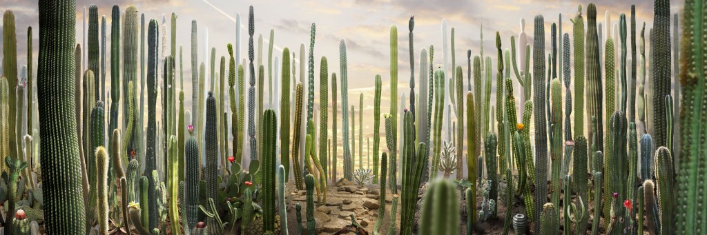
My Response
For my response to Empel's work I created an image of a landscape compiled of several photographs that I took specifically for this response and also some that I had already taken for previous tasks. I used photoshop to bring all the images together, changing the lighting of each image and also the hue so that it would slightly green like the photographs that Empel created. Below are all the photographs that I used for the image I created, a contact sheet of all the images I took specifically for the task and the final image I produced.
|
|
Photographs I used in my final image:


Final Outcome
Henri Rousseau
Henri Julien Rousseau was born in Laval in the Loire Valley into the family of a plumber. With his father's death Rousseau moved to Paris in 1868 to support his widowed mother as a government employee. He started painting seriously in his early forties and by age 49 he retired from his tax collectors job to pursue art. Rousseau claimed he had "no teacher other than nature", although he admitted he had received some advice from two established academic painters, Felix Auguste-Clement and Jean-Leon Gerome. Essentially, he is self taught and considered to be a naive or primitive painter. His best known paintings, like the ones shown below, depict tropical, jungle scenes even though he never left France or saw a jungle. His inspiration came from illustrated books and the botanical gardens in Paris as well as the tableaux of "taxidermified" wild animals. He had also met soldiers who had survived the French expedition to Mexico and listened to their stories of the subtropical country they had visited. He described his visits to the Jardin des Plantes: "When I go into the glass houses and I see the strange plants of exotic lands, it seems to me that I enter a dream."
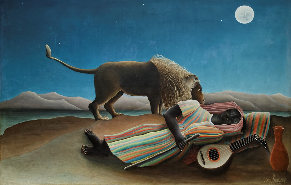
La Bohémienne endormie (1897)
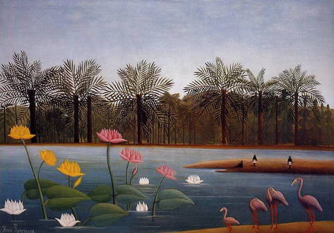
the flamingoes (1907)
Rousseau's flat, seemingly childish style gave him many critics; People were often shocked by his work or ridiculed it. Many observers
|
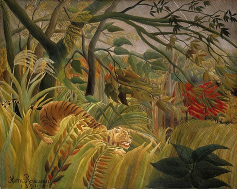
tiger in a tropical storm/surprised! (1891)
|
commented that he painted like a child and did not know what he was doing, but the work shows sophistication with his particular technique. From 1886 he exhibited regularly in the Salon des Independents, and, although his work was not placed prominently it drew increasing following over the years. Tiger in a tropical storm was exhibited in 1891, and Rousseau received his first serious review, when the young artist Felix Vallotton wrote:"His tiger surprising its prey ought to not to be missed; it's the alpha and omega of painting." Yet it was more than a decade before Rousseau returned to depicting his vision of jungles. In 1893 Rousseau moved to a studio in Montparnasse where he lived and worked until his death in 1910. During 1897 he produced one of his most famous paintings, La Bohemienne endormie.
Development

Marcus Lyon
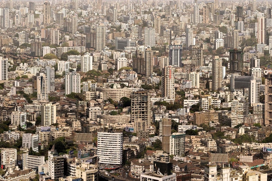
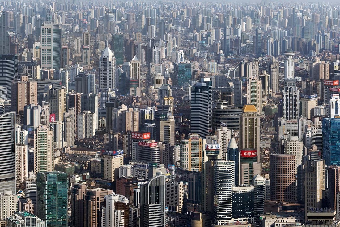
Marcus Lyon is a British artist. His works and publications are held in both private and international collections including the Smithsonian Institution, the Art Institute of Chicago and the Arts Council of Great Britain. He has been commissioned and exhibited globally. Born and raised in rural Britain, Lyon studied Political Science at Leeds University, Leadership at Harvard Business School and Performance Measurement at the Kennedy School of Government. His early working life with Amnesty International in Latin America was the inspiration for his twenty-five year exploration of the issues at the heart of globalisation. "I have endeavoured to create new visual languages within which I can communicate a deeper truth. The results depict landscapes without horizons, built from a myriad of perspectives, each one familiar to the inhabitants of these environments and yet intriguingly new: mirroring the multiple patterns of creation and migration that feed these homage’s to the human will to conquer and adapt in the name of the future." His technique is simply but painstaking. Lyon splices together hundreds of images from an existing scene (usually shot from above) to create an agglomeration which mirrors global themes of rampant consumption, massive urban sprawl and the huge gulf between rich and poor. If these chaotic scenes seem too large to be true it’s because they are.
|
|
Lyon explains how his landscapes capture our globalised world at its most extreme. When I was born, in 1965, there were a billion people living in the urban environment,” says the British photographer Marcus Lyon. “Now there are closer to four billion, and by the time we get to 2030, there will be five billion. That’s one of the great migrations of our time.” Lyon worked as a reportage photographer for the likes of Amnesty International in the developing world throughout the 1990s and early 2000s, shooting images in the slums and ghettos of the rapidly growing cities of Latin America, Asia and Africa. When, in 2008, the UN estimated that, for the first time, more than half of the world’s population was now living in urban areas, Lyon felt the urge to document this change. Over recent years he has been creating a series of finely manipulated photomontages that capture our urban, mechanised, out-of-kilter world. His BRICs artworks, created 2008-10, conjure up the dizzying megacities of Brazil, Russia, India and China
|

|
This image from Lyon's 'BRICS' series is titled BRIC VI, CUMBALLA HILL, MUMBAI, INDIA and was taken in 2010. In order to get the desired, cluttered look that Lyon wants to achieve through creating these images he has repeated several buildings in the foreground of the photograph and pasted them further back in the image, slightly smaller, to create the illusion of the landscape being filled with skyscrapers and architecture. This overcrowded look reflects the problems of globalisation that Lyon is so interested by. Throughout the whole photograph there is hardly any area of the landscape which isn't covered by buildings. However, in the front of the image almost in the middle is a small section of road and cars. By leaving this section of the image building-less the image becomes a lot more powerful as the viewer is able to get perspective on how huge the buildings are. It also gives the viewer a reminder that people have created the problem of globalisation, even though it isn't as vast as this image suggests, one day it will be.
|
BRIC III, YUGO-ZAPADNIY OKRYG, MOSCOW taken in 2008 is the third image in Lyon's 'BRICS' series. This particular photograph is interesting as it doesn't feature huge, imposing skyscrapers like most of the other images in the series. Instead it embodies very long, but still enormous looking buildings. In this photograph, there is nothing offering the viewer perspective so that they can imagine how vast the buildings really are, however, looking closely at the photograph the viewer will notice the sheer amount of windows spread across each building. It is not entirely clear what these structures are for, but they do resemble huge apartment blocks or estates. This corresponds with the problem of globalisation as it could represent the overpopulation that has lead to it. Therefore, by using this image as an example, it is made obvious the way in which Lyon can choose the types of buildings to capture and even lay out his images to address different problems that he finds to be important.
|
The fifth image in Lyon's 'BRICS' series is titled BRIC V - CBD, SHANGHAI, CHINA and was taken in 2009. This image must be the most shocking of them all as, when looking closely, there are some sections of the photograph that do not feature any huge skyscrapers, but instead what look like tiny, industrial buildings and houses. This draws on the issue of globalisation as it shows how, in some parts of the world, people face these kinds of problems everyday as they're right on their doorstep. The smaller structures within the image also makes it more dramatic as it emphasises the sheer sizes of the giant buildings throughout the whole image. What I think is most effective about this image, and others in the series, is the way that Lyon continually edits the skyline in the far background of the photograph, using much much smaller versions of these huge buildings to make the landscape look as if it's going on forever. Lyon does this in order to represent what our environment will look like in future years with extreme overcrowding.
|
My Response
For my response to Marcus Lyon I took several photographs of buildings, in doing so I tried to capture them from far away so they would better fit in a photograph with a lot of other images. Below are all the images I took for the task in a contact sheet and my final edited image with all the photographs I chose to use to create it.
|
|
Photographs I used in my final image:


Final Piece
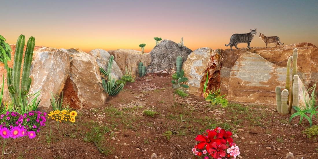
For my final response to the structure unit I decided to continue looking at the work of Ruud Van Empel, as I felt that the outcome of using nature in the artificial photographs looked more interesting than architectural structures. However, instead of drawing influence from Empel's 'Study in Green' series I chose to make the final response more intricate by enlarging the width of the photograph similar to Empel's final photographs featured in his 'Theatre' series. Below are a few of the images I looked at in the series when planning to make my own response.
Contact sheets of all the images I took for my final piece:
|
|
|
|
Photographs I used in my final image:


Final Outcome: